
How to Choose an Ecommerce Platform in Malta: A Buyer’s Checklist
A practical requirements checklist for Malta businesses comparing ecommerce platforms, payments, tax, delivery, integrations, ownership, security and growth.

Website Content Checklist for Malta Businesses: What to Prepare Before Design Starts
A practical checklist for Malta businesses preparing website copy, images, proof, SEO inputs, approvals and content handoff before design begins.
Mobile-First Website Design: Capturing More Conversions
The Mobile Imperative for Modern Business Growth
Mobile devices now account for over 60% of global web traffic, and for industries like e-commerce, local services, and media, that figure regularly exceeds 70%. By 2025, mobile commerce is projected to reach $4.01 trillion, representing 59% of all online retail sales. If your business is not optimized for mobile, you are already losing ground to competitors who are.
The stakes are even higher when you consider user patience. Research shows that 53% of mobile users will abandon a site if it takes longer than three seconds to load. A one-second delay in mobile page load can significantly reduce conversions, and desktop conversion rates average 4.3%, while mobile conversion rates often sit at just 2.2%. That gap represents a substantial lost revenue opportunity for businesses that fail to prioritize the mobile experience.
Google’s mobile-first indexing adds further urgency. Since July 2024, Google uses the mobile version of your site as the primary source for indexing and ranking across all websites. If your mobile site is slow, cluttered, or missing content that exists on the desktop version, your search rankings will suffer, reducing organic visibility and traffic.
This article lays out actionable tactics to close the mobile conversion gap and turn your mobile traffic into qualified leads. From design principles that prioritize speed and usability to technical optimizations that align with Google’s standards, the strategies ahead are built for business owners and marketing managers who need measurable ROI, not vague advice. Digital Consulting Pros has helped clients apply these exact methods through a decade of hands-on experience, delivering conversion-focused websites that perform on the devices your customers actually use.
What Mobile-First Design Really Means

Mobile-first design is a development approach that starts with the smallest smartphone screen and scales upward to tablets and desktops. Instead of building a desktop layout and “shrinking it down,” the team makes deliberate choices about what content and functionality matter most for on-the-go users. The process is called progressive advancement: you design the lean, fast mobile version first, then add features for larger screens.
This differs from responsive web design. A responsive site uses CSS media queries to react to screen size, often beginning with a desktop layout. The outcome works on multiple devices, but the mobile experience can feel like a squeezed-down afterthought. Mobile-first is proactive; responsive is reactive. Mobile-first sites are always responsive (they adapt to larger screens), but not all responsive sites are mobile-first.
Core Principles of Mobile-First Design
Content prioritization. Limited screen estate forces you to identify what users actually need. The hierarchy changes: product images, search bars, and CTAs take precedence over decorative flourishes.Simplified navigation. Hamburger menus or bottom navigation bars preserve screen space. Adobe Express advises avoiding intrusive pop-ups on mobile, as they damage the user experience.Touch-friendly targets. Buttons and links should be at least 44×44 pixels, with adequate spacing to prevent mistaps. 75% of mobile interactions are made with the thumb, so primary actions belong in the bottom-center of the screen.Single-column layouts. Multi-column designs that work on a 27″ monitor collapse poorly on a 5″ phone. A single, scrollable column keeps reading flow natural.Speed optimization. 53% of mobile users abandon a site that takes longer than three seconds to load. Mobile-first teams compress images, minify CSS and JavaScript, and use browser caching from the start.
Google Search Central recommends responsive configuration as the easiest to implement and maintain. Responsive sites serve the same HTML on the same URL, displaying content differently based on screen size. Google also uses the mobile version of a site’s content, crawled with the smartphone agent, for indexing and ranking — a policy called mobile-first indexing. If your mobile site lacks the same primary content as the desktop version, Google indexes a thinner page, hurting organic visibility.
For business owners in Malta and beyond, the choice is practical. Mobile-first design yields 15-30% higher conversion rates than desktop-first approaches, according to industry benchmarks. At the agency, the mobile-first process includes a content audit that strips away non-essential elements, ensuring the site loads fast and guides users toward a purchase or inquiry within three taps. This clarity on mobile naturally improves desktop performance, because the foundation is already clean.
Why Google’s Mobile-First Indexing Demands Your Attention

Since 2018, Google has used the mobile version of your website as the primary source for indexing and ranking. The rollout reached every site by July 2024, meaning there are no more desktop-only exceptions. If your mobile experience is slow, cluttered, or missing content, your rankings will suffer — and potential customers may never find you in search results.
This isn’t a prediction. It is the operating system of search today.
Content Parity Is Not Optional
A common but damaging mistake is serving less text, fewer images, or different structured data on mobile than on desktop. Google’s crawler sees the mobile page first. If your mobile page has thin product descriptions or is missing headings, Google indexes a thinner page and ranks it lower. Your mobile and desktop versions must contain the same primary content, headings, structured data (such as Breadcrumb and Product schemas), and meta tags. If you hide content behind a tap or an accordion, ensure it is present in the initial HTML — Google will not load content that requires swiping or clicking.
For separate mobile URLs (m-dot sites), additional rules apply. Never use URL fragments (the ‘#’ character) on mobile URLs — they are not indexable. The desktop URL is the canonical version, and the mobile URL is the alternate. Both must return matching HTTP status codes. A common error occurs when different desktop pages redirect to a single mobile home page; those pages will vanish from the index.
Core Web Vitals Set the Speed Standard
Google’s Core Web Vitals measure how real users perceive page load speed and stability. For mobile, the targets are clear: Largest Contentful Paint (LCP) under 2.5 seconds, Interaction to Next Paint (INP) under 200 milliseconds, and Cumulative Layout Shift (CLS) under 0.1. A 100-millisecond improvement in load time can lift conversion rates by 1%. Sites that consistently miss these benchmarks see measurable ranking drops and reduced visibility in mobile search results.
For a results-driven agency like Digital Consulting Pros, these metrics are not abstract goals — they are the starting point of every mobile optimisation engagement. By auditing a client’s mobile performance against Core Web Vitals and fixing the technical blockers (compressed images, minified code, server response times), the agency turns speed into a competitive advantage that delivers organic traffic and higher conversion rates.
Avoid These Common Mobile-First SEO Mistakes
- Blocking CSS, JavaScript, or images in robots.txt — Google needs these to render the page as a user sees it.
- Using intrusive pop-ups or interstitials that cover primary content, which violates the Better Ads Standard and harms usability.
- Inconsistent structured data: if your desktop page has VideoObject or Product schema, your mobile page must have identical markup with mobile URLs.
- Lazy-loading essential text or image content. Google’s crawler will not trigger lazy loading that depends on user interaction.
- For m-dot sites: duplicate mobile landing pages or missing canonical and hreflang tags.
Google recommends responsive web design as the easiest configuration to maintain and optimize for mobile-first indexing. A responsive site serves the same HTML and URL to all devices, avoiding the content mismatch and canonical pitfalls of separate URLs. For businesses targeting mobile-heavy audiences — e-commerce stores, local service providers, restaurants, and real estate agencies — responsive design is the most reliable path to high rankings and sustained organic traffic.
Closing the Mobile Conversion Gap

Desktop websites convert at an average rate of 4.3%, while mobile sites lag behind at just 2.2%. For a business generating 1,000 monthly leads from each device, that gap represents over 20 lost conversions per month — a substantial revenue leak for any SME struggling to get a positive return on ad spend.
Speed is the biggest driver of this disparity. A one-second delay in mobile page load can cut conversions by 7%, and 53% of users will abandon a site that takes longer than three seconds to load. Mobile users also spend 70% less time on a page than desktop visitors, so every moment of friction compounds the loss.
A documented mobile-first design strategy directly addresses this gap. Sites built with mobile-first principles see 15-30% higher conversion rates compared to desktop-first approaches. Every 100-millisecond improvement in load time adds roughly 1% to conversion rates. For a local service business running €5,000 in monthly ads, that compound improvement can turn a break-even campaign into a profitable one inside a quarter.
Digital Consulting Pros builds mobile-first landing pages and conversion-focused website designs that target the 2.2% baseline and push it higher. Their approach pairs thumb-friendly navigation with lean content structures that respect the 70% shorter attention span mobile users bring. By reducing load times and simplifying checkout flows, they help clients close the gap between what ads spend and what those clicks actually return.
Designing for Thumbs and Speed
Three in four mobile interactions happen with just the thumb. If your primary call to action sits in the top-right corner — where a desktop user’s mouse would naturally hover — mobile visitors are already reaching across the screen to tap it. That friction costs conversions.
The fix is known as “Thumb Zone” design: place your most important buttons in the bottom-center of the screen, where thumbs rest naturally. Google recommends touch targets of at least 48×48 pixels to prevent mistaps, and studies confirm that 44×44 pixels is the bare minimum for comfortable interaction.
Apply the Three-Tap Rule: a user should reach any core goal — add to cart, book a consultation, or find contact details — within three taps. If it takes more, the navigation is too deep for a handheld device.
Simplify Forms and Keep CTAs Visible
Long forms are the fastest way to kill a mobile conversion. Reducing form fields from eleven to four can increase conversion rates by 120%. Every extra field is a reason to abandon the page. Your lead generation and checkout flows should ask for only the data you absolutely need at that moment.
Sticky CTAs and bottom navigation bars stay visible as the user scrolls, keeping the next action always one tap away. Pop-ups that block the screen, however, drive users away — trigger them only on intent signals like scroll depth or exit behavior, not on first arrival.
Digital Consulting Pros applies these principles in every mobile site it builds, starting layouts from the Thumb Zone and trimming forms to the essentials, then scaling upward for tablet and desktop. An email campaign that drives traffic to a mobile page with thumb-friendly buttons and a three-tap path closes more leads than one that lands on a desktop-first design.
The same thinking should extend to every marketing channel. If your social media ads send users to a page with a tiny, hard-to-tap button or a multi-step form, you lose the momentum the ad created. A mobile-first design ensures the conversion path stays smooth from click to completion.
Content That Converts on Small Screens
On a mobile screen, every element competes for attention. A successful B2B digital marketing strategy starts with lean, high-quality content that survives the smallest viewport. Limit each page to its essential purpose and remove any text, image, or button that does not directly serve the user’s goal. This content-first approach mirrors the methodology used by agencies like Digital Consulting Pros, which builds mobile-first designs that turn traffic into qualified opportunities.
Structure mobile copy for quick scanning: use short paragraphs, clear headings, and bullet points where appropriate. Per Google’s guidelines, headings and key content must be identical on mobile and desktop versions to maintain ranking signals. Accordions and tabs can hide secondary content, but the primary text and links must be present in the initial HTML — Google will not execute content that is lazy-loaded behind a swipe or tap.
Images must be high-quality yet compressed. Using the WebP format and srcset attributes for responsive images can reduce page weight by up to 70% while retaining visual clarity. Avoid heavy animations and intrusive pop-ups: they slow load times and degrade the mobile user experience, which directly impacts both conversions and search rankings. The same structured data types — Breadcrumb, Product, VideoObject — must appear on both mobile and desktop versions to ensure consistent indexing.
Technology Stack for Lightning-Fast Mobile Pages
Google’s Core Web Vitals set the performance benchmarks for mobile pages. Aim for a Largest Contentful Paint (LCP) under 2.5 seconds, an Interaction to Next Paint (INP) of 200 milliseconds or less, and a Cumulative Layout Shift (CLS) below 0.1. Every 100ms improvement in load time can increase conversion rates by 1%, so small gains compound into real revenue.
A lean technology stack starts image optimization. Compress images and use next-generation formats like WebP, which reduce file sizes by up to 30% without sacrificing visual quality. Responsive images with “srcset” and “sizes” attributes can cut page weight by as much as 70%.
Minify CSS, JavaScript, and HTML to remove unused characters, reducing code size and loading time. Implement browser caching for static resources so returning visitors load pages faster. Use lazy-loading for images responsibly: ensure primary content (text, main images) is present in the initial HTML, because Google’s mobile crawler won’t trigger content that loads only after a user interaction.
Keep the page lean by avoiding excessive third-party scripts and heavy frameworks. Each extra script adds a network request and processing overhead. Tools like Google PageSpeed Insights and Lighthouse make it easy to audit mobile speed, identify bottlenecks, and track improvements over time.
For further acceleration, explore Accelerated Mobile Pages (AMP) or Progressive Web Apps (PWA). A PWA can deliver app-like performance within the browser, reducing load times significantly. Digital Consulting Pros builds mobile-first websites that meet these speed and usability benchmarks, pairing a fast technical foundation with conversion-focused design. The result is a site that loads quickly on any device and turns visitor attention into measurable business outcomes.
Mobile-First Design by Industry
Different industries have different mobile needs, and a one-size-fits-all approach often leaves money on the table. The core principles of mobile-first design apply universally, but the specific features, content, and user flows that drive conversions vary significantly by sector.
E-Commerce: Optimizing for M-Commerce Sales
Mobile commerce is projected to account for 59% of all online retail sales by 2025, making a mobile-first approach non-negotiable for e-commerce brands. Retailers need to prioritize one-click checkout options, mobile-friendly payment methods like digital wallets, and simplified navigation that follows the three-tap rule. A study found that reducing form fields from 11 to 4 can increase conversion rates by 120%, highlighting how critical streamlined mobile forms are for sales. Digital Consulting Pros designs e-commerce sites that place purchase buttons in the thumb zone and keep the checkout flow frictionless, directly targeting the m-commerce growth opportunity.
Local Services, Healthcare, and Restaurants
Mobile users visiting local service providers, healthcare clinics, or restaurants are almost always looking for three things: contact information, location, and the ability to book or order. A mobile-first design for these businesses must put the phone number, address with a clickable map link, and a prominent call-to-action (like “Book Now” or “Order Online”) at the top of the page. Over 53% of mobile users will abandon a site that takes longer than three seconds to load, so heavyweight images or complex menus can directly cost a business an appointment or a reservation.
Real Estate: Image-Heavy Galleries on Small Screens
Real estate agencies face a unique challenge: they need to display high-quality, image-heavy property galleries on mobile screens without killing page speed. A mobile-first approach for this sector requires lazy-loading images to keep initial load times fast, using next-gen formats like WebP to reduce file sizes, and ensuring that property search filters are easy to tap and use with one hand. The goal is to allow a potential buyer to browse listings, view photos, and submit an inquiry within seconds, all from their smartphone.
Educational Institutions and Tourism
Educational institutions need mobile-optimized paths for course discovery and application forms, while tourism and hospitality businesses (especially relevant for a Malta-based audience) require mobile-first booking engines, itinerary builders, and local information hubs. For both sectors, reducing friction in the application or booking funnel is essential. A clunky mobile form can cause a prospective student or a traveler to abandon the process entirely. A well-executed mobile-first design ensures that every step of the user journey feels natural on a small screen.
Startups and D2C Brands: Speed to Conversion
Startups and direct-to-consumer (D2C) brands typically see a very high share of mobile traffic, often exceeding 70%. For these businesses, the entire website must be a lean, fast conversion machine. This means prioritizing a single-column layout, a clear value proposition visible without scrolling, and a sticky call-to-action button. By building with a mobile-first mindset from the start, startups avoid the costly mistake of retrofitting a desktop site for mobile later, and they align perfectly with Google’s mobile-first indexing requirements.
| Industry | Mobile Priority | Key Optimization |
|---|---|---|
| E-Commerce | One-click checkout, digital wallets | Reduce form fields to 4-5 |
| Local Services | Contact info, maps, booking | Load under 3 seconds |
| Real Estate | Image galleries, property search | Use WebP and lazy-loading |
| Education / Tourism | Discovery forms, booking funnels | Minimize form friction |
| Startups / D2C | Fast conversion, sticky CTAs | Priority on single-column layouts |
Common Mobile Mistakes That Kill Conversions
Even a well-intentioned redesign can undercut performance if it falls into common mobile pitfalls. Hiding important content is a frequent error. While Google’s guidelines state that content placed in accordions or tabs on mobile is treated as visible for ranking purposes as long as it matches the desktop version, completely removing text or product details creates a ‘thinner’ mobile page. That thinner page gets indexed, and your search visibility drops.
Heavy animations and intrusive pop-ups are another conversion killer. Google recommends following the Better Ads Standard, which penalizes ads that take up too much room on a mobile screen. Full-screen interstitials that appear immediately feel aggressive and drive quick exits instead of engagement.
Ignoring page speed is perhaps the most expensive mistake. Research shows that 53% of mobile visitors will leave a site if it takes longer than three seconds to load. A one-second delay can reduce conversions by up to 7%. The responsive-only trap is equally dangerous: shrinking desktop elements creates clutter, poor readability, and missed actions. A true mobile-first approach ensures buttons, forms, and images are built for small screens from the ground up.
Poor image scaling adds unnecessary weight. Using srcset attributes and modern formats like WebP can reduce page weight by up to 70% while maintaining visual quality. Not testing across real devices compounds these issues. Emulators miss real-world problems like touch target sizes below the recommended 44×44 pixels or navigation that works on a simulator but fails on an actual phone.
Implementing a Mobile-First Redesign: Step by Step
A mobile-first redesign follows a sequence of steps that starts with diagnostics and ends with continuous optimization. This process applies whether you run an e-commerce store, a local service business, or a B2B lead-generation site.
Start by auditing your current mobile performance. Use Google’s PageSpeed Insights to measure Core Web Vitals and check the Mobile Usability report in Google Search Console for issues like text being too small to read or links being too close together. This baseline tells you where the biggest problems are.
Next, analyze user behavior in Google Analytics. Look at mobile bounce rate and the mobile conversion funnel. If visitors browse on mobile but finish on desktop, you have a friction point to address.
Redesign the layout starting from a single-column mobile wireframe. Prioritize the content that drives conversions — product details, contact forms, or booking buttons — and push secondary elements below the fold or into expandable menus. Digital Consulting Pros follows this approach for every client site, ensuring thumb-friendly navigation and clear calls-to-action before anything is added for larger screens.
Optimize images by compressing them and switching to modern formats like WebP. Minify CSS, JavaScript, and HTML files. Implement browser caching to speed up repeat visits.
Ensure content parity between mobile and desktop. The mobile version must have the same headings, body text, and structured data. If a Google Search Central bot sees a thinner page on mobile, it will rank the thin page — not the desktop version. Structured data for products, breadcrumbs, and videos must match exactly.
Test on multiple real devices and browsers. Device emulators catch some issues, but real-user testing on physical phones reveals navigation problems and load-time surprises that simulators miss.
After launch, schedule weekly crawls and automate alerts for issues using tools like Google Search Console and a site audit tool. Monitor changes in Core Web Vitals and mobile rankings. Run A/B tests on CTA placement, button colors, and form field count. Reducing form fields from 11 to 4 can increase conversion rates by 120%, per available conversion data.
Measuring Mobile Success: KPIs That Matter
Data beats opinion when optimizing a mobile-first website. Tracking the right mobile-specific KPIs tells you what is working and what is costing you revenue. Without separate mobile metrics, you will miss where and why mobile visitors drop off.
Core Web Vitals and Speed Metrics
Google’s Core Web Vitals set the speed benchmark for mobile. Track Largest Contentful Paint (LCP) under 2.5 seconds, Interaction to Next Paint (INP) under 200 ms, and Cumulative Layout Shift (CLS) under 0.1. Tools like Google PageSpeed Insights and Lighthouse give you these scores directly, while Semrush Site Audit can run a dedicated mobile crawl to surface performance issues across your entire site.
Every 100 ms improvement in load time can increase conversion rates by 1%. A site that loads three seconds or slower risks losing 53% of mobile visitors.
Conversion and Engagement Rates
Pull mobile session data separately from desktop. Monitor mobile conversion rate, form completion rate, and checkout abandonment rate — these reveal friction points in your mobile user journey. Compare bounce rate and average session duration across device segments in Google Analytics to see if mobile visitors engage less or leave faster. A/B test mobile-specific layouts and CTAs against your current design, and track which version shifts the mobile conversion rate upward.
Organic Traffic Sources
Use Google Analytics segments to measure organic traffic from mobile search. If mobile organic traffic drops or mobile pages show lower dwell time than desktop pages, thin content or slow load speeds may be the cause. Digital Consulting Pros can audit these metrics and build a targeted mobile optimization plan using the proprietary DCP Lead Generator™ to capture the traffic you are already earning.
| Metric | Target | Tool |
|---|---|---|
| LCP | < 2.5 seconds | PageSpeed Insights |
| INP | < 200 ms | PageSpeed Insights |
| CLS | < 0.1 | PageSpeed Insights |
| Mobile bounce rate | Benchmark vs desktop | Google Analytics |
| Mobile conversion rate | Track separately from desktop | Google Analytics |
| Organic mobile traffic | Segment by device | Google Analytics |
Future-Proof Your Business with Mobile-First
Mobile devices will represent over 70% of all online traffic by 2025, making mobile-first design a fundamental requirement for SEO and revenue growth. Google’s mobile-first indexing now evaluates your site based on its mobile version, and the conversion gap between desktop (4.3%) and mobile (2.2%) represents a significant revenue opportunity. Investing in a fast, user-friendly mobile site multiplies ROI across all digital channels.
Emerging trends like voice search optimization, AI-driven personalization, and Progressive Web Apps (PWAs) all build on a mobile-first foundation. Digital Consulting Pros helps businesses in Malta understand that these advances require the baseline of a lean, touch-friendly, and speed-optimized mobile experience to deliver real impact.
The single most effective step you can take today is to audit your current mobile performance. Analyze your Core Web Vitals through Google PageSpeed Insights, review mobile usability in Google Search Console, and compare your mobile content parity. From there, invest in a mobile-first redesign with a partner who understands both the global standards and the local Maltese market — because every euro spent on a fast, user-friendly mobile site compounds returns across search, social, and paid channels.


Website Maintenance Checklist for Malta Businesses
A practical WordPress website maintenance checklist for Malta businesses covering backups, updates, security, forms, performance, SEO and ownership.

Website Accessibility Checklist for Malta Businesses
A practical website accessibility checklist for Malta businesses covering briefs, WCAG, keyboard use, forms, media, testing and supplier handover.
Conversion Focused Website Design: Homepages That Convert
Why Your Homepage Needs a Conversion-First Strategy
Most homepages fail because they prioritize aesthetics over action. A beautiful design means little if visitors land on the page and cannot quickly understand what you offer, who you help, or what to do next. A conversion-focused homepage flips the priority: every element — headline, layout, call-to-action button — serves the single goal of guiding a visitor toward a measurable action.
The financial upside is clear. Even a small lift in conversion rate compounds into significant revenue gains. For example, moving from a 2% to a 3% conversion rate represents a 50% increase in leads, making conversion rate optimization one of the highest-ROI activities an online business can pursue.
Digital Consulting Pros applies these same principles across more than 20 industries — from B2B lead generation for Nexari Group to LinkedIn outreach campaigns for coaches and consultants — helping clients turn traffic into qualified sales opportunities through data-backed design and strategy.
The First 10 Seconds Decide Everything

Users form an opinion about your website within 0.05 seconds of landing. That leaves almost no room for guesswork. If a visitor cannot immediately grasp what you offer, who it helps, and why they should stay, they leave. A homepage must answer three questions in those first split-seconds: “What do you do?”, “Who do you help?”, and “Why should I care?” Vague taglines or clever wordplay create confusion, not curiosity. Clarity is the top conversion factor — without it, bounce rates climb and trust erodes before the page even finishes loading.
A homepage must answer three questions in those first split-seconds: “What do you do?”, “Who do you help?”, and “Why should I care?” Vague taglines or clever wordplay create confusion, not curiosity. Clarity is the top conversion factor — without it, bounce rates climb and trust erodes before the page even finishes loading. A clear, benefit-driven headline above the fold is non-negotiable. Most visitors decide whether to stay or leave within seconds, and a vague welcome message does nothing to earn their attention.
Compare “Marketing tools that help small businesses get more local customers” with a generic tagline like “We help businesses grow.” The first version answers who it serves and what outcome they get; the second one does not. Your hero section must deliver four things at once: a headline focused on value, a subheadline that names a specific pain point, a primary call-to-action, and a supporting visual. A term closely aligned with audience intent drives more qualified traffic than a broader phrase simply because it matches what the searcher actually needs. Digital Consulting Pros applies this same principle when building homepages for clients, ensuring that the hero section’s messaging reflects both search intent and buyer psychology so that every visitor who lands on the page already sees something relevant to their needs.
Build a Value Proposition That Stops the Scroll
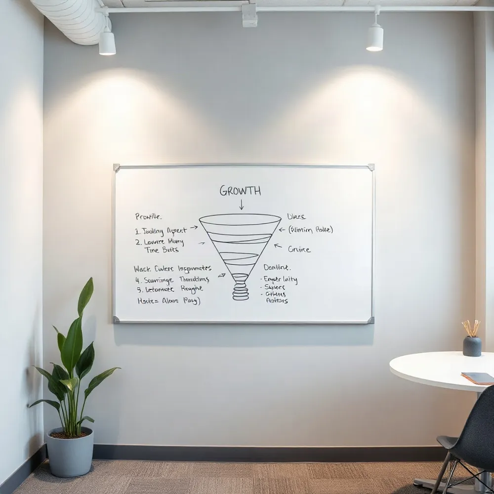
A clear, benefit-driven headline above the fold is non-negotiable. Most visitors decide whether to stay or leave within seconds, and a vague welcome message does nothing to earn their attention.
Compare “Marketing tools that help small businesses get more local customers” with a generic tagline like “We help businesses grow.” The first version answers who it serves and what outcome they get; the second forces the visitor to guess. Your hero section must deliver four things at once: a headline focused on value, a subheadline that names a specific pain point, a primary call-to-action, and a supporting visual. Optional trust badges or testimonials layered in can tip the balance for undecided readers.
Relevance beats volume when selecting keywords for that headline. A term closely aligned with audience intent drives more qualified traffic than a broader phrase simply because it matches what the searcher actually needs. Digital Consulting Pros applies this same principle when building homepages for clients, ensuring that the hero section’s messaging reflects both search intent and buyer psychology so that every visitor who lands on the page already sees themselves as a fit.
One Goal, One CTA, Clear Direction
A homepage that tries to do everything ends up doing nothing. The most effective homepages commit to one primary objective per page, then focus every element toward that single goal. This clarity guides the visitor toward a meaningful action rather than overwhelming them with choices.
Your primary call-to-action (CTA) should be placed prominently above the fold, where visitors first land. When users have enough context after scanning your value proposition, repeat the CTA again later in the page — for example, after a block of social proof or testimonials. This contextual repetition captures visitors who need more reassurance before committing.
Specific CTAs. “Book a Consultation” or “Start Your Free Trial” tell the visitor exactly what will happen next. These strong labels set clear expectations and reduce hesitation at the decision point.Vague CTAs. “Learn More” leaves too much uncertainty. Visitors may wonder what they will learn and whether it’s worth their time, leading to lower click-through rates and lost conversions.
The impact of a focused CTA strategy is substantial. One study found that CTAs on landing pages can increase conversion rates by 80%. For business owners managing paid ad spend, this lift translates directly into more qualified leads from existing traffic.
Social Proof: The Shortcut to Trust
Trust signals do more than reassure visitors — they actively drive conversions. Placing them near calls-to-action or signup forms, and especially above the fold, gives hesitant prospects the confidence they need to take the next step.
A concrete case in point: RubberStamps.net increased revenue per visitor by 33.20% simply by enlarging review star sizes on product pages. That is a reminder that even small visual changes to trust elements can produce meaningful revenue lift.
Digital Consulting Pros applies this principle directly. One client saw website enquiries jump 41% within four months of a multi-channel campaign that prominently featured testimonials and case study stats across Google, LinkedIn, and retargeting ads. Another client booked 17 qualified B2B appointments in just eight weeks after DCP built a social‑proof‑rich outreach sequence.
- Client logos and recognizable brand badges build instant authority.
- Written testimonials with full names and photos feel authentic.
- Case study stats (“41% more enquiries”, “17 appointments in 8 weeks”) give numbers credibility.
- Trust badges such as security icons reduce friction at checkout or signup.
Speed, Mobile, and the Non-Negotiable UX Basics
A fast-loading homepage isn’t a nice-to-have — it’s a conversion prerequisite. Research shows that even a one-second delay in mobile load time can decrease conversions by up to 20%. Since over 70% of web traffic is now mobile, and Google uses mobile-first indexing, speed and mobile usability are directly tied to both user trust and search visibility.
Mobile design requires specific choices: stack content vertically, use large tappable buttons, avoid hover-dependent interactions, and place sticky CTAs so the next action is always within reach. Common culprits that slow pages down include multiple chat tools, social-media embeds, and unoptimized images.
The fixes are straightforward: compress images using modern formats like WebP, serve assets through a CDN, minify CSS and JavaScript files, and enable browser caching. Digital Consulting Pros applies these optimizations as part of its website design process, making sure that speed supports every other conversion element rather than undermining it.
Visual Hierarchy That Guides the Eye
A homepage’s layout dictates where a visitor looks first, second, and not at all. Visual hierarchy uses size, color, contrast, and spacing to create a clear reading order: large headlines grab awareness, bold buttons signal action, and generous white space around those elements prevents distraction. Without this structure, visitors experience cognitive load — the mental effort required to process a cluttered page — which often leads to abandonment.
Use the AIDA Framework to Sequence Content
The AIDA framework (Awareness, Interest, Desire, Action) provides a proven sequence for arranging content from top to bottom. The hero section builds awareness with a benefit-driven headline. Supporting copy and visuals create interest. Social proof or outcome-focused details build desire. And a prominent call-to-action (CTA) captures the final action step. Applying this flow ensures that each visual element serves one role in moving visitors toward conversion.
Directional Cues and Contrast Pull Attention
Directional cues — such as a model’s gaze pointing toward a CTA or an arrow subtly indicating where to click — further guide the eye without relying on heavy text. High-contrast button colors (e.g., orange on a dark background) make CTAs visually distinct from surrounding elements. The effect can be dramatic: Underwater Audio improved its homepage visual hierarchy and saw online sales increase by 35.6%.
Navigation That Supports, Not Distracts
A homepage’s navigation should help visitors find what they need quickly, not overwhelm them with options. Effective website navigation keeps the menu tight — no more than 5-6 top-level items with clear, jargon-free labels. Each item should describe a category visitors actually use (“Services,” “About Us,” “Contact”), not internal terms like “Solutions Ecosystem.”
Place your primary call-to-action in the top-right corner of the menu so it’s always visible as visitors scroll. This sticky placement keeps the next step accessible without cluttering the page with extra navigation links.
For deeper content like service pages or case studies, breadcrumbs help both users and search engines understand site structure. They show the path back to the homepage and make it easy to explore related sections without getting lost.
Internal linking from the homepage to top service pages using descriptive anchor text also builds topical authority. For example, linking “B2B lead generation” instead of “click here” tells search engines and visitors exactly what they’ll find. Digital Consulting Pros uses this approach to connect its homepage to dedicated service pages for SEO, Google Ads, and AI-driven lead generation tools such as the DCP Lead Generator™.
| Element | Best Practice | Why It Matters |
|---|---|---|
| Menu size | ≤6 top-level items | ≤Reduces cognitive load; improves scanability |
| CTA placement | ↗️ Top-right corner | ↑Always visible; increases click-through rates |
| Labels | →Clear nouns (e.g., Services) | ⬆Visitors find what they expect; lowers bounce rate |
| Breadcrumbs | 🍽️ Yes on deep pages | ↑User orientation + crawl efficiency |
| Anchor text | 📝 Descriptive phrase (e.g., B2B lead gen) | ↑ Search ranking + click context |
Reduce Friction at Every Step
Conversion friction is anything that slows or stops your visitors from completing a desired action. Common friction points include overly long forms, unclear messaging, and too many competing links on your pages.
Minimize your form fields by asking only for essential information — typically name and email. A short form feels quick and safe, while a long form without clear justification can deter visitors.
Clarify next steps with micro-copy near your CTAs: ‘No credit card required’, ‘Cancel anytime’, or ‘We’ll never share your email’. These small reassurances address objections before they arise, reducing hesitation at the moment of decision.
SEO and the Conversion-First Homepage
SEO should influence the architecture of your homepage before visual design begins. This means structuring content with a clear heading hierarchy (H1, H2s, H3s) that is both crawlable for search engines and scannable for visitors. Pages that are easy to navigate and have logical content flow rank better and convert more effectively.
Title tags should be kept under 60 characters with the primary keyword placed near the beginning. Meta descriptions should be 150–160 characters long and include a call to action to encourage click-throughs from search results. These on-page elements are what convince a searcher to visit your site in the first place.
Structured data (schema markup) helps search engines and AI systems understand who you serve, what services you offer, and how you help. For example, marking up reviews, business details, and service areas can make your homepage eligible for rich results in search. Internal linking from the homepage also passes authority to your priority service pages, helping them rank faster.
Test, Measure, Improve Continuously
Conversion optimization is not a one-time task — it requires continuous testing and measurement. The most effective approach to A/B testing is to test one meaningful change at a time, such as CTA copy, button placement, or headline wording, using sufficient traffic and a clear hypothesis.
Prioritize high-traffic, high-intent pages first — typically service pages — then move to blog posts with strong organic reach. Before testing, define your conversion goals (e.g., form submissions or booked calls), set baseline conversion rates, and establish clear targets so you can measure the impact of each change.
Tools like Google Analytics 4 provide aggregate metrics, while heatmaps and session recordings from Hotjar or Microsoft Clarity reveal exactly where users hesitate or drop off. Form analytics can identify fields that cause abandonment. Combine these tools to diagnose friction points before running tests.
A real-world example shows the power of this cycle: a mid-size consulting firm revised its homepage with clearer client-first messaging, moved CTAs above the fold, added testimonials and logos, and compressed media to speed up load times. The result was a 37% drop in bounce rate and a 4.3x increase in leads within two months.
Common Mistakes That Kill Homepage Conversions
Visitors decide in seconds whether to stay or leave. A study from the Nielsen Norman Group found that users often leave a webpage within 10 to 20 seconds, so the content above the fold must immediately communicate your value proposition. If your headline and hero image don’t align with the searcher’s intent, you lose the sale before the scroll. Digital Consulting Pros specializes in building homepages that hook attention quickly. Our design process prioritizes clear, benefit-driven headlines and a single, prominent call-to-action above the fold. We help you avoid the common mistake of burying your core message under generic copy. Instead, we craft a focused funnel that guides each visitor toward one desired action, whether that’s requesting a quote, or downloading a lead magnet.
Your homepage has roughly five seconds to make an impression. According to a study highlighted by Ritger Digital, you need to win those seconds with a clear, concise headline and a visual that reinforces your unique selling proposition. We take this principle further. Digital Consulting Pros builds that foundation by staging your strongest asset first, whether it’s a compelling statistic, a customer testimonial, or a product demo. Competitors often stuff the top of the page with generic hero sliders and vague taglines. We flip that, placing your most persuasive element front and center.
Beyond the Fold: Guiding the Scroll
The fold is a myth in the sense that users will scroll, but only if you give them a reason. The best homepages use the ‘F-shaped’ pattern, guiding the eye from the headline to the value prop, then to social proof, and finally to the CTA. A well-structured homepage mirror this journey. It answers three questions in order: What do you offer? How will it benefit me? What do I do next? The 11 Ways to Instantly Increase Conversions guide supports this logic, emphasizing the need for a clear value proposition and a single call-to-action. We ensure your entire scroll path is conversion-focused. Each section builds trust and momentum, leading the visitor to click and convert.
However, many homepages fail because they ask the user to make a decision before providing enough reassurance. They place the signup form right at the top, demanding personal information before earning trust. Instead, we recommend a progressive approach. Use your homepage to answer objections, showcase case studies, and highlight customer logos. Then, present your offer. This is a core principle in our website design process, where we map out the conversion funnel before a single pixel is placed. By the time a visitor reaches your CTA, they’ve already been sold on the value.
The Role of Clarity and Design in Conversion
Clarity comes before conversion. A messy, cluttered homepage is the ultimate turn-off. A study from AmericanEagle.com highlights that best practices for conversion include simple design, clear navigation, and prominent CTAs. We agree. We replace complex layouts with simple, high-converting web design. Our focus is on minimal visual noise and maximum persuasion. We use white space strategically to draw the eye to your key message and CTA. Competitors sometimes load their homepages with every possible feature, creating a confusing experience. We strip away the clutter, focusing on a single goal.
This commitment to clarity extends to your website copy. We help you write copy that speaks directly to your target buyer’s pain points and aspirations. Instead of buzzwords like ‘synergy’ or ‘best-in-class,’ we use concrete, outcome-driven language. We need to answer the question in the visitor’s mind: ‘What’s in it for me?’ This is where high-converting website design comes into play. It’s not just about looking good; it’s about designing a tool that guides the user toward a specific action. We build pages that are both visually appealing and engineered to convert, ensuring your homepage is not a digital brochure but a lead-generation machine.
| Aspect | Impact on Conversion | Best Practice |
|---|---|---|
| Headline | High | Communicate value proposition clearly |
| Above the Fold | High | Place key elements in first 10 seconds |
| Visual Design | Medium | Use clean, uncluttered layouts |
| Clear CTA | High | Single, contrasting action button |
| Social Proof | Medium | Showcase testimonials and case studies |
Real Results: Data-Backed Wins From Smart Design
Numbers speak louder than claims. Several businesses have seen measurable gains by applying the principles outlined in this article, proving that conversion-focused design delivers real ROI.
Choose Your Gift (CYG), an employee gift-pricing program, saw a 47% increase in online transactions and a 97% revenue increase year-over-year after a website redesign that enhanced navigation and branding. General American (LGA), a life insurance company, improved its sales conversion rate by 27% year-over-year after launching a customer-focused content and analytics platform. These results show that even established companies can unlock significant growth with deliberate design changes.
Smaller changes deliver outsized returns too. Ideal of Sweden increased clicks on its add-to-cart button by 5.6% simply by adding a countdown banner — a low-effort urgency trigger. A mid-size consulting firm with a slow, unclear homepage cut its bounce rate by 37%, improved mobile load time from 5.8 to 2.1 seconds, and generated 4.3 times more leads within two months after rewriting its headline, moving CTAs above the fold, and adding social proof.
Digital Consulting Pros applies this same data-driven methodology for its clients. One client reported a 41% increase in website enquiries within four months through multi-channel visibility across LinkedIn, Google, Facebook, and retargeting ads combined with warmer sales conversations. Another client achieved a 58% positive response rate one month into a LinkedIn outreach campaign managed by the agency’s team.
From Homepage to Revenue Engine
When a visitor lands on your homepage, you have only a handful of seconds to capture their attention and guide them toward action. That’s why every element, from the headline to the call-to-action button, must be deliberately designed to move the visitor closer to conversion. A conversion-focused homepage is not about creative flair alone; it’s a strategic asset that directly impacts your bottom line.
In practical terms, this means your homepage should instantly communicate what you offer, who it’s for, and what you want the visitor to do next. This might sound simple, but too many business homepages lead with vague taglines, generic hero images, and navigation that’s optimized for the company internally rather than for the customer. Converting visitors into customers requires a clear hierarchy, compelling copy, and a prominent, unmissable call to action.
Core Conversion Principles
Clear Value Proposition. Within seconds, a visitor should know exactly what you do and why they should stay. Your headline and subheadline should speak directly to their pain points and desired outcomes. For example, instead of a generic tagline, use specific language like ‘We Design Homepages That Triple Your Consultation Bookings.’Strategic Call to Action. Every page should have one primary goal, and your call-to-action button should reflect that. Whether it’s ‘Get a Free Quote’ or ‘Book a Consultation,’ the action should be specific, urgent, and impossible to miss. Above-the-fold placement is almost always best, but make sure it’s repeated strategically throughout the page for visitors who need more time.Social Proof and Trust. Visitors are inherently skeptical. They’re looking for evidence that you can deliver on your promises. That’s where social proof comes in. Customer testimonials, client logos, case studies, and trust badges (like security certifications or industry accreditations) serve as that evidence. They signal that others have taken the risk and been rewarded, reducing the perceived risk for new visitors.Minimal Friction. Every extra field in a form, every extra click to find information, and every slow-loading page is a chance for a visitor to leave. A conversion-focused homepage streamlines the journey. That means short, clear forms; fast loading times; and a layout that doesn’t demand users scroll endlessly to find what they need.
Design and Copy Elements That Convert
Design and copy are not separate disciplines; they work together to guide your visitor from curiosity to conversion. Take a look at the practices from Website Homepage Best Practices, which emphasize the importance of readability, visual hierarchy, and a mobile-first approach. A homepage that is difficult to read, slow to load, or impossible to navigate on a smartphone will kill conversions faster than almost any other offense.
Similarly, your copywriting should focus on the benefits, not just the features. Instead of saying ‘We have 20 years of experience,’ say ‘We’ve spent 20 years helping businesses like yours save thousands in ad spend.’ The best copy uses concrete numbers, addresses objections, and, most importantly, compels visitors to take that desired action. For a deeper dive into structuring your message, consider the funnel-focused approaches outlined in the conversion-focused web design guide.
Turning Your Homepage into a Lead-Generation Engine
Ultimately, your homepage should do more than just look pretty; it should actively generate leads and supplement your wider marketing efforts. This means integrating clear calls-to-action not just in the hero section but also in your footer, in the sidebar, and even as sticky elements on mobile. And if your homepage’s primary role is to capture leads, make sure that’s the singular focus of every key element on the page.
For instance, you might use pop-ups or slide-ins to offer a lead magnet, like a free checklist or a case study, in exchange for an email address. Or you might use a chatbot to qualify visitors in real time. A results-focused approach often aligns closely with methods like homepage SEO, ensuring that the visitors who arrive are already looking for a solution you provide. These tactics work together to turn your homepage from a digital brochure into a core business channel that consistently drives qualified opportunities and revenue.

Freelance Web Designer or Web Design Agency in Malta?
A practical guide for Malta businesses comparing a freelance web designer with a web design agency across skills, process, continuity, testing, ownership and support.
Website Redesign SEO Checklist for Malta Businesses
A practical SEO checklist for Malta businesses redesigning an existing website, covering URL mapping, redirects, indexability, content, analytics and post-launch monitoring.

Stop Losing Prospects: Designing Websites That Convert Traffic
Stop Chasing Traffic, Start Chasing Results
Traffic is easy to inflate, and most agencies sell it that way. More visits sound great in a monthly report, but if those visits don’t become leads, quotes, or sales, you’re paying for noise. Conversion rate is the sharper number to watch: it tells you whether your traffic is the right traffic, and whether your site gives visitors a reason to act.
A conversion-first mindset changes where your budget goes. Instead of pouring more into ads that bring unqualified clicks, you refine the pages those clicks land on: clearer headlines, stronger calls to action, faster load times, and mobile layouts that remove friction. The result is a direct lift in revenue per visit, not just a bump in the raw count.
Tracking. Set up a proper analytics setup (like GA4) so you can see where visitors drop off, not just where they start. Monitor conversion events, not vanity metrics like bounce rate alone. This gives you a measurable baseline to improve.Testing. A/B testing lets you compare versions of a headline, button, or form side by side. Even small changes, when tested systematically, can compound into sizable conversion gains. This approach keeps your decisions data-driven, not guess-based.Optimizing. Once you know what converts, double down on those elements. Remove distractions, tighten your copy, and simplify forms. Digital Consulting Pros applies this same cycle, using both a decade of hands-on experience and AI-driven tools like the DCP Lead Generator™, to help businesses turn the traffic they already have into qualified leads.
Conversion-focused website design, whether you choose a specialist agency or handle it in-house, always starts with the same question: what action should a visitor take on each page? The best-performing sites answer that clearly, with a single focused goal and no competing options. For most businesses, that action is a lead capture or a purchase. Keep the path short and the value obvious.
- Define the one conversion goal per page (e.g., form fill, phone call, checkout).
- Write a headline that states the benefit immediately, not a vague tagline.
- Place your primary call-to-action above the fold and repeat it after scrolling.
- Remove navigation links that distract from the main goal on landing pages.
- Speed up page load time — slower pages lose visitors before they convert.
Diagnose the Real Problem: Traffic or Conversion?

Before you spend another dollar on ads or redesign your homepage, ask yourself one question: is your problem a traffic problem or a conversion problem? Too many businesses pour budget into driving more visitors when their existing visitors already bounce. The faster you identify which stage of the funnel is leaking, the faster you can fix the source of the loss instead of treating the symptom.
A common pattern is high traffic paired with low engagement. Maybe your blog gets thousands of views, but your contact form stays empty. That points to a conversion issue, not a visibility issue. On the other hand, if your pages barely attract any visitors at all, you likely have a traffic problem that needs SEO, content, or advertising attention. To tell the difference, look at behaviour metrics such as bounce rate, time on page, and form submissions. For example, a site that consistently sees visitors leave within seconds likely has a design or messaging mismatch, not a lack of reach.
Here are a few signs that can help you separate the two problems:
- Traffic problem: low page views, poor search rankings, little social engagement, and minimal ad clicks.
- Conversion problem: decent traffic but high bounce rate, low click-through on calls-to-action, abandoned forms, and weak sales follow-through.
Once you’ve identified the bottleneck, the fix becomes more targeted. If it’s traffic, focus on search engine optimisation, content marketing, and paid campaigns. If it’s conversion, shift attention to design, copywriting, and trust signals. Conversion rate optimisation best practices offer a practical starting point, but they only help if you’ve correctly diagnosed the issue first.
Clarify Your Message and Value Proposition
Most businesses assume their growth problem is a traffic problem. They pour more money into ads, chase viral content, and obsess over page views, only to watch the sales pipeline stay flat. The real bottleneck is often conversion: the mechanics of turning the visits you already have into qualified leads and paying customers. Before you spend another dollar on reach, it pays to isolate where the leak actually is.
Start by separating the two metrics. Traffic is the volume of people landing on your site. Conversion is the percentage of those people who take the action you want, whether that is a form fill, a demo booking, or a purchase. A site pulling in 10,000 visitors a month with a 1% conversion rate generates 100 leads. Doubling traffic to 20,000 with the same rate gives you 200. But lifting the conversion rate to 2% at the original 10,000 visitors also gives you 200 leads, without the extra ad spend. Conversion improvements compound the value of every visit you already pay for.
Why high traffic with low conversion is a red flag
When visitor numbers climb but conversions stay flat, it usually points to a site experience issue rather than a visibility issue. Common culprits include cluttered layouts, unclear calls to action, slow load times, and forms that ask for too much information too early. Each of these creates friction, and friction quietly kills the intent that your traffic brought in. Focusing on conversion-focused web design principles helps you identify and remove those barriers so the visitors you already attract actually move forward.
Another frequent cause is a mismatch between your advertising message and the landing page it sends people to. If your ad promises a free guide or a quick quote and the page delivers a dense sales pitch, people bounce. Aligning the copy, visuals, and offer across the full path from click to conversion is a core part of conversion rate optimization, and it is often where the quickest wins hide.
How to measure the real problem
A simple diagnostic separates the two issues. Track your current conversion rate, then look at the source of your traffic. If organic search, paid ads, and social all convert at similar low rates, the problem is likely on-page. If one channel converts far worse than the others, the issue may be message-to-page mismatch or audience targeting. A few questions will sharpen the picture: Is the primary call to action visible without scrolling? Does the value proposition appear in the first few seconds? Is the form short enough to feel painless?
Once you know the gap, the fix is usually tactical. Simplify the headline to state the benefit plainly, make the call to action action-oriented, and remove distracting navigation from landing pages. Running A/B tests on these elements often reveals meaningful lifts without any increase in traffic spend. For businesses that want a structured approach, Digital Consulting Pros pairs this kind of conversion audit with their AI-driven lead generation tools, including the proprietary DCP Lead Generator™, to automate the follow-up and nurturing that turns those better-converting visitors into actual sales.
Traffic vs. conversion at a glance
| Focus | What it measures | Typical fix |
|---|---|---|
| Traffic | Volume of visitors | SEO, ads, content reach |
| Conversion | % taking desired action | Design, copy, form length |
| ROI impact | Leads per dollar spent | Align message and page |
Align Content with User Search Intent
Most business owners chase one metric: traffic. They pour budget into ads and content hoping more visitors automatically means more sales. But a high visit count with a low conversion rate is just expensive vanity. The real problem isn’t visibility; it’s what happens after a visitor lands on your site. Your pages may be pulling people in, but if they don’t guide those visitors toward a clear action, the traffic is wasted. Identifying where you lose potential customers is the first step to turning clicks into revenue.
Conversion rate optimization (CRO) addresses this gap directly. Instead of chasing more traffic, you improve the experience you already have. Small tweaks such as clearer headlines, stronger calls-to-action, and faster load times can lift conversions significantly. As VWO’s guide on conversion rate optimization explains, focusing on user behavior and testing changes is more effective than simply buying more visits. This shift in mindset separates growth-focused businesses from those stuck in a traffic-only cycle.
The Alignment Gap
A common hidden culprit is misalignment between your content and the searcher’s intent. If you rank for a broad keyword like “digital marketing” but offer a B2B service, you’ll attract visitors who aren’t ready to buy. Instead, target transactional or commercial-intent terms that match what you sell. When your page content directly answers the query and presents a clear next step, conversion rates climb. Digital Consulting Pros specializes in aligning your website and campaigns with the exact stages of the B2B funnel, so you attract qualified prospects rather than casual browsers.
Too many agencies sell traffic without addressing the conversion side. They’ll boost your rankings, but if your site doesn’t convert, the ROI never materializes. Digital Consulting Pros takes a different approach: we combine SEO and paid campaigns with conversion-focused design and lead-generation tools. That means every dollar of ad spend works harder, and you don’t need endless new visitors to see growth.
Signs Your Site Underperforms
- High bounce rate on key landing pages, especially those receiving paid traffic.
- Traffic increases month over month, but leads or sales stay flat.
- Visitors leave without taking any action, such as filling out a form or making a call.
- You lack a clear, single call-to-action on each page.
If any of these sound familiar, the problem isn’t your traffic volume; it’s your conversion path. Addressing these issues often delivers faster, more cost-effective results than doubling your ad budget.
Build Trust to Boost Visitor Confidence
Traffic alone never paid the bills. What actually moves revenue is the visitor’s belief that your site is worth their time, their email address, and eventually their budget. That belief is built from trust signals: the visible cues that tell a first-time visitor your business is real, reliable, and ready to serve them. When those cues are missing, even the best traffic sources stall at the point of conversion.
For business owners and marketing managers, the payoff of getting this right is concrete. Per a 2024 CXL study, trust-building elements like customer logos, testimonials, and clear value propositions can lift conversion rates by as much as 33%. Yet many sites bury these elements below the fold or dilute them with generic stock imagery. Digital Consulting Pros, a full-service digital marketing agency based in Malta, specialises in rebuilding those trust moments into measurable ROI for small to medium-size enterprises and B2B firms. Their decade of hands-on experience shows that when trust signals are placed where buyers actually look, the same traffic converts into qualified sales opportunities.
The Trust Signals That Move the Needle
Social Proof. Testimonials, case studies, and client logos work because they shift the risk from the buyer to someone who already took it. Place a rotating testimonial near your primary call-to-action, and pair it with a named client outcome rather than a vague “loved working with them.”Transparent Contact. A real phone number, a physical address, and a professional email remove the anonymity that makes visitors hesitate.Digital Consulting Pros builds contact pages that make reaching a human effortless, which directly reduces the friction that kills conversions.Clear Value Proposition. If a visitor cannot tell what you do and for whom within five seconds, they leave. A crisp, benefit-led headline backed by a subheadline that names your target audience is the fastest trust builder on the page.Security Badges. SSL certificates, payment icons, and privacy statements signal that you protect customer data. For ecommerce and lead-capture forms, these badges are non-negotiable.Authority Cues. Press mentions, industry certifications, and published research position you as a credible operator, not a fly-by-night.Digital Consulting Pros leverages its own AI-driven lead generation tools and training programs to demonstrate expertise, not just claim it.
Where Competitors Fall Short
Many agencies talk about conversion rate optimization (CRO) in abstract terms, offering a checklist of “best practices” like faster load times and clearer buttons. Practitioners like VWO provide solid foundational guidance, but their advice often stops at generic principles, leaving business owners to figure out how to apply them to their own industry and buyer persona.Digital Consulting Pros takes a different route: they diagnose your specific funnel, map trust signals to each stage of your buyer’s journey, and then test, measure, and refine until the numbers move. Their proprietary DCP Lead Generator™ automates prospecting and nurturing, ensuring that the trust you build converts into a steady pipeline, not just a one-off sale.
Another gap: many so-called CRO guides are written for ecommerce giants with large traffic volumes and dedicated testing teams. Small and medium-size businesses rarely have that luxury. Digital Consulting Pros focuses on high-impact, low-complexity changes that fit your budget, from redesigning a single landing page to restructuring your entire information architecture. Their conversion-focused web design approach, refined over a decade, turns visitor hesitation into confident action without requiring a full engineering team.
A Practical Checklist for Immediate Wins
- Audit your homepage: does your headline state your unique value proposition within five seconds?
- Move at least one strong testimonial above the fold on your highest-traffic page.
- Add a phone number and physical address to your site’s header or footer on every page.
- Place trust badges (SSL, payment icons, privacy policy) directly beside your lead capture form.
- Test one change at a time, measure the conversion rate, and keep what works.
| Trust Signal | Where to Place | Why It Works |
|---|---|---|
| Testimonial | Near CTA | Shifts risk to past buyers |
| Phone number | Header/footer | Removes anonymity |
| Value prop | Above fold | Clarifies your offer fast |
| Security badge | On forms | Protects data perception |
| Client logos | Below hero | Demonstrates real clients |
Remove Friction with a Clear Call to Action
Before you pour more money into ads or redesign your homepage, take a step back. Most businesses assume low conversion rates mean bad traffic. In practice, the issue often sits deeper: a confusing information architecture, a slow page, or a value proposition that never explains why a visitor should act. The fastest path to results starts with diagnosing the actual bottleneck rather than guessing.
A practical first step is reviewing your analytics for drop-off points. Look for pages with high exit rates, especially on product or service pages where you expect action. If visitors leave without engaging, the problem is likely on-page, not in your ad copy. This kind of audit is exactly where a conversion-focused web design review pays off, as small layout or messaging tweaks often shift outcomes more than traffic volume ever could.
What Stalls Your Funnel Right Now
- Weak calls to action that blend into the page design
- Missing trust signals, like testimonials or clear guarantees
- Forms that ask for too much information upfront
- Slow loading times that push visitors away before they see your offer
Competitors often rely on generic tactics like more sidebar pop-ups or louder buttons. Digital Consulting Pros flips the approach: we study where each visitor hesitates, then rebuild the page around a single, clear action. Instead of adding friction, we remove it, which is why our clients see leads convert from the same traffic they already have.
Turning Diagnosis Into Action
Once you know the weak spot, the fix becomes measurable. Improve the headline, simplify the form, or move the call to action above the fold. Track the change over a week or two, not a single day. Continuous testing beats one-off overhauls, and a steady cycle of small wins compounds into real revenue growth. If you need a structured starting point, tools like conversion rate optimization best practices offer a solid checklist, but the real value comes from applying them to your specific audience and offer.
Make Your Homepage Convert First-Time Visitors
A slow or confusing homepage does more than frustrate visitors. It quietly raises bounce rates, wastes your ad budget, and pushes potential customers toward competitors who answer their questions faster. Before you invest in a redesign, take a step back and identify what is actually costing you conversions.
Start by reviewing your analytics. High traffic with low engagement often points to a mismatch between your value proposition and what visitors see above the fold. If visitors leave within seconds, your headline or hero image may not speak to their needs. If they browse but never take action, the problem could be a weak call-to-action or excessive friction in your forms.
Look at Your Conversion Path
Map the journey from first click to completed lead. A common mistake is assuming every visitor lands on your homepage ready to buy. Many are in research mode, comparing options. Your job is to guide them naturally toward a next step, whether that is downloading a guide, requesting a demo, or getting a quote. Digital Consulting Pros designs pages that lead visitors through that path with clear, relevant prompts at each stage.
One effective way to diagnose friction is to review session recordings and heatmaps. These show where people click, scroll, and hesitate. If a high percentage of visitors abandon a form at a specific field, that is a signal to simplify. The same approach applies to page speed: a delay of even a couple of seconds can cut conversions noticeably, so run a quick performance test and fix anything that slows rendering.
Traffic quality. If visitors arrive from broad or mismatched ads, no homepage tweak will fix the leak. Audit your campaigns to ensure you are attracting people who fit your buyer persona.Message clarity. Your headline should state exactly what you offer and for whom within a few seconds. Avoid jargon and lead with the outcome your customer cares about.Trust signals. Testimonials, case studies, certifications, and familiar logos reduce anxiety. Place them near your primary call-to-action where doubt is most likely.
Once you have a clear diagnosis, you can prioritize the fixes that will have the biggest impact. Many businesses jump straight to a full redesign, but often a few targeted changes, a sharper headline, a stronger button, and a simpler form, are enough to lift conversions. Digital Consulting Pros applies this data-first approach to every website it builds, so you are not guessing at what works.
| Signal | Likely Cause | Recommended Fix |
|---|---|---|
| High traffic, low leads | Weak value proposition | Rewrite headline and hero copy |
| High bounce on landing pages | Slow speed or poor mobile layout | Compress images, simplify design |
| Abandoned forms | Too many fields or unclear CTAs | Reduce fields, add microcopy |
Embed CRO Best Practices into Your Web Design
Most business owners assume that more traffic means more sales. In practice, a steady stream of visitors who never act usually points to a breakdown somewhere between first impression and action. Before spending another dollar on ads, it pays to locate the leak. A quick audit of your funnel can reveal whether the issue sits at the top (traffic quality and messaging), the middle (lead capture and nurturing), or the bottom (offer, trust, and checkout friction).
The B2B marketing funnel offers a useful framework for this kind of diagnosis. You can track visitors from awareness through consideration to decision, and at each stage identify where they drop off. For example, high traffic with low engagement signals a relevance or design problem. High engagement with few leads points to a weak value proposition or a lead capture form that asks for too much. High lead volume with low sales often means the follow-up and nurturing process is missing a step.
Traffic vs. Conversion: Which Metric Matters More?
Traffic. Volume of visitors your site receives. It tells you how well your awareness efforts are working, but it says nothing about relevance. A thousand visitors who land on the wrong page won’t buy anything.Conversion. The percentage of visitors who take a desired action, such as filling out a form, booking a call, or making a purchase. This is the metric that ties your marketing spend to revenue. Improving conversion by even a few points can outperform a large traffic increase.
A common mistake is to celebrate a jump in page views while conversions stay flat. Yet conversion rate optimization (CRO) best practices show that small, targeted changes to your pages, such as clearer headlines, stronger calls to action, and faster load times, can have an outsized impact on results. For many small and medium businesses, fixing on-site conversion issues is the fastest path to a measurable ROI, and it often costs less than scaling up ad spend.
Three High-Impact Levers to Pull First
Message match. Your ad copy and landing page headline should speak the same language. If a visitor clicks a Facebook ad promising a free consultation and lands on a homepage about web design services, the mismatch kills trust. Align the message across every touchpoint.Lead capture. The form is where visitors decide whether to hand over their contact information. Reduce friction by asking for only the essential fields. Tools like the DCP Lead Generator™ automate follow-up and nurture, so a lead never goes cold while you’re busy elsewhere.Proof and urgency. Testimonials, case studies, and limited-time offers give hesitant visitors a reason to act now. When prospects see that others like them have achieved results, the risk of moving forward feels smaller.
While many agencies focus on driving traffic and little else, Digital Consulting Pros takes a results-driven approach that starts with diagnosing the real bottleneck. Rather than simply increasing ad spend, we run a detailed audit of your funnel, identify the conversion blockers, and then implement fixes across your website, lead capture, and follow-up systems. This data-backed methodology prioritizes measurable ROI, so every change is tied to a clear business outcome.
The goal isn’t to chase vanity metrics. It’s to build a system where every visitor who lands on your site has a clear, compelling reason to become a customer. When you fix the leaks in your funnel, the traffic you already have starts working harder, and the return on your marketing investment compounds.
| Funnel Stage | Common Symptom | Primary Fix |
|---|---|---|
| Top | High traffic, low time on site | Improve message match and ad targeting |
| Middle | High engagement, few leads | Simplify forms and strengthen value proposition |
| Bottom | High leads, low sales | Add proof, urgency, and follow-up automation |
Use Data and Analytics to Find Drop-Off Points
Before you touch a single campaign budget line, you need to know exactly where visitors are dropping off. Most businesses blame their ads, but the real problem is usually hiding in the page itself. A poor load time, a confusing layout, or a form that demands too much information can quietly kill conversion rates while your traffic numbers look healthy.
Conversion rate optimisation starts with measurement. Tools like Google Analytics and heatmapping platforms show you where users click, scroll, and abandon. The Conversion Rate Optimization: Complete Guide from Mouseflow breaks down how to read those signals, so you can pinpoint friction points instead of guessing. Armed with that data, you can make targeted changes that actually move the needle.
Common Conversion Killers to Fix First
Slow load times. Every second of delay costs you conversions. Compress images, leverage browser caching, and simplify your code. A faster page keeps visitors engaged and signals trust to both users and search engines.Weak or missing calls to action. If your visitors aren’t sure what to do next, they won’t do anything. A clear, action-oriented button like “Get a Free Quote” or “Book a Demo” removes ambiguity and guides them toward the next step.Cluttered layouts. Too many options paralyse decision-making. Strip away distractions, focus on one primary goal per page, and use whitespace to draw attention to your offer. Minimalism often outperforms elaborate design.Forms that ask too much. Every extra field is a reason to abandon. Ask only for what you truly need to qualify a lead. The less friction, the higher your completion rate.
For a deeper look at the design side, the Conversion Focused Web Design guide from VWO outlines specific layout and messaging principles that boost performance. Pairing those best practices with your analytics data gives you a systematic way to lift conversion rates without inflating ad spend.
Why You Need a Partner Who Measures
DIY optimisation can work, but it’s slow and easy to get wrong. Digital Consulting Pros brings a decade of hands-on experience to the table, combining AI-driven lead generation tools with a results-driven methodology that focuses on ROI. Where a generic approach might throw budget at more traffic, Digital Consulting Pros first diagnoses the real bottlenecks, then applies data-backed fixes that turn existing visitors into qualified leads. The result is measurable improvement in lead flow and revenue, not just vanity metrics.
| Problem | Typical Result | How Digital Consulting Pros Helps |
|---|---|---|
| High ad spend | Low return on investment | Tightens targeting and optimises landing pages for better ROI |
| Low conversion rate | Traffic but no sales | Rebuilds pages around clear CTAs and frictionless forms |
| Outdated web presence | Visitors leave quickly | Redesigns for speed, clarity, and mobile usability |
| No lead qualification | Poor sales follow-up | Uses AI lead scoring to prioritise high-value prospects |
Measure the Right KPIs for Real ROI
Every marketer knows the pain: traffic spikes, yet revenue stays flat. You pay for clicks, and visitors land on your site, but they leave without buying, calling, or filling out a form. The gap between traffic and revenue is where budgets get wasted, and it’s the exact problem Digital Consulting Pros solves for business owners who are tired of guessing what works.
Start With a Clear Definition of a Conversion
Before you can optimize anything, you need to know what a conversion means for your business. For an e-commerce store, it might be a completed purchase. For a B2B firm, it could be a booked demo or a submitted contact form. Digital Consulting Pros helps you define these micro-conversions that lead to revenue, so every click has a clear purpose and a measurable next step.
Without this clarity, you risk optimizing for vanity metrics like page views when you should be optimizing for qualified leads. Conversion-focused web design principles, such as clear calls-to-action and prominent value propositions, turn casual visitors into buyers read more about conversion best practices. The goal isn’t just more traffic; it’s more of the right traffic that moves through your funnel.
Audit Your Website’s Conversion Hurdles
A website that looks good but doesn’t convert is a liability. Start by auditing your landing pages for friction points: slow load times, confusing navigation, or forms that ask for too much information. Every extra field is a reason for a visitor to leave. Digital Consulting Pros performs these audits and implements fixes that reduce friction, ensuring your pages guide users toward action rather than away from it.
Information architecture plays a huge role here. If visitors can’t find what they need in three clicks, they’ll bounce. A well-structured site, with logical page hierarchies and clear pathways, directly impacts conversion rates explore IA strategies. Streamlining your site’s structure isn’t just about aesthetics; it’s about creating a flow that naturally leads to a sale.
Leverage Data to Make Smarter Ad Decisions
Instead of spreading your budget thin across every platform, focus on channels that deliver real ROI. Google ads might work for capturing high-intent searches, while LinkedIn is ideal for B2B outreach. Digital Consulting Pros runs targeted campaigns across Google, Meta, TikTok, and LinkedIn, using A/B testing and behavior-based insights to refine messaging. This data-driven approach ensures your ad spend goes toward audiences most likely to convert.
For B2B companies, combining paid ads with proactive lead generation amplifies results. Turning LinkedIn connections into high-value leads, for example, requires a strategy that goes beyond simple connection requests; it needs nurturing sequences and valuable content see how to convert LinkedIn connections. By pairing ad campaigns with these outbound tactics, you create multiple touchpoints that keep your brand top-of-mind until the buyer is ready.
Measure What Matters: KPIs That Reflect Revenue
Traffic and impressions are easy to report but hard to tie to profit. Shift your focus to metrics like cost per lead (CPL), conversion rate, and customer acquisition cost (CAC). These numbers reveal whether your marketing is generating actual business or just noise. Digital Consulting Pros tracks these KPIs for every campaign, providing clear weekly reports that show how each dollar performs.
| Metric | What It Measures | Why It Matters |
|---|---|---|
| Conversion Rate | Percentage of visitors who take a desired action | Tells you if your site and messaging are effective at turning traffic into leads |
| Cost Per Lead (CPL) | Average ad spend required to generate one lead | Helps you compare the efficiency of different channels and campaigns |
| Return on Ad Spend (ROAS) | Revenue generated for every euro spent on ads | Reveals the true profitability of your advertising efforts |
Choose the Right Channels to Maximize Budget
Budget is the first filter when you pick marketing channels, and it is also the one most businesses get wrong by defaulting to the platforms everyone else talks about. The practical approach is to rank channels by expected return per dollar, not by how visible they are. A channel that costs little but converts slowly can be just as damaging as one that is expensive and noisy.
Paid channels. Google, Meta, TikTok and LinkedIn ads give you speed and precise targeting, but they consume budget continuously and demand constant optimization to stay profitable. High ad spend with low conversion rates is a common failure pattern, which is why many businesses burn through monthly budgets before seeing a return.Organic channels. SEO, content marketing and social media management cost less per touch, but they compound slowly and require patience. For small to medium-size enterprises, a steady stream of foundational traffic often provides a more predictable baseline than ads alone.
The winning mix usually pairs a paid channel for immediate lead flow with an organic channel for long-term cost reduction. For example, running Facebook advertising alongside a focused SEO program lets you capture demand now while building equity that lowers your cost per lead over time. Digital Consulting Pros regularly builds this paired structure for clients, so budget is never locked into a single channel that stops working overnight.
Align Spend with the Buyer Journey
Different stages of the buyer journey demand different channels. Top-of-funnel tactics like content and social ads build awareness, while bottom-of-funnel tactics like retargeting and email capture ready-to-buy prospects. A practical way to think about it is through conversion rate optimization best practices: optimize each stage for the action you want, then allocate budget based on where the biggest leak exists.
| Channel | Best for | Budget profile |
|---|---|---|
| Google Ads | High-intent search | High, fast spend |
| Meta & TikTok | Awareness, retargeting | Moderate, flexible |
| Nurturing, reactivation | Low, high ROI | |
| SEO | Compounding organic traffic | Low, slow build |
| B2B appointment setting | High, precise |
Transparency on what each channel can deliver keeps expectations realistic. Digital Consulting Pros helps clients map every channel to a specific stage and a measurable outcome, so budget decisions follow the buyer journey instead of guessing. That results-driven methodology is what separates a tidy channel mix from a scattered one.
Continuously Test and Improve with CRO
Many businesses chase new visitors while ignoring the people already browsing their site. A 2026 Digital Consulting Pros analysis shows that focusing on conversion can produce more revenue from the same traffic volume. Before adding ad spend, fix the leaks in your current funnel.
Design for Action, Not Just Aesthetics
A beautiful homepage is useless if it doesn’t guide visitors to a clear next step. Conversion-focused web design principles emphasize visual hierarchy, contrast, and a single primary call-to-action per page. Digital Consulting Pros applies these principles to every layout, making sure your value proposition is visible without scrolling.
- Place your primary CTA above the fold and repeat it at the end of the page.
- Use directional cues like arrows or gaze-aligned imagery toward the offer.
- Remove navigation links that distract from the conversion goal.
- Test button color, size, and copy to find what your audience responds to.
Copy That Speaks to Pain, Not Features
Visitors decide in seconds whether to stay or leave. Your headline must address their immediate problem and your subheadline must promise a specific outcome. Copywriting techniques that work include using numbers, naming the target audience, and focusing on benefits rather than product specifications.
Reduce Friction to Increase Conversions
Every extra field in a form or extra step in a checkout is a reason for a visitor to abandon. Lead generation best practices show that pre-filled data and minimal fields can significantly lift conversion rates. Digital Consulting Pros builds streamlined forms that capture only the essential information, so you qualify leads without scaring them away.
Run Tests Instead of Guessing
Digital Consulting Pros uses A/B testing to validate every change, from headline variations to CTA placement. Conversion rate optimization best practices recommend testing one element at a time and letting each experiment run long enough to reach statistical significance. This data-driven approach turns opinions into decisions.
| Tactic | What to Do | Expected Impact |
|---|---|---|
| Page Load Speed | Compress images and enable caching | Fewer bounces, more page views |
| CTA Clarity | Use action verbs with urgency | Higher click-through rates |
| Form Length | Cut fields to name and email | More completed submissions |
| Mobile Layout | Stack content, enlarge buttons | Better tablet and phone conversions |
Website Traffic. Monitor visits, but don’t celebrate numbers alone. Digital Consulting Pros tracks engagement metrics like time on page and scroll depth to measure real interest.Lead Quality. A conversion isn’t valuable if the lead never buys. Our team scores leads by behavior and readiness, ensuring you focus on prospects most likely to close.Revenue Attribution. The ultimate metric is ROI. We connect conversions back to specific campaigns and pages, showing exactly which traffic sources deserve more budget.
Get More Value from Every Visitor
A familiar frustration: the analytics dashboard shows steady visitor numbers, yet the inbox stays quiet and the sales pipeline feels empty. The traffic is there, but little of it turns into qualified leads. When that gap persists, the usual reflex is to chase more traffic, often by pouring budget into ads or content promotion. That instinct can waste money if the real bottleneck sits elsewhere.
Conversion rate benchmarks make the point concrete. Across industries, the average website converts only about 2% to 5% of its visitors into actual leads or sales. That means 95% of the people who land on a page leave without taking the step you want them to take. The opportunity is not in attracting more visitors to ignore your site; it is in improving what happens to the visitors you already have.
The Funnel Leak: Where Traffic Falls Away
Think of the buyer journey as a funnel with several stages: awareness, interest, decision, and action. Traffic enters at the top, but each step introduces friction that can push people out. A visitor might arrive from a Google search, read a headline, glance at the hero section, and bounce within seconds if the value proposition is unclear. Another might scroll further, but leave when the page loads slowly or the forms ask for too much information.
The most common culprits create predictable drops. A weak or vague value proposition fails to tell visitors what you offer and why it matters. Slow page speed tests patience and hurts both user experience and search rankings. Complicated navigation makes it hard to find the product, service, or answer someone came for. And a generic call-to-action gives no clear next step, so even interested visitors hesitate.
Digital Consulting Pros builds conversion-focused websites and runs targeted ad campaigns across Google, Meta, TikTok, and more, so the same visitor who arrives from an ad or a search result is guided toward a clear action. Instead of simply driving more traffic to an underperforming page, they diagnose the specific friction points and fix them.
Six Conversion Killers Hiding on Your Site
- Vague value proposition. If a visitor cannot tell within five seconds what you do and why it matters, they leave. A crisp headline and a concise subheadline that state the outcome you deliver make the difference.
- Slow page speed. Every extra second of load time increases bounce rates and reduces conversions. Compress images, minify code, and use a content delivery network to keep pages quick.
- Confusing or cluttered navigation. When visitors cannot find the page they want, they abandon the search. A simple, logical menu structure with clear labels keeps people moving toward a conversion.
- Overcomplicated forms. Long forms with unnecessary fields create friction. Ask only for the essential information, and every additional field you remove lifts completion rates.
- Weak or invisible call-to-action. A vague button like “Submit” or a CTA buried below the fold gives people no push. Use action-oriented text, place the button prominently, and make it stand out visually.
- Lack of trust signals. Visitors hesitate to share contact details without cues that you are credible. Testimonials, client logos, case studies, and security badges reduce that hesitation.
Audit your site against that list, and you will likely pinpoint why traffic fails to convert. Start with the fastest wins, such as rewriting the headline and the primary call-to-action, then move on to the technical fixes like page speed and form length. This approach focuses your effort on the pages and elements that have the most direct impact on revenue.
Attracting Qualified Visitors Who Convert
Fix the on-page friction first, then think about the quality of the traffic itself. Not all visitors are equal. A high volume of broad, unqualified traffic can look impressive in analytics but deliver few leads because most of those people do not need what you sell. The goal is not just more visitors; it is more visitors who are genuinely in the market for your product or service.
Targeted advertising plays a central role here. Instead of casting a wide net, you can define your audience by demographics, interests, and search intent, and reach the people most likely to become customers. Digital Consulting Pros runs targeted ad campaigns across Google, Meta (Facebook and Instagram), TikTok, and LinkedIn, so your budget reaches prospects who are actively looking for a solution rather than random browsers. That combination of relevant traffic and a conversion-ready website is what turns clicks into customers.
The Cost of Ignoring Conversion Rate Optimization
Poor conversion performance carries a concrete financial penalty. To illustrate, imagine a site generating 10,000 visitors per month with a 2% conversion rate. That produces 200 leads. If the average customer value is $1,000, those 200 leads represent $200,000 in potential revenue each month. Now hold traffic at 10,000 visitors but lift the conversion rate to 4%. The same traffic now produces 400 leads, or $400,000. Doubling the conversion rate doubles the revenue without spending a single extra dollar on ads.
In other words, conversion rate optimization is often the highest-return marketing activity available. It compounds the value of every visitor you already pay to attract, whether through ads, SEO, or social media. A modest improvement from, say, 1.5% to 3% can have a larger financial impact than a substantial increase in traffic.
Measure, Test, and Improve Continuously
Conversion improvement is not a one-time fix; it is an ongoing cycle of measurement, hypothesis, testing, and refinement. Set up analytics to track the metrics that matter, such as conversion rate, bounce rate, and the performance of individual landing pages. Then use A/B testing to try one headline against another, one button color against another, or one page layout against another. Even small differences can add up over time.
Digital Consulting Pros brings a decade of experience running this process for small and medium-size businesses, with a results-driven methodology that emphasizes return on investment. They also offer consulting, lecturing, and training to help in-house teams understand and apply these tactics themselves. Whether you need help with a single landing page or the full funnel, the goal stays the same: turn the traffic you already have into qualified leads and paying customers.
| Conversion Killer | Typical Result | How to Fix It |
|---|---|---|
| Vague value proposition | Visitors bounce quickly | State your core outcome in the headline |
| Slow page speed | Higher bounce rate, lower ranking | Compress images, minify code, use a CDN |
| Confusing navigation | Visitors can’t find the page they need | Simplify menus, use clear labels |
| Overcomplicated forms | Visitors abandon before submitting | Remove unnecessary fields |
| Weak call-to-action | No clear next step, lost conversions | Use action-oriented text and place it visibly |
| Lack of trust signals | Visitors hesitate to share details | Add testimonials, logos, and security badges |
If you recognize these patterns on your own website, that is good news: it means the problem is fixable. Traffic alone does not build a business; conversions do. By addressing the friction points that stop visitors from becoming leads, you can turn the traffic you already have into a steady source of revenue. For help diagnosing the specific issues on your site and implementing the fixes, consult Digital Consulting Pros to boost your conversion ROI.

Ecommerce Website Design Malta: A Pre-Launch Checklist
A practical ecommerce website design checklist for Malta businesses covering catalogue structure, mobile checkout, payments, delivery, SEO and launch testing.

Website Design Costs in Malta: What Should Your Quote Include?
Compare website design quotes in Malta with a practical checklist covering scope, mobile design, content, SEO, ownership and ongoing costs.

Stunning parallax scrolling web designs that make you never want to stop scrolling
Life’s a interesting ride, much like the unique history of Porsche, which started with humble beginnings and zoomed into the spotlight of iconic automotive design. It’s fascinating how business resilience, like Hadaka Co’s journey, mirrors those twists and turns—one moment, you’re soaring, the next, you’re navigating a hairpin turn. In blending art and web design, creativity finds a way to dazzle, akin to exploring the intimate canals of Amsterdam or reminiscing about cinematic classics like The Goonies. Today’s digital storytelling—from captivating canines to dynamic parallax effects—is an art form that transforms mundane experiences into engaging narratives, underlining the importance of creativity in both design and everyday life.
Key Takeaways
- Porsche’s history is a testament to evolution and innovation in automotive design.
- Resilience in business, as exemplified by Hadaka Co, can lead to remarkable success stories.
- Art and web design can create a unique blend that captivates audiences.
- Storytelling in digital media is evolving, utilizing creative techniques like parallax scrolling.
- The connection between creativity and our personal journeys is more significant than we often realize.
Now we are going to talk about how one website captures the evolution of a legendary car brand in a fun and engaging way.
01. A Ride Through Porsche’s History
Have you ever been on a website that feels like a thrilling rollercoaster ride through time?
The PORSCHEvolution site is just that. It’s a delightful mashup of nostalgia and slick design that showcases Porsche cars from way back in the 1930s to the slick models of 2021.
Created by the talented UX designer Ondrej Homola, this site doesn’t just show off cars; it practically tells a story that revs your engine.
Imagine scrolling through history, with each car making an appearance like an old friend at a reunion.
Here’s how it all works:
- Each section of the site introduces a new Porsche through the decades.
- You’re greeted with parallax scrolling that feels like you’re zooming along a winding road.
- A catchy soundtrack from Daft Punk is reimagined to fit each era, keeping you bopping along as you scroll.
It’s almost like attending a concert where every song has a major key change, each representing a different era of car innovation.
Remember the excitement of your first car? For many, a Porsche is that dream car—exotic, powerful, and oh-so-stylish!
Scrolling through the site, one can’t help but feel a flutter of excitement.
Like the time a friend invited us all to a motorsport event, and I found myself standing next to the sleek elegance of a new 911, thinking, “If I squint hard enough, I could pretend it’s mine.”
With each scroll, users are whisked back to the 30s when the Type 64 Racing Coupé ruled the streets, all the way to today’s engineering marvels.
The design is clean and hits all the right notes. Just like how one feels good after a long drive with the windows down and music blasting—freedom wrapped in leather and horsepower!
Every car isn’t merely a model; it represents innovation, style, and a dash of luxury.
Yet, it also tells stories of change, resilience, and passion—just like its drivers.
It’s challenging not to feel a bit of nostalgia mixed with excitement for the future of these iconic machines.
Porsche has a way of weaving adventure into the machinery, and this site encapsulates that spirit flawlessly.
Each decade tells a thrilling tale of passion and engineering breakthroughs.
So grab your favorite drink and buckle up as we take this ride through one of the most fascinating histories on four wheels.
Who knew scrolling could be so much fun?
Now we are going to talk about a flashy example of web design that catches the eye and might just leave us scratching our heads in wonder.
02. Hadaka Co
Let’s be real: when we came across Hadaka Co, we felt like we’d wandered into an imaginative carnival where every ride is a little too wild for its own good. This Japanese website rocks some serious parallax scrolling, but is it the kind of trip we want to take?
Picture bright neon lines whipping around like a high-energy video game. There’s a flying robot cat (yes, you read that right), a girl wielding a sword, and a smorgasbord of cute anime characters that make you question your sanity at 3 a.m. You’re left wondering if you should laugh, cry, or grab a bag of popcorn.
The amusing part? Some of the text is in Japanese, so we’re guessing what it all means. The scrolling message ‘We naked all to wonder’ sounds abstract enough to be profound… or a smidge confused. Honestly, it feels like we’ve stumbled into an art installation where the curator had one too many espressos.
One thing we can agree on is that Hadaka Co certainly showcases creativity. It makes us feel like we’re on a visual rollercoaster, but remember that old saying, “with great power comes great responsibility”? Well, this site takes its sweet time loading, leaving us tapping our feet while contemplating life choices. Sometimes, us impatient souls need websites to deliver quicker than a pizza on a Friday night.
This website is a fine example of how dynamic design can truly captivate, even if it makes our brains do a little somersault. Here’s a quick rundown of what it brings to the table:
- Visual Overload: A riot of colors and animations that could charm even the Grinch.
- Memorable Characters: We may not understand the language, but anime cuteness speaks to everyone.
- Design Trends: Still reminding us that parallax scrolling isn’t just a phase; it’s here to stay – at least for now.
In conclusion, this site not only flaunts creativity like a peacock at a fashion show, but it does raise questions on usability. Are flashy visuals the holy grail of web design, or do we need them tempered with a dash of practicality? As we continue to explore more examples like Hadaka, we can look for that delicate balance between artistic flair and straightforward navigation.
Now we are going to talk about a brave step taken by Squarespace in 2020, showcasing remarkable individuals who turned challenges into triumphs.
Celebrating Resilience in Business

With businesses struggling through a tough 2020, we could all use a bit of uplifting news.
Squarespace decided to shine a light on those who dared to launch new ventures, even when the odds were stacked against them.
They put together a project featuring six inspiring success stories.
Imagine a comedian, a baker, and a fitness studio all rolling up their sleeves—talk about a diverse cast!
Among the highlights, we have the talented Ziwe Fumudoh, whose sharp wit and humor have entertained many during tough times.
Then there’s Richard Valls, a French actor who traded the spotlight for the sweet scent of baked goods.
And let’s not forget the fitness studio Good Move, helping people stay in shape—maybe while munching on those treats from Valls!
What’s fantastic about this project is not just the beautiful illustrations that bring these stories to life, but also the engaging Q&As that let us peek behind the curtain.
We can feel a sense of community, like we’re all in this together, sharing tips on how to keep the proverbial ship afloat.
With parallax scrolling, the project keeps us glued to the screen, much like the latest Netflix binge, but perhaps a tad more productive!
To summarize, here are some key figures featured in Squarespace’s initiative:
- Ziwe Fumudoh – Comedian
- Richard Valls – Baker
- Good Move – Fitness Studio
Recognizing Innovation
This wasn’t just a pretty bunch of illustrations.
It was about celebrating true grit!
We all know it takes more than a good idea to keep pushing forward.
These stories remind us of the innovative spirit that’s alive and kicking out there.
In case you’re wondering about the details, here’s a little overview. Check out the table below:
| Entrepreneur | Venture | Background |
|---|---|---|
| Ziwe Fumudoh | Comedy | Entertaining during tough times |
| Richard Valls | Baking | From actor to baking delights |
| Good Move | Fitness | Promoting wellness through exercise |
There we have it, three examples of resilience wrapped in creativity.
This project proves that even on rocky roads, there are inspiring stories waiting to be told.
Whether it’s a laugh, a warm pastry, or a workout that brings us together, they’ve got us covered!
Now we are going to shed some light on the intriguing fusion of art and web design, which may just open your eyes in delightful ways.
04. A Creative Blend of Art and Web Design
Who would have thought that the fascinating tales of art could intertwine with web design? We’ve stumbled upon an engaging site that makes a compelling case for why web design truly deserves a spot in the art world.
It’s like finding out your favorite pizza topping pairs well with chocolate—unexpected yet, somehow, it just makes sense.
The site takes us on a vibrant ride through the timeline of web design, showcasing how artists of the past have influenced today’s digital canvas. And let’s be honest, sometimes scrolling through a website feels like an art gallery that just keeps growing!
Each section introduces a host of innovative parallax scrolling techniques that constantly surprise us. Kind of like those old “Choose Your Own Adventure” books, except instead of making life decisions, we get visually stunning artwork at every scroll.
The joy of seeing how different design techniques blend is like mixing paint colors and discovering a new hue. Here’s a quick rundown of what we might encounter:
- Historical Context: How do classic art movements inform today’s digital aesthetics?
- Engagement Techniques: Tricks that keep users entertained while they browse.
- Visually Striking Examples: Links to some of the wildest interfaces out there.
Imagine your grandparents’ stories about their childhood, yet sprinkled with a splash of tech-savvy flair. This is how the site aromas waft through our screens, inviting us to explore further.
Speaking of exploration, remember when we all turned to Google to figure out how to hold a camera properly for that perfect selfie? Now, web design is evolving in a similar way. It’s like every new website is a child trying to find its way in a world of endless possibilities—sometimes awkward, sometimes brilliant, but always growing.
As we scroll through, we can feel the rhythm pulse. It’s as if the site has a heartbeat all its own, blending artistry with technology. Just last week, an article mentioned that companies are investing more in graphic design to keep up with current trends. Well, it seems the website we’re talking about is ahead of that curve.
In this union of older artistry with fresh tech, we find ourselves engaged more creatively than ever. The next time we refresh our browsers, let’s remember to take a moment to appreciate how vibrant and artistic web design has come to be.
So, who knew learning about web design history could be like unwrapping a present on a birthday morning? We hope you’ll journey through this fascinating site soon—it’s quite the gift!
Next, we are going to talk about how the Qode Interactive Catalogue makes browsing themes feel like a mini-adventure. And who doesn’t love a little excitement with their design choices, right?
05. Exploring the Qode Interactive Catalogue
The Qode Interactive Catalogue kicks off with what can only be described as a parallax scrolling experience that’s like a thematic rollercoaster—minus the heart-stopping drops.
As we glide through the intro, we encounter a menu that isn’t just a list but a sleight of hand, revealing stylish images as we hover over each WordPress theme. It’s as if the themes are winking at us, saying, “Pick me! I’ll make your website shine.”
Sure, it isn’t the first time we’ve seen parallax scrolling take center stage, but here it’s more than just a flashy effect. It’s like finding the right shoe: both stylish and practical. By effectively showcasing various applications for each theme, Qode makes sure we aren’t just left daydreaming about design possibilities.
The animations scattered throughout add a bit of pizzazz without making the experience overwhelming. It’s like adding just the right amount of spice to grandma’s famous spaghetti sauce—enough to make it zhuzh but not to leave us scratching our heads questioning what just happened.
- Intuitive navigation as we explore themes
- Visuals that draw us in without overwhelming
- Animations that feel just right
With just a click on any theme name, we zoom into a scrolling portfolio. This is where real magic happens—flipping through designs like flipping through a fashion magazine, each showcasing different applications. It’s like having a personal stylist, but for websites! No more boring templates; each click leads us to fresh inspiration.
Let’s admit it, we’ve all been there—endlessly scrolling through countless themes that blur together like an over-mixed paint palette. But Qode’s approach? It stands apart like that one cousin at family gatherings who doesn’t just tell a good story, they make the room laugh out loud.
In essence, the Qode Interactive Catalogue isn’t just an assortment of themes; it’s an experience crafted for usability. We get all the bells and whistles, but more importantly, it’s about what those bells and whistles can do for us. Something to consider next time we’re seeking that perfect theme for a new project.
Now we are going to talk about a fascinating project that rolls out the red carpet for history enthusiasts and curious minds alike.
Exploring Amsterdam’s Waterways
When you think of Amsterdam, what comes to mind? Maybe those charming canals, or perhaps the overabundance of bicycles—probably one of the few places where a bike is the reigning monarch!
Well, we recently stumbled upon an amazing site called Canals, which masterfully tells the story of how the stunning canals came to be. Designed by Marcus Brown and developed by Aristide Benoist, this project takes us on a 400-year exploration, which, let me tell you, is more exciting than reading my aunt’s collection of travel journals.
What captivated us most was how this site feels like flipping through a beautifully curated coffee table book instead of just scrolling through standard online pages. Honestly, it’s like entering a time machine.
With parallax scrolling, every time we scroll down, it feels like we’re diving deeper into a fascinating aquatic history rather than just scrolling through pixels. Wave after wave of history draws us in, sometimes even compelling us to put our coffee mugs down as we think, “Wow, who knew canals could be so captivating?”
Here are some standout features of the site that tickled our fancy:
- Visual delight: The design is gorgeous, really. It has that effortless elegance that can make even a history buff’s heart skip a beat.
- Historical precision: Each section doesn’t just tell a story; it weaves narratives from the past, capturing the essence of the 17th-century engineers who were probably the first ‘water architects.’
- Interactive experience: The whole site encourages us to engage. You might even find yourself becoming the unofficial tour guide for your next dinner party. Trust us; you will impress.
Imagine effortlessly sharing facts about how these canals helped transform Amsterdam into a trading powerhouse. You might even give the impression you’ve read deeper into the subject than you actually have!
Often we overlook our surroundings, casually gliding past history with our noses buried in our phones. This project gives us a nudge—a gentle reminder to appreciate the beauty and ingenuity surrounding us.
With the world still buzzing from events like the recent climate summit, this site serves as an excellent reminder of how humans adapt and change their environments. Perhaps we could learn a page or two from those 17th-century constructors who navigated their waterways with sheer determination and a splash of creativity.
So next time we find ourselves dreaming of a Dutch escapade, let’s not just imagine ourselves frolicking through tulip fields; let’s take a moment to appreciate the canals that tell stories older than our grandparents.
Sounds tempting, doesn’t it?
Next, we are going to explore a beloved classic that has left an indelible mark on pop culture, one that many might recall with a hearty chuckle or a fond sigh. Let’s talk about The Goonies!
07. The Tale of The Goonies
Oh, who could forget the thrill of watching a ragtag group of kids stumbling upon a treasure map, battling pirates, and, honestly, each other?
If you grew up in the ’80s, chances are you’ve seen this film more times than you can count.
I remember sitting with friends, popcorn in hand, wide-eyed as we followed Mikey, Chunk, and the gang on their wild escapade.
It was like a rite of passage, really.
Now, there’s a website that pays homage to this nostalgic treasure. Created by the talented Joseph Berry using WebFlow, The Tale of The Goonies brings that vintage magic back to life.
With its clever use of parallax scrolling, it’s like the film is coming at you in 3D.
Here’s what we can expect from this lovely site:
- A deep dive into the characters.
- Fun facts that will unleash your inner trivia champ.
- Stunning visuals that could make a pirate drool.
- Nostalgic music clips that might just get you singing along.
If you’re feeling adventurous just like our favorite gang, check out the site for a blast from the past!
And remember that iconic phrase from Chunk? “Hey, you guys!” It still rings in our ears.
Here’s a fun little breakdown of the film and its impact over the years:
| Aspect | Description |
|---|---|
| Release Year | 1985 |
| Director | Richard Donner |
| Iconic Quote | “Goonies never say die!” |
| Current Cult Status | Beloved classic with a dedicated fan base. |
So, whether you’re revisiting for the hundredth time or discovering it afresh, The Goonies continues to remind us of the importance of friendship, adventure, and a little bit of mischief along the way.
Let’s keep that treasure hunt spirit alive, shall we?
Now we are going to talk about how some creative folks are using clever techniques to keep things interesting on their websites, particularly with UX design.
08. Louie Sellers
When browsing portfolio sites, we often find ourselves yawning or scrolling aimlessly, right?
But then comes along Louie Sellers, a UX designer who has turned his site into a delightful experience.
He employs parallax scrolling, which is basically a fancy way of saying the background and foreground move at different speeds.
It’s like watching a magician perform—you’re hooked and waiting to see what comes next!
Imagine landing on his site and encountering a virtual marker that actually uncaps, then closes as you scroll to the end.
This little touch is a fun nod to his business name, “Recap After Use.”
Talk about a memorable brand experience, folks!
Louie’s site is a perfect example of how to blend playfulness with professionalism.
We all know those websites that feel like a chore?
Not his.
Here’s what makes it stand out:
- Engaging design: It grabs attention without yelling for it.
- Clever effects: It keeps visitors curious and eager to scroll.
- Brand reflection: The marker symbolizes his creative approach.
Sellers shows us that a little creativity goes a long way in the digital landscape.
With his portfolio, he’s not simply flaunting his work; he’s telling a story.
It’s kind of like inviting friends over and presenting them with not just a meal, but a full dining experience.
And let’s face it; we all prefer a meal that lingers in our memory rather than one that vanishes faster than the last donut in the box.
He demonstrates that a portfolio can tell a narrative, engage the audience, and reflect brand identity all at the same time.
That’s a lot to juggle, but Louie makes it look effortless.
With so many options out there, we all want to make sure our own portfolios stand out without feeling overly dramatic.
When us designers tap into creativity while remaining grounded, that’s when the magic happens.
Louie Sellers deftly reminds us that a touch of innovation can transform a standard portfolio into an engaging journey, enticing visitors to stick around (and maybe come back again).
So, what can we learn from Louie?
Let’s not be afraid to infuse our personality into our projects.
They say a little creativity can brighten even the dullest of platforms, so why not put it to work?
In a world where everyone is trying to capture attention, let’s do it with style—maybe even a wave of the marker!
Now we are going to talk about a cool technique in web design that can catch our attention in unexpected ways.
09. Delassus Group
Parallax scrolling—sounds fancy, doesn’t it?
The truth is, it’s a fun little trick that can transform a regular site into a visual treat.
Much like reading a thrilling novel, we don’t always know what’s coming next.
This method usually lets us scroll vertically, but let’s not forget about the horizontal magic too!
Take a peek at the site from Delassus Group, a Moroccan fruit powerhouse.
They’ve utilized this technique brilliantly, showing off their juicy offerings in an eye-catching but straightforward manner.
While the design might not scream “groundbreaking,” it definitely sticks in our minds like the last slice of peach pie at a summer barbecue.
Isn’t that the goal?
To make a lasting impression?
We can easily get lost in a sea of websites, but when a site uses parallax scrolling, it’s like a fun rollercoaster ride—up and down, left and right, keeping us engaged.
Their approach is almost reminiscent of a perfectly ripened fruit: straightforward, yet satisfying.
Here’s what we love about it:
- User Engagement: It grabs our attention without being over the top.
- Visual Appeal: The mixture of imagery and scrolling creates a unique experience.
- Brand Identity: It helps Delassus stand out in the crowded digital orchard.
The beauty of parallax scrolling is that it doesn’t require all the bells and whistles to be effective.
Sometimes, simple is better—think of it like a well-made sandwich.
Throw in too many ingredients and it can get messy; keep it crisp, fresh, and straightforward?
Now that’s something we can sink our teeth into!
As tech trends fluctuate constantly, the ability to adapt keeps a company’s online presence vibrant and engaging.
By incorporating techniques like this, brands can ensure they aren’t just another face in the crowd.
They can actually create an experience that resonates with users.
Whether we’re digitally window shopping for ripe avocados or scrolling through a harvest of delightful apples, sites like Delassus remind us that creativity and simplicity can go hand in hand.
So, let’s tip our hats to those creative geniuses out there, especially in the food industry, who are redefining how we interact with their products online.
It’s a juicy time to be in the digital space, and we’re here for all of it!
Now, we’re going to talk about a website that really knows how to make a lasting impression. Dogstudio’s homepage is more than just a cute gimmick; it’s a playful fusion of artistry and technology that glorifies the intersection between creativity and digital dynamics.
Captivating Canines and Clever Design

When you visit Dogstudio, you’re greeted by an animated creature that seems to teeter between ‘doggo’ and ‘wild wolf.’ As we scroll, this lively figure twists and turns, almost challenging us to keep our eyes on the screen. It’s like a friendly game of tag, where the dog is always one step ahead!
The way the pup—or wolf, who’s judging?—lightens up as we hover over sections of their latest projects brings a smile. Honestly, it’s like that moment when the sun beams through the clouds and just makes everything brighter. We chuckle because it genuinely does feel like the dog is teasing us to click around. And let’s face it, we all enjoy a little interaction on a website to make things lively.
| Feature | Description |
|---|---|
| 3D Animation | The animated figure that interacts as you scroll. |
| Dynamic Lighting | Colors change as you hover over project titles. |
| Text Engagement | The dog playfully obscures text highlights. |
This site isn’t just about establishing a visual feast; it also speaks volumes about the team behind Dogstudio. Their work radiates creativity, and it’s evident they’ve sprinkled some of their personality into every pixel. Each piece of their work feels like a postcard from a creative journey they’ve been on, and honestly, we’re here for it.
- Engaging animations keeping viewers entertained.
- A creative portfolio showcasing diverse projects.
- A lively, light-hearted presentation that invites further exploration.
So, what can we learn here? Dogstudio shows us that sometimes, a little fun goes a long way. Their site not only holds our attention, but it also compels us to seek out their projects. In a digital landscape flooded with options, they’ve crafted a delightful niche that keeps people coming back for more.
Now we are going to talk about a fascinating blend of storytelling and design that shows how engaging long articles can still capture attention. It’s like trying to keep a cat entertained with a laser pointer–a bit tricky but definitely possible!
11. The New York Times: Tomato Can Blues
In a time when our attention spans rival that of a goldfish, getting folks to stick around for a long read can seem like an uphill battle. But hey, leave it to The New York Times to show us how it’s done! They introduced us to a delightful piece called Tomato Can Blues, crafted by Mary Pilon with striking illustrations from Atilla Futaki.
This article is not just a read; it’s basically a rollercoaster for your eyes! As we scroll down, we watch the colorful illustrations wiggle and squirm, bringing the story of a cage fighter to life. Have you ever had your breakfast scrambled? Well, this is like a beautifully layered omelet that you don’t wanna miss!
Futaki’s illustrations pull from police records, eyewitness stories, and even the reporter’s own scribbles, giving us a real feel for the narrative. They’re like little windows into the story—every frame a piece of the larger puzzle. It’s impressive how the animation captures our attention so effectively!
We all remember those days in school when the teacher would drone on, right? Well, Tomato Can Blues turns that concept on its head. Here’s how they did it:
- Visual Engagement: The animations keep viewers hooked. Who needs static images when you can have an illustrated brawl get all animated and punchy?
- Layered Storytelling: The scrolling reveals new details, much like peeling an onion—one layer at a time.
- Dynamic Design: It’s all about combining clever design with storytelling. No one wants a snooze-fest when reading!
So, how does this relate to our lives today? Well, given the media landscape we often find ourselves in, finding ways to keep people engaged is crucial. Just look at the latest TikTok trends that make content bite-sized and easily digestible. While that’s a far cry from long-form journalism, it does highlight the shift in what captures our day-to-day attention.
As we witness advancements, let’s not forget that even the most traditional media formats can shake things up! Tomato Can Blues might just foreshadow future storytelling. Who knew cage fighting could be so enchanting? Well played, New York Times. Well played!
Now we are going to explore a standout piece of journalism that pushes creative boundaries and tells a gripping tale.
Captivating Storytelling: The Art of Snow Fall
Ah, the New York Times, the gold standard for news. Remember that time when someone shared the “Snow Fall” article with us? Talk about a fancy online masterpiece!
In December 2012, this gem hit the digital shelves.
It wasn’t just your run-of-the-mill article; it was like a finely crafted winter blanket that wrapped us up in a gripping avalanche story at Tunnel Creek.
It utilized parallax scrolling—a term that sounds like it belongs on a spaceship—to breathe life into long-form journalism.
The way they layered photos and videos with written content felt like watching a dramatic film, complete with suspenseful music and adequate popcorn breaks.
Let’s just say, it’s not often that a snowy tragedy becomes an interactive experience that leaves us holding our breaths.
Those clever designers at the Times caught our attention and our imaginations! Imagine creating a digital snow globe that showcases depth through motion, making snowflakes dance across the screen.
The piece even snagged a Pulitzer Prize, which is like the Oscars for written words. Ingredients for success? A blend of stunning visuals, gripping narratives, and perhaps a sprinkle of fairy dust for good measure!
It kicked off a trend, inspiring countless writers and journalists to stretch their wings and try new storytelling methods.
- Parallax scrolling adds a dynamic touch.
- Engaging multimedia elevates traditional reporting.
- A collaborative effort that showcases numerous talents.
- Innovative design attracts both readers and critics.
“Snow Fall” didn’t just tell a story; it revolutionized how journalism can interact with its audience. Watching it felt like moving from black-and-white television to 4K streaming overnight!
Even in 2023, it’s referenced in conversations about online storytelling. Many digital creatives still glance back at that snowy mountain of content with nostalgia in their hearts, longing to recreate the magic.
So, hats off to the Times for taking risks that turned out beautifully! We could all take a page from their book (preferably with a few scrolling layers of images and video).
Who said journalism has to be all words and no fun? It’s about time we sprinkle some creativity into the mix!
Now we are going to talk about a superb website that showcases how well parallax scrolling can enhance user experience. Not just any website, but one that takes us on an adventure above the treetops!
13. The Art of Parallax in Firewatch
Ever wandered into a game that feels like you’ve walked right into a painting? That’s exactly how we feel with the Firewatch website.
It’s not just an online portal; it’s an experience!
Imagine layers weaving in and out like your favorite sandwich, but without the calories!
The use of parallax scrolling here is genius. With six moving layers that create that delicious depth, it’s like standing on a hill and watching a sunset, with figures dancing across the horizon.
And guess what? There’s no screen hijacking here! You can scroll freely without feeling like a child on a merry-go-round – it’s just smooth sailing all the way.
You may be wondering, “Is that all?” Well, not quite. This nifty trick is strategically placed at the top of the site.
So, we feast our eyes on that visual delight while digesting the game’s information without getting blindsided.
Talk about a pleasant reading experience!
Simply put, it’s parallax done right – a sprinkle of flair that doesn’t overshadow the content. For those intrigued by this technique, there’s a handy demo floating on CodePen.
You’ll be scratching your head, trying to remember the last time web design made you feel this way.
- Engaging visuals: The layers pull you in, making you feel part of the story.
- User-friendly design: Who needs distractions when you can have clarity?
- Moderation at its finest: A little pizzazz goes a long way!
So, let’s tip our hats to a website that does justice to parallax scrolling without a circus show of effects.
Firewatch teaches us that sometimes, less really is more.
Just like grandma always said, “Too much icing on the cake ruins the flavor!”
In this case, Firewatch is a cake we could eat every day.
Now, if only their customer service was as smooth as their design…!
Now we are going to discuss a vibrant web trend that adds some pizzazz to online storytelling: parallax scrolling. This technique isn’t just a fancy visual trick; it’s a way to engage viewers and create a memorable experience, especially if done right. Here’s a little peek into what makes this style worthwhile and how we can use it effectively.
Exploring Parallax Scrolling in Web Design
Have you ever found yourself lost in a website, scrolling down, and suddenly the background moves at a different speed than the rest of the content? That, my friends, is parallax scrolling working its magic!
It’s like watching a movie where the background sometimes steals the spotlight—fun, isn’t it? This visual delight has roots going back to classic animation, where they used layers to create a sense of depth. Remember that odd pastime of playing 8-bit video games? Yep, that illusion of movement originated from something similar!
What Exactly is Parallax Scrolling?
At its heart, parallax is about layers. Imagine a grand beach party setup—your friend dancing in the foreground while the waves in the back seem to lazily roll in at their own pace.
This web design technique makes the viewer feel like they’re part of an experience rather than just reading a page. It can create a sense of journey through delightful storytelling!
Bringing Parallax to Life
So, how can we incorporate this cool feature into our websites? The easiest route is through some nifty CSS, which guides how our visual elements interact on-screen. Or, for those of us who aren’t quite code-wizards, using a pre-designed template can easily sprinkle in that parallax magic.
Platforms like WordPress come loaded with templates that embrace this charm. You could even host a template party—grab some friends and brainstorm! Think how your website could become a digital carnival.
Perks of Using Parallax Scrolling
- Creates an instant “wow” factor.
- Keeps visitors engaged longer.
- Helps tell a compelling brand story.
Imagine a potential customer landing on your beautifully layered site and just being mesmerized, like a kid in a candy store. Sounds delightful, right?
But let’s not go overboard—keeping user experience in mind is vital. After all, we don’t want our visitors feeling like they’re trying to dodge squirrels in a crowded park.
Finding the Right Balance
Parallax doesn’t have to shoulder the entire spotlight. It can shine subtly—like a hidden gem. If used wisely, it can enhance the story you’re telling instead of becoming a digital distraction.
Consider giving your users the option to adjust effects. A button to toggle the parallax on or off can be a lifesaver, especially when they’re just trying to find the contact info!
Web Builders and Parallax Features
Several popular website builders have adopted parallax scrolling, but they’ve refined it significantly over the years. Platforms like Wix, Squarespace, and Webflow offer easy tools to implement motion effects without needing a computer science degree.
In contrast, builders like Elementor and Divi allow for more detailed controls, letting designers tweak the speed and layering for truly engaging layouts.
The winds of change are here—most builders now prioritize smoother, nuanced effects that keep the user journey front and center!
So, as we navigate our web design adventures, remember: a sprinkle of parallax can be a delightful addition, but let’s keep it charming, not chaotic!
Conclusion
To wrap it all up, from Porsche’s storied past to the captivating designs that compel us to look closer, each piece of the puzzle plays a role in shaping our experiences. The blend of storytelling and visual elements in web design not only grabs our attention but invites us to reflect on our journeys. Whether it’s the resilience shown by businesses or the charm of a V8 engine, creativity propels us forward in unexpected ways. So, the next time you find yourself lost in a creative project or an enthralling story, remember there’s a rich history behind it, one that continues to evolve and inspire.
FAQ
- What is the main purpose of the PORSCHEvolution site?
To showcase Porsche cars from the 1930s to 2021 in an engaging and nostalgic way. - Who created the PORSCHEvolution site?
The site was created by UX designer Ondrej Homola. - What unique feature does the PORSCHEvolution site use to enhance user experience?
It employs parallax scrolling, adding a dynamic feel to the browsing experience. - What kind of visuals can users expect from the Hadaka Co website?
Bright neon colors and lively animations, creating a chaotic but creative atmosphere. - What initiative did Squarespace launch in 2020?
An initiative to highlight inspiring individuals who launched new ventures during challenging times. - Who are some of the entrepreneurs featured in Squarespace’s initiative?
Ziwe Fumudoh (comedian), Richard Valls (baker), and Good Move (fitness studio). - What is the primary concept behind the site showcasing art and web design?
To illustrate how historical art movements influence contemporary web design. - How does the Qode Interactive Catalogue make browsing themes exciting?
It features parallax scrolling and interactive visuals that engage users while exploring WordPress themes. - What does the Canals site offer users in terms of content?
A detailed narrative of Amsterdam’s canals, blending historical storytelling with engaging design. - How does Dogstudio’s website enhance user interaction?
Through playful animations that engage visitors as they scroll and hover over elements of the website.
2026 Web Design Trends That Will Redefine User Experience
Web design trends are like fashion fads—they seem to come and go faster than a kid can lose interest in spinach. Remember the time everyone was mad about parallax scrolling? Now, it’s all about minimalism and mobile-first designs! User engagement isn’t just a fancy phrase; it’s the lifeblood of websites today. Every click, scroll, and tap counts. Recently, I stumbled across a site that was a visual feast but impossible to navigate. Talk about a one-way ticket to frustration! That’s why keeping up with trends matters. Whether you’re running a personal blog or corporate site, knowing what’s hot and what’s not can make all the difference. Trust me, a slick design can turn casual visitors into raving fans quicker than you can say ‘Call to Action.’
Key Takeaways
- Current design trends prioritize user experience over flashy graphics.
- Minimalist designs are gaining popularity for their clarity and ease of navigation.
- Mobile-first approaches are essential as more users browse on smartphones.
- Content that resonates emotionally tends to keep users engaged longer.
- Tenet’s innovative methods differentiate their web design services from the competition.
Now we are going to talk about the exciting trends in web design that are not just about looking good, but also play a pivotal role in enriching user experience.
Web Design Trends to Boost User Engagement
We are on the brink of a web design renaissance! This year is shaping up to be eye-opening. It’s not just about aesthetics; it’s about creating memorable interactions that keep users coming back for more.
So, what’s on the design menu? Let’s unwrap some delightful trends!
- Minimalist Design: Think “less is more.” There’s a certain zen in simplicity. Throwing out the clutter helps users focus on what really matters. Remember that time we were at a restaurant, and the menu had so many options we just ended up having breadsticks? That’s what a crowded design feels like. We want users sipping coffee, enjoying their meal, not studying an overwhelming menu!
- Interactive Elements: Ever visited a site where you thought you could just reach out and touch the images? Interactive designs create a playground where users can engage actively, turning clicks into connections. It’s like being at a carnival – the thrill is in the interaction!
- Eco-Friendly Design: Sustainability isn’t just a trend; it’s an ethos. Many brands are embracing green practices, from hosting on renewable energy to creating energy-efficient sites. It resonates with users who care about the planet. You know, like when you find that vegan option that tastes just as good as the real deal!
- Parallax Scrolling: This technique adds depth and engagement. Imagine a dynamic story unfolding as you scroll down; it’s like walking through a gallery where each artwork reveals a plot twist.
Why These Trends Matter
As we adopt these needs-driven trends, web designers are not just decorating digital spaces. They create environments where users feel at home, keeping them engaged like a fascinating podcast that just won’t let you hit pause.
The humor? We’re all in this digital jungle together, laughing at the bloopers along the way. Consider this: 36% of designers are now leveraging AI tools. It’s like a digital concierge helping us navigate the design maze while we sip our lattes.
In terms of design, customizing experiences through unique content or distinctive images is the way to resonate with users. Like that favorite sauce on your favorite dish that makes all the difference!
So, as we forge ahead, let’s embrace creativity while ensuring functionality. When we blend innovation with a human touch, we’re not just updating a website; we’re building a community. Who knows, one day, we might even get to a point where clicking “I accept” on cookie policies feels less like a chore and more like receiving a warm greeting!
Now we are going to talk about what makes some brands choose a specific web design and development agency over others. Spoiler alert: it’s not just about flashy colors!
What Sets Tenet Apart in Web Design and Development Services?
When brands select a web design partner, it’s like choosing the right pair of shoes: comfort, style, and durability matter. At Tenet, we know the struggle of strutting through the digital landscape, and we pride ourselves on making clients’ websites not just functional but also unforgettable.
We’re not just about making things pretty. Our team has experience so vast it could give the ocean a run for its money, which is why top brands flock to us. Here’s the scoop:
- Client Satisfaction: Picture this: a 98% client satisfaction rate. That’s like winning at bingo every time! Happy customers are our badge of honor. We’ve bagged a reputation that keeps us ranking high, and we’re proud of it.
- Award-Winning Work: Much like a child getting gold stars for good behavior, we’ve collected multiple awards. Each accolade pushes us to keep sharpening our skills and staying ahead of the competition. Who doesn’t like accolades?
- Systematic Approach: You know how your favorite restaurant has a process for flipping tables quickly so you never wait too long? That’s us! We believe in efficient systems that keep communication clear and projects flowing smoothly. No guesswork here!
- Skilled Team: Think of us as the Avengers of web design—each member has a superpower. Our team is composed of experienced professionals who know their craft. You can rest easy; we never promise what we can’t deliver!
👉 Want some assistance turning your website dreams into a reality? Connect with our experts today, and let’s get the ball rolling!
💡 RELATED RESOURCES:
- How much does mobile app development cost?
- App development cost in UK
- Website design cost in the UK
- Website design cost in Dubai?
- How much does digital product design cost?
Conclusion
In conclusion, engaging web design is not just about aesthetics; it’s about creating experiences that resonate. With the right trends, a sprinkle of humor, and maybe a dash of cat videos, you can connect with your audience on a deeper level. And if you need that special touch, Tenet’s unique blend of creativity and tech savviness can help make your web presence memorable. So, let’s put on our design thinking caps and craft something exceptional!
FAQ
- What are the current trends in web design that enhance user experience?
Current trends include minimalist design, interactive elements, eco-friendly design, and parallax scrolling. These practices focus on user engagement and creating memorable interactions. - Why is minimalist design important in web design?
Minimalist design helps eliminate clutter, allowing users to focus on essential content. It creates a zen-like experience, making navigation easier and more pleasant. - How do interactive elements boost user engagement?
Interactive elements create a playground for users to actively engage with the website, enhancing connections and making the experience more enjoyable and memorable. - What is the significance of eco-friendly design in web design?
Eco-friendly design showcases brands’ commitment to sustainability, resonating with environmentally conscious users by employing green practices and energy-efficient technologies. - What is parallax scrolling, and how does it enhance the user experience?
Parallax scrolling is a technique that adds depth to web pages, creating a dynamic storytelling experience as users scroll, much like enjoying a gallery of artworks. - Why do brands choose specific web design and development agencies?
Brands choose agencies based on factors like client satisfaction, quality of work, systematic processes, and team expertise, rather than just aesthetics. - What is Tenet’s client satisfaction rate?
Tenet boasts an impressive 98% client satisfaction rate, reflecting the effectiveness of their web design services and the happiness of their clients. - What distinguishes Tenet from its competitors?
Tenet’s systematic approach, talented team members, and a collection of awards help distinguish them by ensuring efficient processes and high-quality results. - How important is a skilled team in web design?
A skilled team is vital as it ensures that each project is handled by professionals with expertise, leading to better results and successful website development. - How can someone connect with Tenet for web design services?
Interested individuals are encouraged to connect with Tenet’s experts to discuss turning their website dreams into reality.
Information architecture: a strategic guide to building sites that convert
Alright, folks! If you’ve ever tried to find something on a website and felt like you’ve fallen down a rabbit hole, you’re not alone! Information architecture, or IA for short, is that invisible thread that stitches everything together online. A good IA can make or break user experience, and trust me, I learned that the hard way. I once spent hours searching for my cat photos on a ‘user-friendly’ site only to discover they were magically categorized under ‘Fluffy Animals.’ Yikes! This article will unpack why some IA projects flop, share some genius techniques to make sense of your site structure, and explore how to sidestep common pitfalls. Let’s sprinkle in some humor and get you on the right path without getting lost like I did with my cat pics!
Key Takeaways
- IA is crucial for user experience; even small errors can lead users astray.
- Many IA projects fail due to lack of real data and user input.
- Collaborative approaches often result in clearer and more effective information layouts.
- Avoiding common blunders can save time and frustration in the long run.
- Strategic IA isn’t just theoretical; it can significantly impact business success.
Now we are going to talk about the unseen framework that makes websites tick. You know, like how a solid pair of shoes can turn a walk into a dance—good structure keeps users engaged. Let’s explore what actually goes into crafting that framework, especially ensuring that it resonates with users while still ticking all the business boxes.
Understanding Information Architecture
Information architecture, or IA as the cool kids call it, is all about arranging content on a website in a way that seems natural to users. Remember that time you visited a website and felt like you were deciphering ancient hieroglyphics? Yeah, we’ve all been there. A well-structured IA should steer us away from that confusion, guiding users smoothly to what they need.
Think of IA like a well-organized closet. If everything is shoved haphazardly into one corner, good luck locating that winter coat in July. Similarly, IA combines insights from various sources—like competitive research, customer feedback, and sales intel—into something cohesive that not only serves the users but also aligns with your goals. It’s like having a GPS that actually leads you somewhere instead of taking you in circles.
So where do we begin? First off, let’s gather some intel. Ask yourself:
- What do competitors excel at, and why does it matter?
- How do folks talk about their pain points on forums? (Spoiler: lots of complaining!)
- What dark secrets do your analytics reveal about user behavior?
- What insights can stakeholders in sales, marketing, and support offer about customer needs?
Investing two to four weeks upfront to gather and synthesize this information can save a boatload of future headaches. Cutting corners by relying on cookie-cutter templates might lead to producing websites that blend into the background noise or, worse, confuse every visitor who lands on them. Ain’t nobody got time for that!
Creating good IA isn’t about impressing users with artistry or trendy UX tricks; it’s ensuring every piece of information is built around real user signals and market needs. Imagine the joy of finding a taxonomy that matches how your customers think—like scoring the last parking spot during a crowded concert.
The end goal? Improved findability and a navigation system that feels less like a math problem and more like a stroll through a well-marked park. So, let’s make that website not just functional but also a joy to use. After all, a happy user is a returning user! And who knows, they might just spread the word about your site like it’s the best-kept secret.
Next, we’re going to discuss why so many Information Architecture (IA) projects fall flat and what we can do to avoid these pitfalls.
Why Many IA Projects Miss the Mark
Ah, the age-old struggle! It seems like some agencies are stuck in a loop of either copying what their competitors do or relying on internal guesswork.
This often leads to a lack of originality, and nobody wants to be just another face in the crowd, right?
The Copycat Conundrum
Let’s do a quick exercise, shall we? Take a glance at a handful of agency websites. Count how many of them have the same layout with sections like “Services,” “About Us,” and “Resources.” Spoiler alert: you might see a pattern—80% similarity, at least!
This isn’t strategy; this is rehashed routine.
Using similar templates puts businesses in a sticky situation. If everyone in your industry has the same navigation?
Well, it screams, “We’re just like the other guys!” You could deliver an exquisite service, but the design tells visitors that you blend into the background. It’s like being at a party wearing the same outfit as everyone else—yikes!
The Guesswork Gamble
Let’s talk about the other side of the coin: the assumption game. Many agencies think they know what users want based on internal wisdom—like navigating a maze based on a blindfolded guess.
This often looks like departments getting their own sections or a page for every feature, which sounds orderly but can be rather silly.
The reality is, what internal stakeholders think they need can be worlds apart from actual user behavior.
Analytics can be a treasure trove, revealing which pages attract clicks and where folks tend to hit roadblocks. Not to mention, sales conversations could shine a light on customer inquiries that data hasn’t captured yet. Ignoring this information? Well, it’s like walking into a restaurant and ordering a salad at a steakhouse.
The Intelligent Approach
So, what’s the golden approach? It’s all about gathering strategic intelligence!
We’re talking about getting to know the customers through all the signals available—like social media banter, sales dialogues, and even what customer support hears day-to-day. It’s about piecing together the fantastic puzzle that is user experience.
And let’s not forget about those techy AI tools that can whisk all this information together in no time!
Imagine feeding in hundreds of customer chats and having them spit out insights that guide your IA—kind of like having a crystal ball, but much more reliable.
When to Use Each Approach
So when do these approaches make sense? Spoiler alert: simplicity can work, but only in specific instances.
Template-based methods tend to work best when:
- A site is straightforward (think under 10 pages and one service).
- Time is of the essence (a launch is needed in just a few weeks).
- Budgets are tight (like, really tight—under $15k tight).
- The offering is so standard that differentiation doesn’t even matter.
- Customers expect a classic format (local services typically follow this).
Examples? Think plumbing services or local legal firms—most of them have the same format: Services, About, Contact us. It works because, well, everyone knows the drill.
On the other hand, strategic intelligence makes a splash when:
- You want to stand out in a crowded market.
- There are multiple goals to achieve beyond just leads.
- You have various audience segments to cater to.
- Your site features over 30 pages.
- Brand positioning is up in the air or needs fine-tuning.
So, let’s be clear: neither approach is inherently wrong. They solve entirely different dilemmas. The secret sauce? Tailor your method to what you actually need, not just what the agency says is the next big trend.
Now we are going to talk about an insightful tool that’s excellent for checking how well any agency handles its Information Architecture (IA). Think of it as your trusty flashlight in a dark alley, illuminating the options before you—rather than just stumbling around in the dark.
Evaluating Agency Information Architecture Approaches
How to make the most of this framework:
- Ask strategic questions when you chat with agencies about their IA strategies.
- Place their responses in either the Template-Based or Strategic Intelligence column.
- Select the approach aligned with your site’s intricacy, competitive pressure, and wallet size.
| Question | Template-Based Agency | Strategic Intelligence Agency |
|---|---|---|
| Where does IA structure come from? | Copying industry norms or competitors | Insights gathered from competitors, social media, and data crunching. |
| Who participates in IA decisions? | Only the web design team | A diverse group: sales, marketing, and support teams, plus strategists and designers. |
| What’s the discovery timeline? | 1-2 days of interviews | 2-4 weeks of comprehensive analysis including interviews, competitive insights, and social listening. |
| How are navigation labels decided? | Based on internal terms | Derived from customer dialogue, sales transcriptions, and validated research. |
| What competitive analysis occurs? | Just taking screenshots | Thorough reverse-engineering of competitors to see what works—and what doesn’t. |
| How is customer insight established? | Guesswork or minimal input | Deep dives into social channels, sales calls, and data analytics. |
| How does IA connect with business goals? | Developed separately from strategy | Aligned directly with lead generation, recruiting, and overall business objectives. |
| Key IA deliverable | Wireframes based on industry templates | A strategic IA blueprint that maps everything from customer language to business alignments. |
Quick Decision-Making Guidelines
Choose strategic intelligence IA if:
- Distinction from the competition is crucial.
- More than one business goal is on the table.
- You have multiple audience segments to consider.
- Your site features over 30 pages.
- Your brand positioning might need some polishing.
- Your previous approach fell flat.
Template-based strategies can shine when:
- Your site is straightforward (fewer than 10 pages).
- You’re in a hurry to launch (think 4-6 weeks).
- Your budget is tight (under $15k overall).
- Differentiation isn’t on your radar.
- Customer expectations are already clear as mud.
This framework can really help in selecting the right methodology for your needs. Asking these questions during agency evaluations (yes, including us!) can show whether they’re engaging in meaningful strategy or simply putting a fancy hat on cookie-cutter templates.
Smart Techniques to Build Information Architecture from Real Data
Now we’re going to chat about the nitty-gritty of honing in on strategic intelligence for creating sound information architecture. Spoiler alert: it might get a bit hands-on!
Engaging Stakeholder Interviews: Where Insights Thrive
Bringing diverse perspectives into the fold is key because our IA must align with what’s actually going on in the business—not just whims of the design team.
When chatting with stakeholders from different departments, we often stumble upon the most valuable nuggets. Imagine asking the sales team what catches their prospects’ attention.
Questions like these can walk us through their world:
- Sales: “What’s the most common question you get from prospects?”
- Marketing: “Which content really drives traffic?”
- Support: “What’s the top three questions you hear repeatedly?”
- Leadership: “What business goals should the website earlier than just lead generation?”
We constantly see that getting these answers shines a light on how the IA should be sculpted, moving beyond mere aesthetics.
Sales Conversations: The Goldmine of Customer Insights
Sales calls aren’t just chatter; they’re like treasure chests of customer intentions. If you get your hands on recorded calls, give yourself a little homework: transcribe a few and listen for patterns.
Which phrases do they use to express their concerns? What questions pop up like toast in a toaster? This information is vital for refining navigation and content.
Just a quick note: always play it straight—get consent before recording. Here’s what to pull from those gems:
- Customer word choices: How they explain their challenges.
- What info matters most: Their priorities.
- Objections: What holds them back from making a decision.
Using AI for Spotting Trends and Ideas
AI is like that brilliant friend who brings clarity to chaos—super useful but not a replacement for our brainpower.
Imagine throwing a mountain of sales call transcriptions at an AI tool. It might just pick out trends quicker than you can say “What’s my password again?” It’s rough how much we can learn in minutes compared to weeks of manual searching.
There’s a whole buffet of uses for AI in crafting our IA:
- Diving into heaps of customer feedback and support tickets.
- Figuring out competitor content styles.
- Looking for themes across our transcripts.
- Creating navigation options based on actual customer phrases.
- Spotting content gaps between user inquiries and our website’s offerings.
Competitive Deep-Dive: Learning from Others
Let’s face it, studying competitors can be eye-opening. But don’t just copy-paste what they do; instead, think strategically.
Taking a look at the top 5 competitors and a couple of aspirational brands lets us pinpoint:
- How they organize their products or services.
- Which navigation trends they employ.
- Gaps we can take advantage of.
It’s all about spotting when to go with the flow and when to color outside the lines!
Social Listening: Tuning into Customer Minds
Ah, social media—where customers lay bare their frustrations! Scouring Reddit threads can reveal some pretty eye-opening insights.
Let’s be real: the way customers express their issues can be worlds apart from how businesses frame their solutions. Stop by:
- Subreddits related to your industry.
- Industry-specific forums.
- Review platforms like G2 and Trustpilot.
People are vocal about their pain points, and by tuning in, we can align our strategy accordingly. Never forget: this is all about keeping things professional while practicing good etiquette!
Data Analysis: The Reality Check
Watching analytics in action can really knock the wind out of our theoretical sails! Sometimes, what we assume users want is not what the data screams at us.
When comparing pages we think are essential to those that genuinely drive action, our findings often get surprisingly real.
Key sources to peek at:
- Google Analytics: Check entry/exit points.
- Search Console: Look at search queries bringing traffic.
- Heatmaps: See where the real clicks are happening.
Discerning patterns is crucial; it sometimes reveals a vast divide between our expectations and reality. Let data guide us as we reshape the IA.
Now we are going to talk about how we blend various inputs into a cohesive information architecture (IA). Think of it as cooking without a recipe; it can be chaotic if we’re not careful, but oh, the flavor when done right!
Blending Inputs for Clear Information Architecture
Gathering insights is like collecting breadcrumbs—tiny bits that can lead us to a delicious strategy. But turning those breadcrumbs into a full loaf of bread takes a bit more than hope. It takes some strategy! We’re not just crafter chefs; we need to make thoughtful decisions about what to use.
Evaluating Competing Insights
We all know that data usually wins the argument. However, context is like the secret spice that brings out the best in every dish. It can be a situation where sales insights recommend one ingredient, while marketing folks might suggest another. We’ve got to wade through these voices and decide which ones carry the most seasoning for our strategy.
Framework for Strategic Decisions:
What user expectations should we meet?
Some patterns in the market are like classic dishes. Messing with them might just confuse the diners! Users have their go-to expectations, and we often want to meet those standards.
Where can we stand out?
Identifying gaps in industry standards is where the magic happens. Taking on the challenge to recognize what competitors overlook is like finding a missing ingredient in a recipe; it can revolutionize everything!
What business goals must structure support?
It’s not just about enticing the customer with a tasty menu; we have to think about all the diners at the table. Drawing visitors’ attention while considering investor relations can be tricky. A look at the websites of some “unicorn” startups reveals what happens when we focus solely on one audience. Other vital pages end up unceremoniously buried, much like my gym membership under last year’s resolutions!
What language should we speak to our customers?
Labels from customer conversations are often more relatable than the stuffy jargon we love to use. The goal? Craft sweet-sounding signals that make people know exactly what they’ll get when they click through. It’s like knowing what surprise awaits at the end of a treasure hunt!
Building User-Friendly and Distinct IA
The ideal IA is a delightful mix that honors basic user needs while also establishing a standout identity. This means sticking with common labels when users expect them and experimenting with distinct categorizations only when it makes sense.
Let’s bridge the gap between customer terminology and our brand’s voice! Think of URL structures as paths leading diners straight to the choice dish you want them to enjoy. And let’s not forget internal links; they should serve as the waitstaff guiding people through our culinary offerings smoothly.
Making navigation work for all business goals while keeping priorities in line is food for thought—pun intended. This blending of functionality and creativity can unleash some fabulous outcomes.
The Synthesis Blueprint
A well-crafted IA blueprint isn’t merely a set of structure layouts; it reflects our strategic decisions. Here’s what it should outline:
- Competitive positioning (where we stick to the tried-and-true versus where we want to be innovative)
- Customer language mapping (labels that resonate with our customers)
- Business goal alignment (how our structure supports various objectives)
- Strategic rationale (the thought process behind each choice)
- Initial sitemap showing the navigation hierarchy
Only after this is all laid out should we think about sketching those wireframes. Like a well-cooked meal, it’s all about preparation!
Now we’re going to dig into some common pitfalls in information architecture (IA) that we should definitely steer clear of. Believe us, nobody wants to wind up with an IA that’s a hot mess.
IA Blunders We Need to Keep in Check
Mirroring Competitors Like It’s a Fashion Trend
Imagine slipping into a pair of shoes that someone else has worn around the block. Sure, they look stylish, but they might not feel the same on your feet. When we mimic competitors’ IA without putting on our thinking caps, we’re essentially saying their choices are the gold standard. But guess what? Their blueprint was crafted with their audience in mind, not ours!
Learning from competitors? Absolutely! Just don’t don their entire wardrobe. Know when to stick to the script to meet user expectations and when to switch it up to show off our unique flair.
Jargon That Only Makes Sense to Us
So your product is an “Enterprise Intelligence Solution.” Fancy language, right? But if potential customers are Googling “business analytics software,” that’s donde se necesita la traducción! (Translation: that’s where we need some translation!)
We often see companies lost in their own internal jargon jungle. Navigation turns into a puzzling expedition instead of a clear guide. Here’s a real-world comparison:
- Before (jargon-heavy): Solutions → Capabilities → Offerings → Resources → Insights → Engage
- After (customer-friendly): Problems We Solve → How It Works → Pricing & ROI → Case Studies → Learning Center → Talk to Us
Same info, but the second version feels like a warm hug from a trusted friend!
Navigating by Org Chart, Not User Needs
Arranging IA like a high school reunion seating chart might please the internal team, but it leaves users scratching their heads. Spoiler alert: users aren’t interested in how we’re structured like a family tree. They just want solutions to their problems.
Pushing Opinions Over Actual User Data
Let’s be real: “I think users will love this” is not a strategy. It’s a gamble at best! Every team member has ideas about what users need, but real-world data reigns supreme. When the opinions of Steve from marketing clash with what actual users are doing, we all know who comes out on top— data!
Only Focusing on One Goal Like a Hungry Seagull
Sure, lead generation’s important, but let’s not forget all the other folks checking out the site— recruiters, potential partners, even friendly journalists. A website that optimizes only for one audience might as well be a seagull, circling one French fry while ignoring the buffet around it.
Building IA Without the Big Picture
Let’s not create IA in a bubble. If the design team builds it without tying it back to the brand strategy, it might work, but it won’t hit the mark strategically. Every choice in IA should align with our brand’s story, business goals, and market position.
Now we are going to talk about the real deal with strategic information architecture (IA)—laying the groundwork for something that’s more than just a pretty website.
Getting Real: The Essentials of Strategic IA

The Investment Prerequisites
Let’s keep it real: getting into strategic IA means preparing for a little wait. Think of it like shopping for the perfect pair of shoes; you can’t just grab the first shiny thing you see. We’re talking about a commitment of 2-4 weeks before design work even kicks off. This process typically entails:
- Chatting with stakeholders from various departments—think sales, marketing, and even that one guy in support who always has an interesting story.
- Analyzing sales calls, which sometimes feel like detective work as we hunt for patterns in the dialogue.
- Reverse engineering our competition. We’re not talking about sneaking into their offices, but more like figuring out what makes them tick.
- Social listening—because sometimes, your customers say things online that are more telling than a chat over coffee.
- Diving into data—collecting everything from analytics to SEO insights. It’s like scavenging, but with graphs!
- Tapping into AI to lend a hand with those patterns so we can speed things along.
- Finally, gathering all this intel into a coherent strategy. It’s like piecing together a jigsaw puzzle, but with fewer missing pieces.
When it comes down to it, many agencies skip this step. Why? Clients often want immediate results and recoil from the timeline—like a cat dodging a bath! They throw together some template designs and call it “custom IA.” Sure, it’s delivered faster, but it’s usually built on shaky foundations and past competitors’ blueprints.
Investing in a thoughtful approach takes longer, but it’s like buying quality shoes—you’ll avoid painful blisters down the road. Companies that focus on intelligence-driven IA find they gain advantages that can’t be achieved by hastily cobbling together templates.
What We Leave Out (And Why That’s Okay)
Let’s be honest; we don’t conduct formal user testing with hired participants or fancy eye-tracking studies—that’s not our jam. While they have their place, they often come with price tags that send mid-sized businesses running for the hills.
Instead, we lean on the goldmine of knowledge already within reach: sales chatter, support interactions, competitive strategies, and the social buzz around our brand. Paired with AI-assisted analysis, we create a rich understanding of user needs—without breaking the bank.
For most companies, pulling together existing intel gives them 80% of the insights for just 20% of the formal research cost. Why pay more for something they can gather from their own backyard?
When Simpler Solutions Hit the Mark
Brevity is sometimes the soul of wit! Websites with fewer than 10 pages don’t necessarily need an intricate IA. If you’re a local plumber or a solo consultant, a straightforward template might be just what the doctor ordered.
Sometimes, time is of the essence (like when a project’s due within 4-6 weeks). In such cases, getting something up and running quickly trumps meticulous strategy.
For those budgets hovering around $20k, investing in exhaustive research often isn’t feasible. It’s best to execute a well-structured template rather than forcing a questionable strategy into a tight budget.
When customer expectations are nailed down, and deviating from them could lead to headaches (like in e-commerce checkout flows), sticking to established conventions can be a smart move.
In those scenarios, template-driven agencies can be lifesavers. And if you ask, we’re happy to point you in their direction! Different strategies work for different needs.
And you know what? That’s perfectly alright. Not every situation demands an all-out strategic plan!
| Aspect | Description |
|---|---|
| Investment Timeline | 2-4 weeks initiation period before design. |
| Stakeholder Engagement | Includes interviews across departments. |
| Data Gathering Methods | Sales call analysis, competitive research, social listening, etc. |
| AI Utilization | To expedite analytic processes. |
| Final Synthesis | Combines all data into a strategy. |
Next, we’re going to discuss some of the most common inquiries surrounding strategic information architecture (IA). It can feel like trying to find a needle in a haystack sometimes, right? So let’s break it down together!
Common Questions Regarding Strategic Information Architecture
How long does strategic IA take?
Generally, we’re looking at a timeframe of about 2 to 4 weeks for proper research before jumping into the design phase. It’s a bit like marinating a steak; the longer it sits, the better it gets. Quick fixes might seem appealing, but they could lead to costly do-overs later. Trust us, no one wants a kitchen disaster!
What’s the investment for this approach?
Strategic IA can add around $5,000 to $15,000 to your project costs. It might sound like a hefty expense, but think of it as insurance. You’re ensuring you don’t end up building your house on a shaky foundation. Nobody wants to end up like the Big Bad Wolf’s first two victims!
How is this different from what most agencies do?
Most agencies often either follow the crowd (the template approach) or rely on snap assumptions. It’s like showing up to a potluck with chips and dip—everyone appreciates it, but is it memorable? Strategic intelligence, on the other hand, pulls together insights from various sources, creating a unique and customized experience. This is where we get the good stuff.
How do you use AI in your IA process?
AI is like that friend who always remembers everyone’s birthdays and has a ridiculous knack for picking out the best gifts. It helps us analyze tons of data quickly, picking out patterns that humans might miss. We’re talking about massive sales transcripts and customer feedback, revealing insights faster than you can say “I need coffee.”
When does template-based IA make sense?
Template IA often works for smaller sites or businesses that don’t need to stand out too much, like a local coffee shop. If your website has fewer than ten pages, a template can save you time and cash. Just be honest about your needs; you don’t need a Michelin star meal for a simple cookout!
How do you know if your current IA is working?
It’s like checking the scoreboard during a game. If your bounce rates are high or conversions are low, your IA might be in dire need of a makeover. If the support team is bombarded with the same questions repeatedly, it could be a telltale sign that users can’t find what they need.
What questions should I ask agencies about IA?
Don’t be shy! Here are some questions you can ask:
- Where does the structure come from?
- Who takes part in the decisions?
- What’s the timeline for discovery?
- How do you decide on navigation labels?
Make sure you get the inside scoop and not just vague responses!
Do I need this approach if I have a small website?
If you’re running a small site, chances are you can skip the strategic IA. If your site has less than ten pages, it might just be overkill. Leave the deep thinking for when your website matters in a competitive arena.
What’s the ROI of strategic IA versus templates?
Strategic IA tends to give a better bang for your buck—higher conversions, lower bounce rates, and happier users. Nobody wants their brand to look like everyone else’s. Standing out? That’s the name of the game.
How do sales call insights inform IA decisions?
Sales calls are like little treasure chests of info! They tell us what potential clients are curious about, the questions they have, and the language they use. This info can totally shape the way we design navigation and content priorities.
How do I map customer language to navigation labels?
Start collecting customer language from sales transcripts, support tickets, and social chatter. Look for patterns, and then align your navigation labels with how your customers phrase things. Remember, if they call it “business analytics,” don’t you dare call it “intelligent platform.”
What’s the difference between information architecture and a sitemap?
Think of information architecture as the roadmap and the sitemap as the GPS that shows the actual turns. You need a strategy first before visualizing it in a sitemap. Otherwise, you’re just driving in circles!
How do I build IA for multiple audiences?
Start by identifying what each audience needs. Investors want to see the cash flow, job seekers want to know about the culture, and prospects are all about solutions. Lay out your navigation with your primary audience in mind while still keeping paths clear for the others.
Now we are going to chat about the significant edge that well-thought-out information architecture (IA) can give us in today’s business landscape.
Harnessing the IA Edge for Success
Building strong information architecture is not just ticking boxes; it’s about gathering solid insights rather than relying on a one-size-fits-all template.
Sure, it might take a bit more time and a few extra bucks up front, but isn’t that a small price to pay for something that actually makes sense? We once had a project where we spent hours pouring over customer feedback and digging into market research instead of diving into cookie-cutter designs. The end result? A user experience that felt like a warm hug instead of a cold handshake.
Imagine walking into a store where everything is laid out just as you need. That’s what effective IA does—it organizes information based on what customers want, not just what the internal teams think sounds good on paper. When navigation reflects everyday language, users feel as if they’re talking with a friend rather than reading a corporate manual.
But you know what really gets us? When a strong IA sets a business apart. In today’s crowded market, where everyone is screaming for attention, having a unique IA isn’t just nice to have—it’s necessary.
- Does it spark joy for the user?
- Is it based on actual data and not gut feelings?
- Will it help us achieve our business goals?
The framework mentioned earlier? It works for any team, including ours. Use it as a litmus test to compare what you’re getting. Are you just purchasing expensive templates, or are you gaining valuable insights?
Asking tough questions is key. It’s like digging through layers of an onion until we reveal the core. Demand some proof behind the methods used. If you’re not getting answers, it might be time to take a hard look at your strategy.
In this competitive landscape, the gap between run-of-the-mill IA and a thoughtfully constructed one could mean the difference between blending in with the wallpaper and standing out like a neon sign in a blackout.
So, ready to craft an IA that not only looks good on paper but also converts? Let’s roll up our sleeves and get to work!
Conclusion
To wrap things up, designing a solid information architecture can feel like assembling IKEA furniture without instructions—lots of guesswork involved! But with the right mindset and strategies, you can create a user-friendly layout that doesn’t leave your users banging their heads against their screens. The future is bright for IA if we can blend real insights with creativity. Now, let’s avoid those blunders and build something amazing together, shall we?
FAQ
- How long does strategic IA take?
Generally, we’re looking at a timeframe of about 2 to 4 weeks for proper research before jumping into the design phase. Quick fixes might seem appealing, but they could lead to costly do-overs later. - What’s the investment for this approach?
Strategic IA can add around $5,000 to $15,000 to your project costs. Think of it as insurance, ensuring you don’t end up building your house on a shaky foundation. - What’s the difference between strategic IA and template-based IA?
Most agencies either follow the crowd with templates or rely on assumptions. Strategic IA pulls insights from various sources, creating a unique and customized experience. - How do you use AI in your IA process?
AI helps analyze tons of data quickly, picking out patterns that humans might miss. It can reveal insights faster than manual searching through transcripts. - When does template-based IA make sense?
Template IA often works for smaller sites or businesses that don’t need to stand out much, especially if your website has fewer than ten pages. - How do you know if your current IA is working?
Check bounce rates and conversion rates. If users struggle to find what they need, support inquiries may become repetitive, signaling that IA needs a makeover. - What questions should I ask agencies about IA?
Ask where the structure comes from, who’s involved in the decisions, what the discovery timeline is, and how navigation labels are decided. - Do I need strategic IA if I have a small website?
For small sites with fewer than ten pages, strategic IA might be overkill. You can often proceed with simpler, template-based approaches. - What’s the ROI of strategic IA versus templates?
Strategic IA tends to yield higher conversions, lower bounce rates, and happier users, providing a better return on investment compared to template-based designs. - How do sales call insights inform IA decisions?
Sales calls provide valuable information about customer interests and language, which can shape navigation and content priorities effectively.
Inside Our Website Design Process: From Planning to Handoff
Crafting a website isn’t just about slapping on some graphics and hoping for the best. It resembles cooking a new recipe: you wouldn’t toss the ingredients together without a plan, right? Each step is crucial, and trust me, I’ve burned my share of the proverbial soufflés. Every website deserves a thorough approach that maps out all elements and functions to avoid the chaos of an unplanned structure. Whether you’re a newbie or have dabbled in website development, having a concrete strategy can make the difference between a website that shines and one that fizzles. This article will take you through each essential step in developing a stellar site, sharing personal slip-ups along the way and a sprinkle of humor to boot. Let’s get your website cooking!
Key Takeaways
- A structured process saves time and frustration.
- Creating a sitemap is essential for organization.
- Don’t skip the homepage adjustments for a polished look.
- Essential pages are just as important as the homepage.
- Preparation before development is key to a smooth workflow.
Now we are going to talk about the structure behind delivering an outstanding website. If you think it’s as simple as slapping together some colors and fonts, well, let’s just say you’re in for a surprise!
Why Website Development Needs a Clear Process
Building a great website isn’t just about throwing some code at a screen and hoping for the best. No way, José!
Let me tell you, it’s more like a group project where everyone swears they did the work, but really, it’s all about teamwork.
We often hear the saying, “jack of all trades, master of none.” Well, this couldn’t be more accurate in web development.
Designers can’t always market and vice versa. Each job requires specialized skills. That’s why we’ve put together a delivery process that covers all bases, with clear stages and distinct responsibilities to keep everything flowing smoothly.
Here’s a quick rundown of how we tackle this beast:
First Stop: Discovery & Strategy
Before we plunge into designs and color palettes, we sit down and hash things out.
This is the discovery phase—the moment we gather the essential intel. Think of it as detective work where we analyze what’s working, what’s not, and where we can sprinkle some magic.
Oh, we once believed that if a website wasn’t crumbling apart, we should just leave it alone. Now, our motto is, “If it’s doing okay, let’s kick it up a notch!”
Metrics like traffic and conversion rates tell us what to look out for. This shift has really been a breakthrough for our clients.
During this stage, we dive into:
- Getting clear on business goals
- Discussing how the website impacts revenue
- Defining the messaging tone
- Making sure the tea…er, stakeholders are all on the same page
- Figuring out tech integrations
- Drafting an initial sitemap and planning content
We crunch all this data to decide whether to take on the project or help steer clients in a direction that suits them better.
Next Up: Design
After we’ve mapped the path, it’s time to get creative!
Here, the strategy gets a visual makeover. Starting with wireframes, we layout the site like we’re setting the stage for a Broadway show. It’s all about hierarchy and making sure the important bits stand out.
Once that’s a go, we layer on the visual design. Typography and brand identity come into play, but remember, while looking fabulous is essential, functionality takes precedence.
If a simple layout converts better, that’s what we go for. A pretty face might catch the eye, but you want depth too!
Now: Development
With designs in the bag, we roll up our sleeves and get to coding.
Webflow is our go-to tool, though sometimes we throw in some WordPress for good measure. Here’s the kicker: just because someone can design a snazzy mockup doesn’t mean they should build it. That’s where developers shine!
We learned the hard way that mixing roles often leads to a technical mess. Developers are the ones who keep everything running smoothly, which means fewer headaches for everyone!
Then, SEO Optimization
Just a heads up: SEO is not a last-minute add-on.
As the site develops, our SEO team works closely with designers, ensuring each page matches search intent and keywords. It’s like making sure every piece of the puzzle fits just right.
Good SEO boils down to smart development practices. Proper HTML, metadata, and performance keep sites competitive and visible. Our developers are in sync with SEO, making sure we’re set to shine from the start.
Final Stage: Quality Assurance (QA) & Launch
Here’s where we ensure everything fits and works.
QA is crucial—it’s like a coach reviewing game tape. Any issues get caught before we go live. Our team scrutinizes:
- Layout across devices
- Browser compatibility
- Form submission behaviors
- Content rendering
- Integrations with tools like Google Analytics
Because let’s face it: nobody wants to launch a site that’s broken. QA helps us catch those gremlins early on.
So, there you have it! With this structure, we’ve set ourselves up to succeed, and that’s no accident!
In the next section, we’ll explore how the initial step before any design magic happens is all about strategy. It’s like planning a road trip; you wouldn’t just hop in the car and drive in any direction. You’d need a map, some snacks, and maybe a playlist to keep things interesting.
Step 1: Laying the Groundwork Before Design Begins
So, here’s the scoop: the design process doesn’t kick off in Figma; it starts with a solid strategy.
Right after we put pen to paper on the scope, we plunge headfirst into a week-long discovery adventure. This time is all about getting our ducks in a row—aligning on goals, content, structure, and messaging, long before any visuals take shape.
What kind of shenanigans do we get up to during that week? Buckle up!
- Strategy Workshop: Here, we roll up our sleeves and chart out business goals, value propositions, and the different user segments. Think of it as our brainstorming breakfast, but with fewer bagels and more sticky notes.
- Content Workshop: We hammer out the key messaging pillars, calls to action, and content needs. Picture a bustling café where we’re all brainstorming ideas while sipping our third cup of coffee.
- Product Walkthrough: We get intimate with the product, actually using it. It’s like a first date, but instead of awkward small talk, we’re all about understanding features.
- Sitemap & Information Architecture: This is where we draw out the entire site structure and user flows. Think of it as a treasure map, leading us to hidden gems.
- References & Moodboards: We gather visual inspiration and create moodboards. It’s like putting together a team vision board but without the glitter and glue.
- Strategy Document: Finally, we compile all our brainchild into a client-approved strategy doc that’ll guide us during the design phase. It’s our north star—akin to the GPS of our creative road trip!
By the end of this phase, we have laid down the essentials: business intent, page hierarchy, and creative direction. It’s all about setting the stage for designs that resonate and lead us to the promised land of user engagement. Talk about a blueprint for success!
Now we are going to talk about how we lay down the framework for a website. Think of this as crafting the blueprint for that dream house—except instead of bedrooms and bathrooms, we’re dealing with pages and links. And yes, sometimes it does feel like herding cats when trying to get everything just right!
Creating a Sitemap & Information Architecture

Once we get the green light on the website strategy, it’s time for the real fun: structuring the site. This is where we set the stage for how visitors will wander around, claim their little victories (aka conversions), and maybe even enjoy a few cat videos along the way.
So, what do we need to think about?
- What pages we’ll have and their purpose
- How they’re interconnected like a friendly neighborhood
- What content each page needs to do its job
Page Inventory Breakdown
We categorize every page into one of three groups—kind of like sorting your socks, but a bit more strategic:
- Static Pages: These are like well-furnished living rooms—custom-designed and easy to navigate (like your Homepage, About, and Product pages).
- Dynamic CMS Pages: Think of this as the lively kitchen, always fresh and full of the latest content (like Articles and Case Studies).
- Utility Pages: The unsung heroes, like the laundry room that keeps everything running smoothly (think 404 pages or Login screens).
Each page gets a little tag, too:
- Intent: Is it commercial, informational, or does it just want a map (navigational)?
- Funnel Stage: Is this at the top (TOFU), middle (MOFU), or bottom (BOFU) of the sales funnel?
This helps us pin down what users want and how we can serve it up nicely.
Control the User’s Path with Interlinking
In theory, users should follow a structured path through the site, but in reality, they might as well be on a scavenger hunt—dipping in through random blog posts or even tripping over a 404 page. We’ve seen it all!
So, while we do set up some nice scenic routes (especially if we’re running PPC ads), we also prepare for the unexpected.
Instead, we create interlinking systems that are like a GPS for our visitors, making sure they have:
- Contextual CTAs that make sense
- Crosslinks between TOFU, MOFU, and BOFU pages
- Navigation cues that nudge them onward
This way, they always find something to click on, no matter where they start their adventure.
Outlining Each Page’s Content Needs
Before we leap into wireframing, we diligently sketch out what each page should feature:
- Key headline blocks that grab attention
- Supporting proof—like testimonials, logos, and stats to back us up
- CTAs suited for the occasion (primary, secondary, or contextual)
At this stage, we’re not drafting the actual text yet; that comes later. Right now, it’s all about setting the stage for our designers and writers!
| Page Type | Examples | Function |
|---|---|---|
| Static Pages | Homepage, About | Informational |
| Dynamic CMS Pages | Articles, Case Studies | Content-driven |
| Utility Pages | 404, Login | User experience |
Now we are going to talk about an essential stage in creating an effective website layout. It’s the process that takes us from the fluffy ideas to something we can actually see and critique—wireframing!
Step 3: Crafting the Blueprint for Success
Once we’ve laid out the sitemap and given our content a solid backbone, we jump into wireframing. This is where we sketch out the site’s layout, making sense of how everything fits together.
Why Bother with Wireframes?
Think of wireframes as our digital underlayment. These low-fidelity, black-and-white sketches are our site’s skeleton that gives us a glimpse into how it’ll hold itself together once dressed up with visuals.
We use wireframes to:
- Clarify content priority: It’s like deciding what dish to put at the buffet first—some items need star treatment!
- Pinpoint content requirements: Without the distraction of colors or fancy fonts, we can focus purely on the messaging and ensure it hits the mark.
The whole purpose here is to see how our clients will display their message before rolling out the visual bells and whistles. Think of it like going to a party in your pajamas—sometimes you need to present the essentials before dazzling everyone with your best outfit!
Filling in the Blanks
Let’s be real; we don’t always have every single piece of final content handy. That’s completely okay! In such cases, we pull out our trusty AI tools to whip up draft content. It’s like putting a placeholder in for your best friend when planning the next party—always good to have a backup!
Wireframes don’t just lay out the look; they help us demonstrate functionality. Once the structure has the stamp of approval, we can roll into the exciting phase of visual exploration. Who doesn’t love a good makeover, right?
Now we’re going to cheerfully wade into the intricate waters of designing a homepage. Trust me, getting this step right makes a significant difference in the overall experience.
Step 4: Crafting the Heart of Your Website
Why the Homepage is Our Starting Line
The homepage isn’t just a pretty face; it’s the strong anchor in the sea of your website!
This is where all the traffic streams in, like people trying to catch a glimpse of the latest celebrity at a movie premiere.
It’s crucial in setting the overall vibe—like the first song at a wedding that either gets everyone on their feet or has them sneaking away for a snack.
Sampling Designs in Bite-Sized Pieces
We start with something manageable—think of it like tasting a new dish before ordering the whole menu.
The first five sections come together, leading with the hero and the core value proposition, proving that sometimes less is indeed more.
These sections are crafted in two to three different styles, inspired by the moodboards we all agreed upon.
It’s an exciting phase where we can stretch our creative muscles while still playing by the rules.
Polishing the Visual Identity
Once we decide on a design direction, it’s time for the finesse of visual identity.
This stage involves carefully selecting:
- Typography that sings
- Color schemes that pop
- A logo that tells your story
- UI patterns that are smooth as butter
From this point, the design gets ramped up for each subsequent page, ensuring everything feels cohesive.
What You’ll Walk Away With
Clients leave with a shiny Figma file packed with goodies:
- A homepage blueprint tailored for conversions
- Design elements linked to those moodboards that got your creative juices flowing
- Helpful notes explaining our design choices along with guidance for the developers
Overall, it’s like unwrapping a present after a long wait, filled with clarity and excitement for what’s next!
Now we’re going to talk about the essential stages of refining a homepage. It’s a bit like whipping up a delicious meal – you don’t just throw everything in the pot and hope for the best!
Step 5: Adjusting the Homepage for Peak Performance
Once we get the green light on the initial design, we roll up our sleeves and jump into the nitty-gritty refinement. This step is all about ensuring that the homepage isn’t just shiny, but polished to perfection.
Valuable Insights That Drive Change
Clients are free to share their thoughts on the design; after all, we all know that feedback is vital. Technically, feedback can flood in like a tidal wave, but we set a few ground rules.
If feedback actually makes things better and aligns with the original plan, we’re all ears! This way, we avoid those pesky pixel-pushing sessions that lead to chaos.
Connecting on Many Levels
We like to keep things collaborative, and our clients can jump into designs via Figma. Sometimes we chat in real time, but often we find our groove in a more asynchronous way. Here’s how we keep it all organized:
- Pinned Figma comments for pinpoint accuracy in feedback
- Slack threads for larger conversations and strategizing
- Loom walkthroughs to illustrate ideas or changes
- Google Meet sessions to tackle bigger calls
This multi-faceted approach keeps everyone in sync, just like a well-rehearsed dance troupe.
Keeping the Spark Alive
To ensure we keep the train on the tracks, we agree on some straightforward ground rules:
- Set review periods after each major tweak
- Internal deadlines for gathering all the sparkling feedback
- Maintain a clear log of changes with thorough notes
This structure lets us stay flexible while still hitting our deadlines like a boss.
Taking the Next Leap
Once we finalize the homepage and know it aligns with our earlier objectives, we treat it like a sturdy launchpad. From there, we start scaling that visual vibe across the entire site, ensuring consistency and flair everywhere it goes!
Now we are going to talk about designing those additional pages—essentially the finishing touches that bring the entire site to life. It’s like icing on the cake, people! Let’s break it down, shall we?
Step 6: Crafting the Other Essential Pages
With the homepage giving us the thumbs up, we leap into the full site design, tackling all those remaining pages with gusto. We tackle this in focused waves, prioritizing based on navigation and the all-important funnel.
Focused Sprint Methodology
Our design strategy follows a priority game plan:
- Conversion-driven pages: Services, Product, Pricing
- Trust-building elements: Case Studies, About
- Content hubs: Blog, Podcast, Resources
- Utility pages: Contact, 404, Legal
Each sprint gets a full review and polish before the next kicks off. Think of it as a cutting board—chopping up ideas keeps everything fresh and tasty!
Extending Visual Themes Across Pages
We take inspiration from the homepage, stacking those style guidelines to maintain a consistent vibe across all pages:
- Layout patterns and spacing
- Buttons, forms, and interactive flow
- Typography and color use
This way, we can remain nimble and cohesive—turning out new components to match our shiny style guide whenever we need to. It’s like adding sprinkles—who doesn’t love sprinkles?
Collaborative Feedback Loops
We batch our page deliveries into small groups—think 2 to 3 at a time—allowing us to:
- Speed up feedback
- Make design choices in context
- Minimize backtracking
Once we get that stamp of approval on all pages, we’re primed and ready to roll into development. It’s a team effort, and trust us, collaboration in design works wonders! No one wants to be that solo artist out in the wild, right?
| Page Type | Description |
|---|---|
| Conversion-driven pages | Key pages that drive transactions |
| Trust-building elements | Content that builds credibility |
| Content hubs | Resource-rich areas for engagement |
| Utility pages | Necessary info and support |
Now we are going to talk about the steps we take to get everything ready for development. It’s like preparing for a big dinner party; you want everything to be just perfect, right? Let’s go over how we make sure our designs make a smooth entrance into the tech world.
Preparing for Development
Final Check-Up Before Handoff
Before we hand things over, it’s time for our pre-flight checklist:
- Making sure spacing and alignment are on point across all pages
- Ensuring the components have a handshake agreement on how they look and behave
- Checking color contrast so everyone can enjoy the show without squinting
- Confirming the final content is like the cherry on top—approved and ready to shine
Basically, we do a final inspection to ensure everything looks fabulous and ready for its close-up.
Locking in the Style Guide
Next comes the grand finale of our design system:
- Colors, typography, and spacing all doing their little dance together
- Reusable components strutting their stuff with layout rules
- Notes on animations, hover states, and some insider tips for the CMS setup
This guide ensures our site maintains consistency and remains easy to jazz up as we grow.
Figma Files Ready for the Builders
Sending off Figma files to developers is like handing over a well-organized toolbox:
- Layers cleaned up and labeled like an efficient library
- Notes on functionality and animations so no one gets lost
- Visual assets exported and ready to dazzle on the web
When the files are easy to read, development proceeds without any hitches, akin to reading a great recipe!
Transition to Webflow
Once the design is signed sealed and delivered, our development team springs into action in Webflow. Since we handle both design and development in-house, it’s like having the chefs and waitstaff in sync at a five-star restaurant.
This marks the end of our design phase and kickstarts the project into production. It’s exciting; like watching a cake being brought to life!
Now we are going to talk about the questions that often pop up regarding website design at Tilipman Digital. It’s a bit like chatting over coffee, where we spill the beans on how things work. So, grab your favorite mug and let’s get into it!
Your Questions Answered: Our Website Design Journey
How long does it take to get a new design?
Typically, our projects wrap up in about 3-4 weeks. Of course, this time frame can stretch out a tad depending on how quickly clients provide their feedback (imagine waiting on your friend to text back!). This timeline includes everything from homepage brainstorming to revisions and designing the rest of the pages. We’ll nail down specifics during our kickoff chat.
What about revisions? Are they limited?
Great question! Here’s the scoop: we don’t limit revisions. As long as the feedback aligns with the approved game plan and drives better outcomes, we’re all in. We structure our review sessions to keep things moving smoothly and not let any hiccups slow us down. No one likes being stuck in revision limbo!
Should I have my content ready before we kick things off?
Not at all! It’s perfectly fine to start with rough drafts, ideas, or even a sprinkle of AI-generated content. We can work with placeholder text to get our creative juices flowing. The final touch on the copy happens while diving into wireframes and refining the homepage. Just make sure to have your existing copy handy—we might need it later!
Can I peek at and comment on the designs?
You bet! We design using Figma, which allows you to review and comment directly, making it as easy as pie. No need for downloads or learning curves. Just jump in and give us your thoughts!
Why use Figma instead of Webflow right away?
Well, designing in Figma makes everything smoother. It lets us iterate quickly and collaborate in real-time before jumping into the actual development phase in Webflow. Once we get the thumbs-up on the designs, we hand over all neatly organized files for a stress-free build in Webflow. No messy kitchens here!
How do you ensure the design converts visitors?
Conversion is all about strategy! We set goals, outline messaging, and plan page flows early on. These elements inform our design—everything from the call to action placement to content arrangement is intentional. Every little design detail exists to support your sales funnel, guiding potential customers like breadcrumbs leading them to the good stuff.
- Quick project turnaround
- Unlimited revisions based on strategic feedback
- Placeholder content is totally fine to start
- Seamless commenting in Figma
- Designs that convert based on clear goals
If you need help planning and building the site, see our web design service.
Conclusion
After laying down the foundation and whipping up the essential ingredients, your website should come together like a well-cooked dish. Each phase has its flavor that contributes to the final outcome. Remember, planning saves time and countless headaches down the road. So, whether you’re preparing for development or just fine-tuning your pages, keep that recipe in mind. Your audience will appreciate a site that not only looks good but functions seamlessly. Now, go out there and start building, but keep the fire extinguisher nearby—trust me, it helps!
FAQ
- How long does it take to get a new design?
Typically, our projects wrap up in about 3-4 weeks. Of course, this time frame can stretch out a tad depending on how quickly clients provide their feedback (imagine waiting on your friend to text back!). This timeline includes everything from homepage brainstorming to revisions and designing the rest of the pages. We’ll nail down specifics during our kickoff chat. - What about revisions? Are they limited?
Great question! Here’s the scoop: we don’t limit revisions. As long as the feedback aligns with the approved game plan and drives better outcomes, we’re all in. We structure our review sessions to keep things moving smoothly and not let any hiccups slow us down. No one likes being stuck in revision limbo! - Should I have my content ready before we kick things off?
Not at all! It’s perfectly fine to start with rough drafts, ideas, or even a sprinkle of AI-generated content. We can work with placeholder text to get our creative juices flowing. The final touch on the copy happens while diving into wireframes and refining the homepage. Just make sure to have your existing copy handy—we might need it later! - Can I peek at and comment on the designs?
You bet! We design using Figma, which allows you to review and comment directly, making it as easy as pie. No need for downloads or learning curves. Just jump in and give us your thoughts! - Why use Figma instead of Webflow right away?
Well, designing in Figma makes everything smoother. It lets us iterate quickly and collaborate in real-time before jumping into the actual development phase in Webflow. Once we get the thumbs-up on the designs, we hand over all neatly organized files for a stress-free build in Webflow. No messy kitchens here! - How do you ensure the design converts visitors?
Conversion is all about strategy! We set goals, outline messaging, and plan page flows early on. These elements inform our design—everything from the call to action placement to content arrangement is intentional. Every little design detail exists to support your sales funnel, guiding potential customers like breadcrumbs leading them to the good stuff. - What is the discovery phase?
The discovery phase is the moment we gather essential intel about the project—analyzing what’s working, what’s not, and where we can sprinkle some magic. It sets the groundwork for aligning business goals and discussing how the website impacts revenue. - What is the purpose of wireframing?
Wireframing serves as our site’s skeleton, allowing us to clarify content priority and pinpoint content requirements. It gives us a simple visual representation of the site layout, enabling us to focus purely on messaging before rolling out the visual details. - What types of pages do you create?
We categorize pages into three groups: Static Pages (like Homepage and About), Dynamic CMS Pages (like Articles), and Utility Pages (like 404 pages). This categorization helps us serve users effectively based on their intent and the sales funnel stage. - How do you handle user navigation on the site?
We create interlinking systems that serve as a GPS for our visitors, ensuring they find contextual CTAs, crosslinks between TOFU, MOFU, BOFU pages, and navigation cues that guide them through their journey on the site.
Top 10 Website Design Trends for 2025: The Future of the Web is Here
As we look ahead to 2025, the web design scene promises some exciting twists and turns that might leave our heads spinning—or smiling! From minimalist designs that whisper elegance, to immersive 3D experiences that make you feel like a kid in a candy store, trends are taking a refreshing dive into the creative pool. And let’s not forget about biometric security—because who wouldn’t want their website to be as safe as Fort Knox? Embracing AI for personalized experiences? Yes, please! Add a splash of voice tech, and you’ve got a recipe for websites that are not just functional but downright friendly. Buckle up, we’re about to explore what’s on the horizon for web design, and trust me, you’ll want to take notes (or grab a snack).
Key Takeaways
- Minimalist designs will dominate with simplicity and elegance.
- AI will play a key role in making personalized user experiences.
- Biometric security is set to enhance site safety significantly.
- Voice technology is changing how users interact online.
- Immersive 3D and AR experiences will create engaging interfaces.
Next, we are going to chat about why minimalist website design is all the rage as we roll into 2025. It’s like decluttering your closet but for the internet—who knew cleaning could be so stylish?
1. Minimalist Website Design: A Simple Yet Striking Trend for 2025
As we stride into 2025, minimalist website design is taking the spotlight in the digital arena. It’s all about keeping things clean and clear, with user experience taking the cake. Just like a well-organized sock drawer, a simple design helps users find what they need without the fuss.
Why is minimalist web design a hot topic for 2025?
Let’s face it: We live in an information overload universe. It’s like trying to enjoy a meal while a clown juggles behind you. A busy interface can send potential users running for the hills. That’s where minimalist design swoops in like a superhero, creating streamlined experiences that don’t induce panic.
How to put minimalist website design into practice:
Whitespace:
Use good ol’ whitespace to make sure users aren’t squinting or scrolling like there’s no tomorrow. Think of spacing as breathing room for your content. Just the right amount helps to make things legible and inviting.
Clear Call-to-Action (CTA):
Design CTAs that grab attention without causing chaos on the page. When users can spot what to do next, it’s like putting up a sign that says, “This way to fun!”
And speaking of exciting trends, have you heard about the growing interest in immersive 3D and AR experiences? It’s like stepping into a video game while browsing the web! We’re really moving toward making the digital experience as engaging as the latest blockbuster movie.
If you’re itching to know more about mobile app challenges, that’s also on the radar! Keeping up with mobile app redesign challenges is like trying to keep track of all the different streaming services out there—can we ever keep up? But that’s a ride for another day.
Now we are going to talk about some exciting trends shaping website design in 2025. We’re stepping into adventures with immersive 3D and AR experiences that really turn things up a notch. Buckle up!
2. Immersive 3D and AR Experiences: Top Web Design Trend for 2025
By 2025, website design is shifting gears. We’re talking about immersive 3D experiences and Augmented Reality (AR) that practically reach out and grab users by the eyeballs. Gone are the days when websites felt as flat as a pancake, right? With interactive 3D visuals and AR, sites are transforming, merging the digital with the physical. It’s like mixing cake and ice cream—why choose one when they’re better together?
Now, imagine browsing a store online and instead of just seeing a product photo, you can actually interact with it in 3D or see how your brand-new sofa looks in your living room through AR. It’s like having your own personal shopper without the awkward small talk.
Why are 3D and AR Design Trends Heating Up for 2025?
These immersive experiences take user engagement to a whole new level, like trying to fly a drone for the first time—thrilling, right? Brands are jumping on the bandwagon to keep customers from bouncing away to competitors. Let’s face it; we all remember that one time we clicked away from a boring site, right?
With 3D and AR, brands can showcase their products in jaw-dropping ways that stick in our minds. It’s no longer enough to just have a static image. Innovation is what will keep customers coming back for more. It’s the icing on the cake—or perhaps the cherry on top!
Practical Applications for Immersive 3D and AR in Web Design:
3D Product Views:
Integrate 3D models on product pages so users can rotate and zoom in. Make it a cinematic experience where they feel like they can reach out and touch the product. Always test these features on various devices, because let’s be real, we’ve all seen a website crash faster than a toddler on a sugar high when it’s not optimized.
AR Features:
Let users immerse themselves in AR by visualizing products right at home. Think of it—trying on virtual clothes or placing that vibrant, funky chair into a living room corner before committing to the purchase. No more awkward returns because the couch was the size of a tiny country!
As we usher in this new tech-savvy age, let’s keep our eyes peeled for other innovative trends that will shape the digital landscape. Exciting times ahead!
Now we are going to talk about something that’s becoming a hot topic in the field of website design: biometrics. These features are not just buzzwords—they are proving to be pivotal as we move toward 2025.
3. The Rise of Biometric Security in Website Design by 2025

As we gallop into a future riddled with cyber threats, we’re noticing a significant uptick in the use of biometric security features like facial recognition and fingerprint scanning. These enhancements are poised to transform website logins by eliminating the hassle of memorizing passwords. And let’s be honest, isn’t everyone a bit tired of typing out those long passwords that are all too easy to forget?
Why Biometric Security is a Must-Have Trend in 2025?
Integrating biometric features is like adding a bouncer at the door of a high-end club—only the right folks get in! This approach not only fortifies protection but injects confidence into the online experience for users, making transactions feel like a walk in the park rather than a trek through the Amazon rainforest.
So, why are we turning to biometrics like it’s the latest viral TikTok dance? Let’s look at some eye-opening statistics. In just one year, 2023, Indian websites faced a staggering 5 billion cyberattacks. Seriously, that’s more than the population of Earth trying to hack into a single website! No wonder the push for biometric security is stronger than my craving for pizza after a long day.
How to Get Started with Biometric Features
- Facial Recognition:
This nifty tech verifies user identity with a quick glance, making account access feel like magic. Do you remember a time when unlocking your phone felt like a sci-fi movie? Now it’s a reality!
- Multi-Factor Authentication:
Combining biometrics with traditional methods is like bringing a sidekick to a superhero showdown—less chance for bad guys to win! This makes the website resilient against the grimy hands of cybercriminals.
When a website integrates biometric features, it’s like setting up a personalized virtual assistant that knows their stuff. Imagine if every time you logged in, it was as smooth as butter sliding off a hot pan.
| Biometric Feature | Benefits |
|---|---|
| Facial Recognition | Quick and secure user identification |
| Multi-Factor Authentication | Enhanced security against unauthorized access |
By adopting these biometric measures, we’re looking at a safer e-commerce and banking landscape. Just imagine how relieved we’ll all feel when online shopping doesn’t come with the anxiety of a cyberattack!
Next, we’re delving into how Artificial Intelligence is shaking things up in web design. Spoiler alert: it’s a wild ride!
4. Embracing AI for Personalized Web Design
When it comes to keeping a website fresh, we could all use a little help, right? Imagine a world where websites can read your mind—okay, maybe not that far, but AI is certainly creeping closer to personalizing user experiences.
With AI tools strutting their stuff, websites can whip up custom layouts, streamline content creation, and fine-tune user experiences based on what clicks with visitors. Talk about bringing web design into the 21st century!
Why AI-Driven Design is the Buzzword for 2025
Let’s face it: creativity and efficiency are like the peanut butter and jelly of web design.
AI is becoming the ultimate sidekick, giving designers supercharged abilities to craft visually appealing and deeply personalized sites. It’s like having a magic wand—poof! Tasks that once took hours can be automated in the blink of an eye, all while keeping visitors engaged and ensuring they’ve got their pick of tailored experiences.
No more boring templates—the future is dynamic!
How to Get Started with AI-Enhanced Web Design
Dynamic Content:
Using AI to analyze user data is like having a personal shopping assistant. Websites can adjust what they display in real time, putting products or articles that are perfectly suited to individual tastes right under a visitor’s nose. It’s like magic—only without the top hat and wand.
Chatbots:
Integrating an AI chatbot on your site can feel like having a super helpful buddy available 24/7. Especially for e-commerce shops, it’s crucial to offer personalized assistance.
But before anyone dives into the AI chatbot world, remember to weigh the costs of chatbot development. It’s worth it, but best to keep an eye on the budget!
As we start to wrap our heads around AI in web design for 2025, it’s also exciting to look at emerging trends like emotion-based website design. Where your website can actually react to how a visitor feels? That’s some next-level stuff.
So, let’s see where this ride takes us!
Now we are going to talk about emotion-responsive design, a fascinating trend that’s set to reshape online experiences in 2025. Just imagine a website that seems to know how you feel. Sounds like magic? Well, it’s the latest tech wizardry!
Emotionally Intelligent Websites: The Next Big Thing for 2025
Remember that time we tried to navigate a website that just didn’t get us? Frustration levels rising like a hot air balloon? With emotion-responsive design, those days are on their way out. This technology is like a mood ring for websites — it reads our emotions and adapts in real-time!
Using fancy tech such as AI and biometric indicators, these sites can pick up on everything from our furrowed brows to our typing speed. It’s as if the website is saying, “I see you’re stressed; let me lighten the mood.”
For instance, imagine struggling with a tough course on an e-learning platform. Instead of the usual one-size-fits-all approach, the site could adjust the difficulty based on your level of frustration. Or, consider shopping online and getting ready to abandon your cart due to a mini-meltdown. A splash of calming visuals or a sudden discount could swoop in just like a friend offering a cup of tea during a rough day!
Why is Emotionally Tuned Web Design Key for 2025?
Emotion-responsive design creates bonds stronger than a double-knotted shoelace between us and our favorite websites. It personalizes interactions, transforming every visit into a tailored experience that really speaks to us. This knack for understanding our moods enhances our engagement, leading to happier customers and ultimately, brand loyalty. Talk about a win-win!
How We Can Apply Emotion-Responsive Design:
Adaptive Content:
Craft a website capable of changing headlines, colors, or imagery based on our emotional cues—making the experience feel like a warm hug on a rainy day.
Mood-Driven Themes:
Design different themes that align with our browsing emotions. If we’re feeling festive, let’s see a merry design pop up!
As websites start to morph based on our feelings like those zoom backgrounds at family Zoom calls, it’s also important to consider how this ties in with another hot trend: designing voice user interfaces. Can’t wait for our websites to chit-chat with us just like our friendly barista at the coffee shop!
Next, we’ll explore an exciting shift that’s expected to shape our digital landscape by 2025: the use of voice user interfaces (VUI) in web design. It’s no secret that talking to machines has become almost second nature to us. Who would’ve thought we’d be discussing VUI as a necessity instead of just a futuristic dream?
Voice Technology’s Role in Web Design for 2025
We’re blending our realities with a sprinkle of sci-fi here. With voice technology picking up speed, we bet you’ve chatted with your phone more than some of your friends. By 2025, incorporating voice interfaces into websites won’t just be a trend—it’ll be a standard practice. Imagine being able to command a website without lifting a finger—literally!
Why VUI Matters in Web Design by 2025?
First off, it’s about making our cyberspace more welcoming. VUI isn’t just a fancy add-on; it’s a superhero for users with disabilities or anyone multitasking on the go. Let’s be honest, sometimes we’re all just one-hand-typing while the other hand holds a coffee. Think of VUI as a new best friend—sipping that caffeine while checking off tasks with a simple voice command.
How Voice User Interfaces Will Transform Websites:
Voice Search Optimization:
Voice Commands:
Picture this: your website speaks to your users. With voice search, we need to simplify our web content so that it’s conversational and easy to digest. Let’s ditch the jargon and get straight into natural language. This means speaking to our audience as if we’re explaining something to a friend over brunch.
And what about those voice commands? Imagine a user saying, “Buy me a cactus!” and, poof—there’s a delivery at their door the next day. It’s crucial to incorporate voice action features that let users search or even make a purchase just by talking. Before launching this magic, though, it’s our job to test it out. We don’t want users shouting into the void—but rather having productive chats!
So, what’s next after voice integration? Keep those ears perked, because the upcoming trend is all about intertwining quantum computing with our web design. It sounds fancy and a bit sci-fi, doesn’t it?
For those looking to stay ahead in tech, check out this insightful guide on essential software security testing to keep your applications safe!
Now we are going to talk about the exciting world of tech trends that affect web design, focusing on the buzz around Quantum Computing Integration. You might be thinking: “Quantum what now?” But hang tight, because this is one ride worth taking!
Quantum Computing in Web Design: What We Can Expect in 2025

So, why should we give a hoot about quantum computing for our website? Imagine our computers being able to process information faster than a caffeinated squirrel! That’s right—quantum computing is like the superhero of the tech world, capable of delivering complex calculations in the blink of an eye.
For instance, remember that time we were trying to access our crypto wallet and it felt like watching paint dry? With quantum computing integrated into web design, those wait times could dwindle to nearly nothing. We’ll wonder how we ever lived without it!
Why We Need Quantum Computing in Web Design
In industries with *data galore*—like finance or healthcare—quantum computing isn’t just a luxury; it’s a necessity. Think about it: lightning-fast calculations mean a smoother user experience. We don’t just want speed; we want sites that can juggle tons of data while keeping our information safe. It’s like having a personal butler who can serve five courses at once without dropping a thing!
How to Integrate This Trend in Web Design
Energy-Efficient Designs:
Creating websites that consume less energy is a major plus. We can use lighter codes and greener hosting services, saving the planet one byte at a time!
Real-Time Personalization:
Imagine a site that knows what you want before you even do! Quantum computing can help analyze our behaviors in real-time, offering us content that feels almost like magic. Who wouldn’t love the feeling of getting exactly what they crave?
| Integration Aspect | Description |
|---|---|
| Energy-Efficient Designs | Optimizing the code and using renewable energy sources to lower carbon footprint. |
| Real-Time Personalization | Utilizing user data to provide tailored content almost instantaneously. |
As we gear up for 2025, it’s clear that harnessing quantum computing can position our websites at the pinnacle of efficiency and speed. We might just find ourselves saying, “Why didn’t we do this sooner?” The future’s looking bright, and faster than ever, thanks to this technological marvel!
Now let’s chat about a transformative topic that’s not only interesting but also crucial for the future of the internet—Decentralized Web Design for 2025. Buckle up; it’s going to be quite a ride!
Decentralized Web Design: The Future of the Internet in 2025
In 2025, we’ll see a shift from the old-school centralized servers to something more dynamic: a network of peers called blockchain. Think of it like a potluck dinner—everyone brings a dish, and everyone has to contribute to the meal. It’s all about sharing and enjoying without a single chef calling the shots!
These decentralized applications (dApps) popping up on Web3 platforms are like the new kids on the block. They let us connect directly to services in finance or social media, skipping the middleman altogether. Remember when you had to ask your parents to call their friends? Well, this is like bypassing the parental controls altogether!
Why Decentralized Web Design Matters for 2025
The beauty of Web3 is in its approach to privacy and security. By cutting out central authorities, we minimize the risk of data breaches and reclaim ownership of our online lives. It’s like handing the house keys back to us after a long and arduous rental period. Who doesn’t want that?
Practical Applications of Decentralized Web Design
- User-Controlled Content: This is a biggie! With blockchain’s super-secure nature, we can create and manage our content while raking in the profits without depending on centralized platforms. It’s like hosting your own blog without needing a website host—just pure freedom!
- Smart Contracts: Remember the days of waiting for checks to clear? Well, with smart contracts, there’s no more paperwork and no need for manual validation. Once the terms are met, the algorithm does its magic. It’s like having an automatic butler. “You’ve met the conditions? Here’s your cash!”
As we see decentralized web design gain traction, there’s also a wave of excitement surrounding machine learning. It’s like having a personal trainer for your website, helping it become more efficient and user-friendly. We’re entering an era where web design is both smarter and more personalized—think of it as the evolution from dial-up to fiber optic!
So, if you’re looking to hop on the decentralized train, now is the time to ponder your path forward. Staying ahead of the curve means embracing these advancements, and who doesn’t want to be known as the go-to tech guru at the next dinner party?
Now we are going to talk about how machine learning is shaking things up in website design as we move closer to 2025. It’s like finding a genie in a lamp, but instead of three wishes, we get endless possibilities for creating user-friendly sites!
The Future of Website Design: Machine Learning Trends for 2025
When we think about website design, sometimes it feels like trying to assemble IKEA furniture without the instructions—easy to mess up, right?
But with the magic of machine learning, we can craft a personalized feel for each user.
Imagine websites that learn from us—like a best friend who knows what we want before we even say it.
It involves taking a peek into user data, with algorithms creating layouts that adapt like a chameleon. Amazing, isn’t it?
Why is Machine Learning in Website Design Crucial for 2025?
So, why should we care? For one, machine learning makes the design process quicker than a cheetah on roller skates.
We get to adjust in real-time based on how users are interacting with the site.
What does this mean for us? Well, we’re looking at engaging, user-friendly websites that feel like they were custom-made for every visitor.
Think more retention and satisfaction—like finding a comfy couch during a Netflix binge.
Applying Machine Learning in Website Design
Dynamic Resizing:
With machine learning in our toolbelt, sites can stretch and squish as needed, adjusting layouts based on real-time user behavior. It’s like that friend who always knows when to switch up the game plan to keep everyone entertained!
Behavioral Insights:
This technology is like having a spy (the friendly kind!) that spots how users interact with the website.
By analyzing engagement patterns, we can optimize design elements, making changes that resonate with users.
Let’s be real; we all want our website to be like a well-timed joke—it hits the mark every time!
So, as we dive into 2025, don’t forget to embrace machine learning in our websites.
With the right data, we can leave behind the days of guesswork and step into a future where our sites truly cater to our audience, like a tailor making a suit fit just right.
Get ready, because the next wave of website design isn’t just about aesthetics; it’s about creating experiences that feel personal and engaging!
Now we are going to talk about how haptic feedback is shaking up the way we design websites for 2025 and beyond. Can you believe it? Once reserved for just game controllers and smartphones, haptic tech is stepping onto the web stage with a flair that’s hard to ignore.
The Impact of Haptic Feedback on Web Design Trends for 2025
Imagine scrolling through a site and feeling a gentle pulse or a subtle buzz every time you click a button. Talk about a rollercoaster of sensations! By adding a tactile twist to our interactions, we can create a more vibrant, appealing online experience.
Gone are the days of lifeless clicks and taps. Haptic feedback offers a touch of reality to the virtual landscape, creating a connection that keeps visitors engaged and, dare we say, excited.
This isn’t just a gimmick; it’s a way to make interactions more instinctive, kind of like how we instinctively grab a cookie when it winks at us from the jar. The result? Higher retention rates and clearer communication of digital actions. It’s like teaching a toddler to use a spoon—they need some sensory reinforcement!
Why Embracing Haptic Feedback in Design Matters
Having a sense of touch adds an extra layer of understanding. Who wouldn’t prefer a website that feels alive? That little vibration when you complete an action? Pure joy! It’s as if the website is giving you a high-five every time you engage.
But it’s not just about fun and games. It’s about usability. Haptic feedback helps us decipher what we’re doing on a site without straining our brains, much like how a well-placed sign prevents us from getting lost in a mall.
Practical Applications of Haptic Feedback in Web Design:
- Responsive Feedback:
Imagine a world where every button click feels like a mini celebration. Tactile responses make it easier to navigate and let users know loud and clear when they’ve done something right. Think of this as high-fiving your screen!
- Game-Like Elements:
Integrating haptic feedback into gamified experiences can make users feel like champions. Every reward can come with a satisfying buzz that brings a sense of achievement, much like the feeling after scoring the winning goal.
| Application | Description |
|---|---|
| Responsive Feedback | Physical sensations when buttons are clicked enhance the experience. |
| Game-Like Elements | Rewards with tactile feedback turn interactions into memorable triumphs. |
For those wanting a deeper dive into enhancing user experiences, check out these trends in UX design. They’ll really get your creative juices flowing!
Now we are going to talk about some exciting web design trends that are bound to make waves in 2025. It’s like a spicy dish we can all savor together, one that keeps evolving with the tastes of its diners!
Exciting Web Design Trends to Watch in 2025
Sustainable web design: It’s about time we prioritized the planet with our digital spaces. Imagine your website as a leafy green salad instead of a greasy burger—better for both us and the Earth!
Micro-interactions: These tiny, delightful moments on a website make a huge difference. Ever clicked a button and it danced? That’s a little joy bomb right there, keeping users engaged and smiling.
Accessibility: Making sure everyone can enjoy your site is paramount. Picture a party where everyone feels welcome—nobody likes to be left out!
Community engagement: Your website isn’t just a place for pretty pictures; it’s a gathering spot. Think about it like hosting a block party—everyone should feel invited to connect and contribute.
Predictive UX: Websites that sense what users want before they even know they want it? That’s the equivalent of a waiter who knows exactly when you’re about to finish your drink.
Cognitive accessibility: Incorporating features that make navigation easier for everyone, especially those with learning difficulties. It’s like laying out the welcome mat for all thinkers.
As a web designer or business owner, embracing these trends can make all the difference in a bustling digital marketplace. It’s like wearing a unique outfit at a crowded party—you’ll grab attention simply by being yourself!
When users stumble upon your future-ready site, the fun really begins. A personalized experience guides them on their journey, allowing them to meet their goals while giving you a pat on the back for achieving yours.
And let’s face it—staying updated is crucial as user behavior shifts like a cat on a hot tin roof! Keep an eye out for emerging trends that can enhance the web experience, making it both empathetic and valuable. If implementing these trends feels like a wild new recipe, partnering with top-notch web designers will ensure you whip up something spectacular.
Now we are going to dive into how we can create a website that’s built to last. Think of it as crafting a digital time capsule, designed not just for the present, but for the future, too.
Innovative Clone Scripts for Timeless Web Design
So, how many times have we all watched our favorite websites go out of style quicker than a trendy pair of shoes? It’s like the internet is one big fashion show where everything that was in yesterday is suddenly out today! That’s where our web design approach comes in.
We believe that great design is like a fine wine—it gets better with age. Our service is all about creating websites that won’t just get lost in the digital shuffle.
Some of the key aspects we cover include:
- Responsive design – Because who wants to squint at a website on their phone?
- Performance optimization – If a website takes too long to load, we might as well watch paint dry.
- Advanced security – This is our digital ‘lock and key’. Nobody likes uninvited guests, especially on their websites!
Let’s face it—our online presence shouldn’t just be good enough; it should be exceptional! Whether we’re talking about giving users a smooth experience or ensuring your site plays nice with new tech, our goal is to keep your digital home polished and ready for the next big thing.
Gone are the days when a simple webpage sufficed to attract attention. Today, we must think about how to stand out. Imagine trying to make a splash by jumping into a kiddie pool filled with colorful floats. Not exactly competitive, is it?
We might chuckle at the challenges, but the truth is, a lackluster web presence can sink a great business faster than a lead balloon. By treating your website as a long-term investment, you’re setting yourself up for success.
Need to keep an eye on your competitors? Guess what? They’re probably stepping up their game, as the digital landscape keeps shifting like quicksand. But don’t worry; we’re here to help ensure your site stays relevant and up-to-date, even as trends come and go.
So, ready for a resilient online presence? Let’s make sure your website doesn’t just ride the wave but rather surfs through every current!
Contact us for more information, and let’s create something that not only meets the moment but actually practices a bit of future-proofing for years to come.
Conclusion
As we gear up for 2025, it’s clear that the future of web design is not just about aesthetics but creating meaningful and interactive user experiences. With trends like biometric security, AI personalization, and immersive technologies, the digital landscape is evolving into something far more engaging and secure. When it comes to design, remember that simplicity can be striking, and emotional intelligence in web design is where the magic lies. So, keep an eye on these trends because they’re not just buzzwords; they’re shaping the future and making our digital lives a whole lot better.
FAQ
- What is minimalist website design and why is it trending in 2025?
Minimalist website design focuses on clean, clear layouts that enhance user experience. It’s trending because it addresses the problem of information overload, providing streamlined and efficient digital experiences. - How can whitespace be effectively used in web design?
Whitespace should be utilized to make content legible and inviting, providing breathing room between elements to help users navigate easily without straining their eyes. - What role do immersive 3D and AR experiences play in web design for 2025?
Immersive 3D and AR experiences take user engagement to a new level by allowing interactive product showcases. This innovation helps brands stand out and enhances user retention. - Why is biometric security becoming essential in website design?
Biometric security, such as facial recognition and fingerprint scanning, offers enhanced security and convenience, eliminating traditional passwords that are often forgotten or vulnerable to hacking. - How can AI improve personalized web design?
AI can analyze user data to create custom layouts and content, making websites more tailored and engaging, thus improving user experiences significantly. - What is emotion-responsive design and why is it important?
Emotion-responsive design adapts website elements based on user emotions. It’s important because it personalizes interactions, leading to higher engagement and customer satisfaction. - How does voice technology influence web design?
Voice technology allows users to interact with websites through voice commands, making browsing more accessible and efficient, which is particularly beneficial for multitaskers and those with disabilities. - What advantages does quantum computing bring to web design?
Quantum computing provides rapid data processing and analysis, leading to faster website performance and real-time personalization, enhancing user experiences. - What are decentralized web applications (dApps) and their benefits?
dApps operate on blockchain technology, allowing for user-controlled content management and improved privacy and security by minimizing reliance on central authorities. - What are some upcoming web design trends to watch for in 2025?
Emerging trends include sustainable web design, micro-interactions, enhanced accessibility, community engagement, predictive UX, and cognitive accessibility, all aimed at creating a more inclusive and engaging user experience.
10 Web Design Trends to Expect in 2025
In the quirky universe of web design, it’s amazing how tiny touches can transform user experience. Think about how the right color or a playful animation can evoke emotions. It’s like putting on a favorite pair of jeans—feels right and makes you smile! Remember when websites were all about flashy graphics? Nowadays, nostalgia dances with sleek modernity. Just last week, I stumbled upon a site that gave off serious ’90s vibes, complete with pixel art—my childhood nostalgia kicked in, and I was hooked! As designs evolve, we’re seeing more engaging 3D features that pull you in, making websites feel like dynamic environments. From embracing eco-friendly practices to customizing experiences, the journey in web design today is as thrilling as finding a five-dollar bill in an old jacket. Let’s unravel how these trends are reshaping our online spaces and making browsing a joyful experience!
Key Takeaways
- Small design tweaks can make big impacts on user experience.
- Nostalgia paired with modern design creates a memorable browsing journey.
- 3D features are becoming vital for engagement in web design.
- Eco-friendly practices in web design are gaining traction.
- Inclusivity is essential for creating welcoming online spaces.
Now we’re going to explore the art of micro-interactions—those delightful little details that make a website feel more alive. They’re like the sprinkles on a cupcake; sure, the cupcake itself is good, but with sprinkles? Oh, that’s next-level good! Micro-interactions add that special touch, making the user experience a lot sweeter.
Enhancing User Experience with Tiny Actions
Think about it: when you hover over a button and it changes color, or when a cheeky little animation pops up after you click something, it’s like the website is giving you a high-five. These actions let users know they’re being heard, which taps into our inherent desire for instant feedback. It’s more than just aesthetics; it’s all about making users feel right at home.
Last week, while waiting for my laptop to update (a process that feels longer than a three-hour movie), I decided to survey some of my favorite websites. And you know what stood out? It was those tiny reactions—buttons sliding, alerts popping! It’s like the website was saying, “Hang in there, buddy, we’re on this.”
Let’s Look at Some Ways to Add Micro-Interactions:
- Add Entrance Animations to welcome your users like a friendly barista.
- Incorporate Hover Effects so buttons get all dressed up when someone gets close.
- Integrate Lottie Animations to sprinkle some animation magic into your site.
- Use Tooltips for interactive tips that pop up when we least expect it—like finding cash in an old jacket!
In the digital landscape, where an impatient click is just waiting to happen, we all know there’s no room for fustiness. Every moment counts! Remember that time your phone froze just as you were about to send a text? Frustrating, right? That’s how users feel in a slow-loading webpage without those gorgeous micro-interactions guiding them.
With tools out there that make it easier than making toast, we can amp up the user experience. Take the chance to sprinkle a few micro-interactions into your website! Watch as your visitors not only stay longer but have a more memorable experience. It’s all about making someone’s day—one delightful hover at a time!
And who knows? With the right touches, maybe your website will become the place everyone talks about, much like that shared pizza on movie night. Everyone loves a good interactive website—bring on the fun!
Now we are going to talk about how retro style keeps finding its way back into design, bringing a delightful dose of nostalgia to our screens.
Nostalgia Meets Modern Design
Retro style is that old friend who always knows how to lighten the mood. It pops up frequently, like a catchy song from the past that gets stuck in our heads.
As time marches on, what we label as retro continually shifts—much like vinyl records making a comeback in the digital age. Remember the first time we flipped through an old photo album? That nostalgic feeling can be captured beautifully in design.
When we think of retro, we often envision a feast of vivid colors, pixelated art reminiscent of our favorite childhood video games, and the kind of glitchy effects that would make a 90’s hacker proud. Nowadays, infusing these ingredients with the latest web design functionalities is like making a great smoothie—mixing the classic with a fresh twist.
Many websites are catching this wave, tapping into our collective memories of the 80s, 90s, and early 2000s. It’s a playful jab at today’s overly polished visuals, reminding us of the beauty in imperfections. Who doesn’t love a bit of authenticity with their modern flair?
Tips for Achieving Retro Style:
- Go wild with bold typography. Mix and match quirky fonts that scream personality, using variable fonts to give them some serious character.
- Craft retro-inspired palettes with background overlays and gradients. Think of those neon signs we used to see—brilliant, right?
- Employ CSS filters for a touch of vintage charm, whether that’s a retro glitch effect or simply giving your visuals a weathered look.
Our favorite retro moments often remind us that design doesn’t have to be sleek and polished to be beautiful. Sometimes, a little rough edge adds a touch of relatable realness, like a homemade pie at a fancy dinner party— it may not look perfect, but boy does it taste good.
So when we find ourselves reminiscing about those good old days or simply seeking a fresh take on design, let’s not forget the treasures of decades past. Retro will always have a special place in our creative hearts— a vibrant reminder that sometimes, looking back can propel us forward.
Now we are going to talk about how 3D elements can liven up our online spaces, making them feel less like a flat page and more like a vibrant marketplace or museum of wonders.
Engaging 3D Features for Websites

Remember the first time you saw a website with a 3D product viewer? Your eyes probably widened like a kid in a candy store. That’s what these interactive 3D elements do; they breathe life into web pages, giving us a delightful peek at what a product really looks like from all angles. Imagine scrolling through a site, and boom! There’s your new favorite gadget spinning like it’s on a catwalk.
This trend isn’t just a passing fad—nope! It’s fueled by tech advancements and our growing love for augmented reality (AR) and virtual reality (VR). After all, who doesn’t enjoy feeling like they’re right there in the action? Remember when we all jumped on board with those immersive workout apps? It’s the same idea. We want experiences that are both fun and real, and these 3D elements deliver that punch.
The great news is that tools like no-code platforms are popping up faster than we can refresh our social feeds. It seems anyone with a spark of creativity can whip up a 3D visual like a chef tossing a pizza dough. Sure, we might not all be Picasso, but hey, we can put together something eye-catching!
Here’s How We Can Incorporate 3D Elements:
- Utilize the fantastic tips from platforms that offer creative tools. For example, an AI image generator can help create those stunning visuals we need.
- Spice things up with Mouse Effects or 3D Tilt; it’s like adding sprinkles on a cupcake—totally makes a difference!
| Element | Description |
|---|---|
| Mouse Effects | Add movement based on user interaction; it’s like the website is saying “Hey, look at me!” |
| 3D Tilt | Offers a perspective shift as users scroll; we’re talking about making things pop! |
| Animations | Make elements move or change as users interact; it’s like magic coming alive! |
Don’t you think it’s time our web designs looked as alive as the vibrant interactions we have daily? Let’s take a leap and sprinkle some of these 3D features on our sites. We all know that a little extra effort can really turn heads—and websites! Plus, if your friends don’t start buzzing about your site, you might just want to check those 3D settings again!
Now we are going to talk about a delightful trend in web design that feels like flipping through an old memory book. Scrapbook-style sites are all about showcasing the quirky, the imperfect, and the heartfelt.
Crafting Unique Digital Spaces
Think of it like a digital collage—where scanned textures, playful washi tape-like banners, and the occasional doodle come together to tell a story. It’s like having your childhood art project come to life but in a more sophisticated adult way.
Brands looking to escape the cookie-cutter template trap find this style refreshing. It’s a little rebellious, a little nostalgic, and undeniably charming.
You know, I recently stumbled upon a website that looked like someone had thrown a craft party, and honestly, it made me feel warm and fuzzy inside. It had character!
Getting Started with this Trend:
- Utilize Transform Features for fun, asymmetrical layouts that buck the straight lines of corporate boredom.
- Incorporate widgets like Hotspot and Text Path to give your audience an interactive experience that’ll keep ’em clicking.
- Play with effects, like a page-turner using the Nested Carousel Widget, to keep the creative vibe flowing.
What’s brilliant about this approach is it shouts individuality. You can almost hear the site saying, “I did this my way!” Perfect for brands wanting to show a personal touch amidst the sea of slick corporate designs.
Just last weekend, while sipping my morning coffee, I browsed through a few scrapbook-style sites, and honestly, they sparked a kind of joy that sleek minimalist websites just don’t deliver. The blend of colors, textures, and playful elements transported me back to my childhood days of crafting with scissors and glue.
This aesthetic is almost a statement—a little reminder that in our ultra-digital perfectionist society, it’s okay to be a little rough around the edges. Honestly, who doesn’t love a good glue stick mess now and then?
So, if you’re gearing up to create something that resonates on a deeper level, think of adding elements that echo the scrapbook vibe. It gives a wink to the viewers, saying, “Hey, this is straightforward. No filters here!”
When brands embrace this style, they not only connect better with their audience but also stand out like a colorful patch in a sea of grey suits. It’s business with a twist—no stiff collars allowed!
Now we are going to talk about a design trend that’s all the rage in the design community: bold minimalism. This style keeps things simple but packs a punch.
Striking Simplicity in Design
Bold minimalism is like that friend who shows up to a party in a simple black dress and steals the limelight. It merges clean layouts with eye-catching typography, making everything feel refreshing yet sophisticated. Remember when we all thought extra embellishments were the way to go? Turns out, less is often more!
Today, there’s this growing trend where people hustle for simplicity without sacrificing flair. We want designs that are a breeze to navigate, yet still hold our attention. It’s a balancing act, like trying to eat spaghetti without making a mess—challenging but oh-so-rewarding!
Here’s how to channel bold minimalism using Elementor:
- Play around with Typography Controls and Custom Variable Fonts. This is where you can let your text do the talking!
- Establish design consistency through Global Styles. A well-choreographed dance is much better than a bunch of solo acts, right?
- Leverage Spacing and Layout Tools to create clean, organized layouts that make browsing feel effortless.
We’ve all heard the saying, “Keep it simple, stupid!”—and sometimes it just clicks. We’ve seen brands flourishing by cutting through the clutter, making their message crystal clear. Everyone feels overwhelmed, and a straightforward design can be like a breath of fresh air amidst the online chaos.
Incorporating bold minimalism isn’t merely about aesthetics; it’s also about creating a better user experience. You know, the kind where users find what they need without feeling like they’ve stepped into a digital maze? It’s like organizing your closet—once you’ve sorted through the chaos, it feels both liberating and functional.
Of course, current trends like TikTok and Instagram are buzzing about how visuals matter. But bold minimalism reminds us that sometimes, a few thoughtful words can be more impactful than a dozen filters. After all, effective communication is the name of the game.
In summary, see how we can blend our design tastes with these principles and explore how they can work for us! As we step forward, let’s embrace this blend of simplicity and creativity that boldly stands out, yet doesn’t scream for attention.
Now, we’re diving into the fascinating landscape of how AI is reshaping the visual content scene in web design. With tools popping up like mushrooms after the rain, it’s tough to keep up! Let’s dig into what this exciting shift means for creators.
AI’s Role in Image and Video Generation
AI-generated visuals are like that magical fairy dust that web designers wish for at 3 a.m. when caffeine hits its limits. They provide us with quirky, unique content in the blink of an eye, which is both thrilling and sometimes slightly terrifying, right?
Imagine pulling up an AI tool and crafting a stunning banner in what would normally take hours, if not days. Sounds like every designer’s dream! However, there’s an ongoing debate: will AI really steal our jobs, or is it more like a trusty sidekick, helping us reach new creative heights?
Let’s not kid ourselves—designers have a flair that’s hard to replicate. It’s like trying to explain why Grandma’s secret recipe tastes better than any restaurant’s. It’s all about that personal touch and taste, which machines just can’t replicate. Designers curate visuals with a finesse that speaks to their individual journeys and experiences. Even with all the *tech wizardry*, nothing beats human intuition and creativity.
This shift reflects how our society is warmly welcoming customization and automation. In the hustle and bustle of deadlines, having AI in our corner allows us to maintain a balance between efficiency and creativity. And trust us, it’s a bit like having your cake and eating it too—if that cake could magically generate itself!
Getting Creative with AI Tools:
- Use an AI Image Generator to whip up and tweak visuals like you’re a digital Picasso.
- Optimize your assets with Elementor’s Image Optimizer to ensure seamless integration into your projects.
- Try out new AI tools that can create fresh sections or modify images—think of it as having a creative buddy who can brainstorm 24/7!
As we fumble through these exciting times, we should remember: AI is a tool, not a replacement. So, let’s embrace it! After all, we still need our designers to sprinkle magic dust on the mundane, because life—and design—is about that creative spirit that makes the ordinary feel extraordinary.
Now we are going to explore dark themes, which have not only become all the rage but also a practical choice for our late-night web surfing sessions.
Embracing Dark Themes
In recent years, dark themes have grown beyond just a trend; they’ve become a staple for anyone who spends hours scrolling through content late at night.
It’s like having a comfy pair of sweatpants instead of those stiff jeans—much easier on the eyes!
We all know that our collective browsing habits peak between 4 PM and 10 PM.
And let’s be honest: who wants to squint at a blinding white screen after a long day?
The shift toward dark themes reflects a subtle yet powerful change in how companies are catering to user comfort and preferences.
Creating a Dark Theme with Elementor:
- First up, use Global Colors. Think of it as your personal palette that sets the mood for your site.
- Next, make use of the Theme Builder—it’s like having a magic wand to conjure up the perfect dark color scheme.
- Lastly, for those who love to get into the nitty-gritty, employ Custom Code to fine-tune that dark theme to match your exact style.
| Step | Action |
|---|---|
| 1 | Create a palette with Global Colors. |
| 2 | Utilize the Theme Builder for consistency. |
| 3 | Add Custom Code for unique tweaks. |
Implementing these elements creates not just an aesthetic experience but also a functional one that feels tailored to our needs. It’s like switching from regular fries to sweet potato fries—you still get your fix, but it’s way more enjoyable.
And let’s be real, who doesn’t want to scroll through their favorite memes or binge-watch series without causing eye fatigue?
So, whether you’re designing a new site or just giving your old one a fresh coat of paint, dark themes are definitely worth considering. After all, they’re not just cool; they’re practical too.
Happy theming!
Now we are going to discuss an exciting trend in web design that’s catching everyone’s attention: the evolution of interfaces that adapt uniquely to each user. It’s like having a digital wardrobe that changes according to your mood!
Custom-Fit Web Experiences
Custom-fit interfaces adjust content and layouts for every individual, making sure that users feel like VIPs in a club where they know the secret password.
We all love sites that “get” us, right? Whether it’s Netflix suggesting that next must-watch thriller or a shopping site displaying shoes that match our favorite outfit, it’s all about making us feel understood.
In fact, this trend is popping up everywhere, hitting its stride especially in areas like online shopping and sites packed with content that begs for attention. That tailored experience? It’s no accident.
Strategies for Personalizing with Elementor:
- Use Dynamic Content to showcase info that speaks directly to the visitor. Imagine getting a welcome message that actually uses your name! Exciting, right?
- Implement Display Conditions for sections or specific elements, tailoring layouts and promotions based on who’s showing up at the door.
- Employ Advanced Popups to send out timely messages or special offers that feel curated just for the moment.
Think of it like a barista who remembers your coffee order—nothing beats that feeling. This tech isn’t just smart; it’s friendly!
Bigger brands are diving headfirst into this trend. A recent study showed that personalized marketing can lead to a whopping 80% increase in customer engagement. That’s like your favorite band selling out a stadium tour without even trying!
As we embrace this new wave in web experiences, the focus is on creating connections that resonate. Just like texting an old friend—you want to feel that familiarity and warmth, even through a screen.
So why not get on board? The future is about user-centered design, and making someone’s online visit memorable will not only keep them coming back but could also turn them into a loyal follower.
Next time we’re browsing, let’s think about how we can make our own online platforms reflect a bit of who our visitors are. After all, isn’t that what being online is all about—connecting and sharing? Let’s get creative!
Now we are going to talk about a topic that’s as essential as having a good Wi-Fi signal—accessibility. After all, we wouldn’t want anyone left out of our online shindig, right?
Being Inclusive Online
Accessibility isn’t just a buzzword tossed around at tech conferences; it’s a fundamental requirement that makes websites friendly for everyone, especially those with disabilities.
Think of it like this: if your website is an all-you-can-eat buffet, you want to ensure that everyone, including those with different needs, can help themselves to the feast. It’s a cultural shift that’s gaining momentum, especially with rules like the European Accessibility Act set to roll out in 2025. Can you believe we’ve got deadlines to help everyone navigate the web easier?
There are fantastic tools available that can help creators tune their sites to be, well, accessible superheroes! Accessibility checkers stand by like loyal sidekicks, ready to ensure your site meets necessary standards. Plus, online contrast checkers are there to prevent any visual disasters, like pairing hot pink text with a bright yellow background—yikes!
Using Tools for Accessibility:
- Make sure you’re using proper HTML tags. Treat your content like a pizza: it should have layers!
- Always write Alternative Text for images. Think of it like giving your images a good backstory.
- Utilize ARIA Labels to ensure that buttons with icons don’t turn into confusing riddles for users.
- Check out external Color Contrast Checkers to avoid those eye-straining combinations.
- Embrace Responsive Design Tools so assistive technologies can easily make sense of your site.
- For more info, check out how to make websites accessible.
Accessibility in web design doesn’t just tick boxes; it represents a more inclusive digital environment. Think of it as the digital version of holding open the door for someone. Who wouldn’t appreciate that?
In a world where DIY is all the rage—from sourdough starters to home renovations—let’s not forget that DIY also applies to web design. Pull up your sleeves, use these guidelines, and let’s make the internet a more inviting place for everyone!
Now we are going to talk about a topic that’s not just for tree-huggers anymore: web design that’s easy on Mother Earth. Sustainable web design is becoming a must-have instead of a nice-to-have as more folks demand brands that care about the planet.
Eco-Friendly Web Design Practices

We all know that the internet can be a bit of a gas guzzler. Think of it like that friend who always orders the most complicated drinks that come in tiny cups. Each sip might seem innocent, but the environmental toll? Yikes! Let’s chat about how we can streamline our sites to keep our digital footprint as small as possible.
The Essentials of Sustainable Web Design:
- Create user-friendly layouts by utilizing versatile tools, making it easier for users to find what they need quickly.
- Optimize images like a ninja—smaller files mean less energy used while loading!
- Select eco-friendly hosting options. They may cost a pinch more, but saving the planet is priceless, right?
Speaking of efficient designs, did you know that brand giants like Google have made strides in green tech? It’s a bit like when your grandma switches to LED bulbs at home and claims she’s saving the environment while keeping her electric bill low. Impressive!
Let’s talk details, shall we? Here’s a handy table to illustrate the techniques we can use:
| Method | Description | Benefits |
|---|---|---|
| Efficient Layouts | Utilize tools to build streamlined, user-centric pages. | Enhances user experience and accessibility. |
| Image Optimization | Reduce file sizes without sacrificing quality. | Quicker load times and lower energy consumption. |
| Green Hosting | Choose hosting services powered by renewable energy. | Reduces carbon emissions and supports sustainability. |
In short, embracing sustainability in web design isn’t just a trend, it’s becoming a necessity.
When we choose to focus on eco-friendly practices, we’re not only helping to protect our planet but often optimizing performance along the way.
And who doesn’t love that feeling of doing good while getting things done efficiently? It’s like finding a forgotten five-dollar bill in your pocket—unexpected, delightful, and fully satisfying.
Let’s work together to keep our websites green and mean—like a yoga instructor who also moonlights as a personal trainer! Who says you can’t have it all?
Now we are going to talk about what’s buzzing in web design trends and best practices as we look ahead to 2025. Spoiler alert: it’s not just about slapping a trendy font on a page and calling it a day.
Exploring Future Web Design Trends
Ah, web design! It’s like throwing a party where the guests are browsers—and they can be pretty picky. Remember that time when a website took longer than a snail on vacation to load? Yikes!
In 2025, we’ll all want our digital parties to run smoother. Fast loading times will be the name of the game.
We all understand how quick clicks can lead to clicks that stick. Here are some trends that we should watch:
- Micro-interactions: These little animations can make users smile and add a spark to boring forms. Ever clicked a button that bounced back? That’s a tiny joy right there!
- Sustainable design: Let’s save the Earth, one pixel at a time. Consider those eco-friendly websites that use less energy. It’s like the green smoothie of design.
- Inclusive design: Accessibility will take center stage—because everyone deserves a seat at the table, right? Think of those times when you struggled to navigate a site. We can do better!
- Augmented Reality (AR): Imagine trying on shoes through your screen without leaving the couch. Yes, it’s still socially acceptable to wear sweatpants in public—thank you AR!
Now we might wonder, how can these trends be woven into our creative fabric?
Just think about all the times a well-placed call-to-action saved the day. Instead of just a “Buy” button, how about we jazz it up with some personality? A little humor here and there can turn a visitor into a loyal fan faster than you can say “subscribe.”
Also, let’s remember that color psychology isn’t just for art classes—it directly influences behavior. We all have that friend who can never pick a paint color most of the time.
In web design, however, choosing the right hues can make visitors feel happier and more engaged.
Speaking of happiness, we shouldn’t forget about effective typography.
Fonts have a personality, just like that quirky friend who always shows up at the wrong time. A great design knows which font to flaunt and when!
As we journey into this digital future, let’s keep our eyes peeled for trends that truly resonate with us.
After all, creating a website is like baking a cake: it requires the right ingredients, a dash of creativity, and a sprinkle of love to ensure it rises to perfection. Who knows? By 2025, we might be designing sites that practically serve us dinner.
What design element will we welcome into our creative kitchen next? Let’s keep the conversation going!
Conclusion
At the end of the day, web design is about connection—between users and their experiences. As we embrace trends like dark themes and 3D features, let’s remember that simplicity and inclusiveness matter. Whether you’re scrolling through a site from your couch or creating one, your online journey can be both meaningful and fun. And hey, if it takes a few toddler-like giggles or a touch of nostalgia to make it memorable, why not? Let’s keep designing for joy and purpose, ensuring everyone feels at home on the web. Who knows what fun features will pop up next? Remember, your digital space is your canvas. Paint boldly!
FAQ
- What are micro-interactions in web design?
Micro-interactions are small, subtle animations or reactions on a website that enhance user experience, providing instant feedback and making the site feel more alive. - How can entrance animations improve user experience?
Entrance animations can welcome users to the site, creating a friendly atmosphere, much like a barista greeting customers. - What characterizes retro style in modern design?
Retro style features vivid colors, pixelated art, and glitch effects, blending nostalgic elements with contemporary web design functionalities. - What are some key elements to incorporate 3D features into websites?
Utilize mouse effects and 3D tilt to create a dynamic viewing experience, where elements move or change based on user interaction. - How does scrapbook-style design differ from traditional web aesthetics?
Scrapbook-style design embraces asymmetrical layouts, playful textures, and quirky elements, creating a more personal and unique online experience. - What defines bold minimalism in web design?
Bold minimalism combines clean layouts with striking typography, simplifying content presentation without compromising visual interest. - What tools can help ensure web accessibility?
Tools like HTML tags, alternative text for images, ARIA labels, and color contrast checkers help make websites more accessible to users with disabilities. - What are some sustainable web design practices?
Sustainable practices include creating user-friendly layouts, optimizing images for faster load times, and choosing eco-friendly hosting options. - How can interfaces provide custom-fit experiences for users?
By using dynamic content and display conditions, websites can tailor experiences to individual visitors, making them feel recognized and valued. - What trends are expected in web design by 2025?
Anticipated trends include enhanced micro-interactions, sustainable design, inclusive design, and advancements in augmented reality (AR) integration.
Top 10 Reasons to Choose a Web Design Company Malta for Your Business in 2025
Web Design Company Malta – Why Your Business Needs One
If you are searching for a web design company Malta, you are already on the right track toward building a stronger digital presence. In today’s competitive online marketplace, your website is often the first impression customers have of your business. Whether you are a small start-up in Valletta or a growing enterprise in Sliema, professional web design can help you attract more clients, improve user experience, and increase revenue.
In this article, we’ll explain why partnering with a reliable web design company in Malta can be a game-changer for your business.
Why Choose a Web Design Company in Malta?
1. Local Expertise with Global Standards
A web design company Malta understands the unique challenges of Maltese businesses. From supporting tourism-focused companies in Gozo to serving financial services in Valletta, local designers can create websites tailored to your audience while applying international best practices in design and SEO.
2. Improved First Impressions
According to Business Dasher, 75% of users judge a company’s credibility based on its website design. Your website is more than just an online brochure—it’s a digital storefront that should reflect professionalism and trustworthiness.
3. SEO-Friendly Websites
Having a visually stunning website isn’t enough. A good web design company Malta ensures your site is SEO-optimized so customers can find you on Google. At Digital Consulting Pros, we integrate SEO from day one, helping your site rank higher in search engines.
Key Services a Web Design Company Malta Should Offer
When choosing the right partner, ensure the company provides a full package of digital services.
Responsive Web Design
Your website must look perfect on mobile, tablet, and desktop. With over 60% of users browsing via mobile devices, responsive design is non-negotiable.
SEO & Content Marketing
Optimizing your site with the right keywords, high-quality content, and internal linking strategies helps you rank and stay competitive.
E-Commerce Development
If you run an online store, a web design company Malta can build user-friendly platforms using Shopify, WooCommerce, or custom solutions.
Social Media Integration
Seamlessly connect your website with platforms like Facebook, Instagram, and LinkedIn to expand your digital reach.
How to Select the Best Web Design Company Malta
Choosing the right partner is critical. Consider these factors:
- Portfolio & Case Studies – Review past projects to ensure quality.
- Client Testimonials – Check Google reviews and LinkedIn feedback.
- Technical Expertise – Ensure they understand SEO, UI/UX, and security.
- Support & Maintenance – Websites need ongoing updates and care.
At Digital Consulting Pros, we combine over a decade of expertise in web design, SEO, and digital marketing to deliver results-driven websites for Maltese businesses.
Benefits of Hiring a Web Design Company in Malta
- Cost-Effective Solutions – Compared to larger European markets, Malta offers competitive pricing.
- Local Understanding – Knowledge of local trends, business culture, and customer behavior.
- Personalized Service – Smaller teams mean more tailored communication.
- Trust & Reliability – Face-to-face consultations when needed.
FAQs – Web Design Company Malta
❓ How much does web design cost in Malta?
Costs vary depending on project complexity. Basic websites may start at €1,000, while e-commerce or custom builds can exceed €5,000.
❓ How long does it take to build a website?
On average, a professional site takes 4–8 weeks, depending on size and requirements.
❓ Can a Maltese web design company also handle SEO?
Yes. Agencies like Digital Consulting Pros specialize in web design and SEO together, ensuring you not only have a beautiful website but also one that ranks well.
External Resources for Further Reading
Final Thoughts
Hiring a web design company Malta is an investment in your brand’s future. From professional layouts to SEO optimization, a reliable partner ensures your website becomes a powerful business tool. Whether you are just starting out or scaling your online presence, working with local experts gives you the advantage of personalized, professional, and results-driven web design.
👉 Ready to take your business online? Contact Digital Consulting Pros today and let’s build your success together.
Web Design Malta: 7 Expert Tips to Boost Your Online Presence
Web Design Malta: An Introduction.
In today’s digital age, having a compelling online presence is crucial for businesses. Web design in Malta has evolved to meet the growing demands of users seeking seamless and engaging online experiences. Whether you’re a startup or an established enterprise, understanding the nuances of website design and development can set you apart in the competitive Maltese market.
Table of Contents
- Understanding the Importance of Web Design Malta
- Key Elements of Effective Website Design
- Choosing the Right Web Design Company in Malta
- The Role of Web Development in Enhancing User Experience
- SEO Best Practices for Maltese Websites
- Mobile Responsiveness and Its Impact
- Maintaining and Updating Your Website
- Conclusion
1. Understanding the Importance of Web Design Malta
With the increasing reliance on digital platforms, businesses in Malta recognize the significance of a well-designed website. A professional website not only showcases your brand but also builds credibility among potential clients. According to the Digital Economy and Society Index (DESI) 2022, Malta ranks 6th among EU countries in digital performance, highlighting the nation’s commitment to digital advancement.
2. Key Elements of Effective Website Design
An effective website design encompasses several critical components:
- User-Centric Navigation: Ensuring visitors can easily find information.
- Visual Appeal: Utilizing consistent branding and engaging visuals.
- Loading Speed: Optimizing images and code for faster load times.
- Call-to-Action (CTA): Guiding users towards desired actions.
Companies like Digital Consulting Pros emphasize the importance of these elements in creating websites that resonate with users.
3. Choosing the Right Web Design Company in Malta
Selecting a reputable web design company is pivotal. Consider the following when making your choice:
- Portfolio: Review past projects to assess quality.
- Client Testimonials: Gauge client satisfaction and experiences.
- Services Offered: Ensure they provide comprehensive solutions, including SEO and mobile optimization.
- Post-Launch Support: Determine the availability of ongoing maintenance and support.
For instance, Digital Consulting Pros offers a range of services tailored to diverse business needs.
4. The Role of Web Development in Enhancing User Experience
While design focuses on aesthetics, web development ensures functionality. Effective web development in Malta involves:
- Responsive Design: Adapting to various devices and screen sizes.
- Secure Coding Practices: Protecting user data and ensuring website integrity.
- Integration Capabilities: Seamlessly connecting with third-party tools and platforms.m+7
DCP specializes in creating robust websites that prioritize user experience and security.
5. SEO Best Practices for Maltese Websites
Search Engine Optimization (SEO) is vital for visibility. Key practices include:
- Keyword Optimization: Incorporating relevant terms related to your business.
- Meta Descriptions and Titles: Crafting compelling summaries for search engine results.
- Quality Content: Providing valuable information that addresses user needs.
- Backlinking: Earning links from reputable sources to boost credibility.
Implementing these strategies can enhance your website’s ranking on search engines.
6. Mobile Responsiveness and Its Impact
With a significant portion of users accessing websites via mobile devices, ensuring mobile responsiveness is non-negotiable. A mobile-friendly website adjusts seamlessly to various screen sizes, offering an optimal viewing experience. Digital Consulting Pros emphasizes the importance of responsive design in their web development projects.
7. Maintaining and Updating Your Website
Regular maintenance ensures your website remains functional and secure. Consider:
- Content Updates: Keeping information current and relevant.
- Security Patches: Addressing vulnerabilities promptly.
- Performance Monitoring: Tracking site speed and user engagement.
Engaging with a web design company that offers ongoing support can alleviate the challenges of website maintenance.
8. Conclusion
Investing in professional web design and development is essential for businesses aiming to thrive in Malta’s digital landscape. By focusing on user experience, SEO, and mobile responsiveness, you can create a website that not only attracts visitors but also converts them into loyal customers.
Why Malta Is The Perfect Place To Get Your Web Design Project Done
Introduction
If you’re looking for the perfect place to get your web design project done, then look no further than Malta. This sunny Mediterranean island nation is home to some of the best web designers in Europe and the world. From its vibrant culture and beautiful scenery to the incredible talent pool of experienced professionals, Malta is not only a great place for vacation but also an ideal spot to take your web design projects forward. In this article, we’ll explore why Malta is such a great choice for any web design project and how you can make sure it all goes smoothly.
Malta is a small island located in the Mediterranean Sea. It is a popular tourist destination and is known for its beautiful weather and stunning scenery. Malta is also home to a number of web design and development companies.
There are many reasons why Malta is the perfect place to get your web design project done. The first reason is that the cost of living in Malta is very reasonable. This means that you can get your project done for a fraction of the cost of living in other countries.
Another reason why Malta is the perfect place to get your web design project done is because of the availability of skilled labor. There are a number of highly skilled web developers and designers who live on the island. This means that you can get your project done quickly and efficiently.
Lastly, Malta has a number of excellent infrastructure facilities. This includes high-speed internet, reliable power supply, and modern office space. This means that you can easily get your project done without any issues.
Malta is a European country located in the Mediterranean Sea. It is an archipelago consisting of 3 main islands: Malta, Gozo, and Comino. The country has a population of just under 500,000 people and its official languages are Maltese and English.
Malta is a great place to get your web design project done for a number of reasons. First, the cost of living and doing business in Malta is relatively low when compared to other Western European countries. Second, English is one of the official languages in Malta, which makes communication with web design professionals easy. Third, there is a large pool of talented web designers and developers in Malta that you can choose from.
If you’re looking for a hassle-free and affordable place to get your web design project done, then Malta is the perfect choice!
The Advantages of Malta for Web Designers
Malta is an excellent place to get your web design project done for a number of reasons. The climate is perfect for year-round work, the island has a strong infrastructure with good internet connectivity, and the cost of living is relatively low.
In addition, Malta offers a number of other advantages for web designers. The country has a long history of excellence in education and training, which means that there is a pool of highly skilled workers to choose from. English is also one of the official languages spoken in Malta, which makes communication with clients and colleagues easy.
There are also a number of great places to live and work on the island. The capital city of Valletta is home to a number of historical landmarks and cultural attractions, while other towns and villages offer a more relaxed way of life. Whatever your preference, you’re sure to find somewhere that suits you in Malta.
The Disadvantages of Malta for Web Designers
Malta may be a great place to get your web design project done, but there are some disadvantages to working with web designers in Malta. First, the cost of living in Malta is high, so web designers in Malta may be more expensive than those in other countries. Second, the language barrier can be a problem for some web designers. While most Maltese speak English, there are still some who do not, and this can make communication difficult. Finally, the time difference between Malta and other parts of the world can be a problem when trying to coordinate projects.
Why You Should Consider Malta for Your Next Web Design Project
Malta is the perfect place to get your web design project done for a number of reasons. The first reason is that Malta has a very strong and supportive infrastructure for businesses and startups. This includes a number of agencies and organizations that can help you with your web design project, as well as a large number of skilled workers.
The second reason is that Malta has a very good climate for doing business. The government is extremely supportive of businesses and there are a number of incentives in place to encourage investment and growth. This makes it an ideal place to set up your business or to expand your existing business.
The third reason is that Malta is home to some of the best designers in the world. There are a number of world-renowned design agencies based in Malta, which means that you will be able to find the right team for your project. Additionally, many Maltese designers have won international awards for their work, so you can be sure that they will be able to deliver high quality results.
Finally, Malta is an excellent choice for your web design project because it offers a great lifestyle. The island has a relaxed Mediterranean atmosphere, which makes it the perfect place to live and work. Additionally, there are a number of excellent schools and universities on the island, which means that your employees will be able to get the education and training they need to succeed in their roles.
How to Find a Good Web Designer in Malta
There are a few things to keep in mind when searching for a good web designer in Malta. First, be sure to ask around for recommendations. Friends, family, and colleagues may have worked with a great designer in the past and can put you in touch. Once you have a few names, do your research. Look at the designer’s portfolio and see if their style matches what you’re looking for. Most importantly, don’t be afraid to ask questions. A good web designer should be able to answer any questions you have about the design process and how they will approach your project.
Conclusion
In conclusion, Malta can be the perfect place to get your web design project done. With its vibrant tech industry, it offers plenty of talented professionals at a great price point and with access to some of the best cutting-edge technology in the world. The people are friendly and there is plenty to explore outside of work too! So if you’re looking for an affordable yet high-quality place to get your web design project done, Malta should definitely be top on your list.
You can book a call here: https://calendly.com/digitalconsultingpros/30min
The Perfect Website Design That Will Increase Your Traffic
Introduction
Website design is one of the most important aspects of a business, and it’s important to choose the right design if you want to see traffic increase. There are a few things to keep in mind when you’re designing your website, such as making sure it’s easy to use, incorporating SEO into the design, and creating an aesthetically pleasing site. If you want to see your website traffic increase, follow these tips and make sure you choose the right website design for your business.

How Do Websites Work?
Website design is a crucial part of any business. It can help you to attract customers, and it can also improve the look of your website. However, there is no one “perfect” website design. Instead, there are different types of designs that can be effective for different businesses.
One common type of website design is the “blogger’s blog” layout. This type of layout is typically used by people who write articles or blog posts on a regular basis. The blogger’s blog layout consists of a main content area on the left side of the page, and each article or blog post has its own dedicated row in the content area. On the right side of the page, you will find a series of column headings that list the title, author, date published, and other information about that particular post.
The “blogger’s blog” layout is simple to use and it works well for websites that have a lot of short articles or blog posts. However, this type of layout doesn’t work well for websites with a lot of long articles or blogs. Instead, you should use a more conventional website design layout if you want your website to look professional and attracts more customers .
Another common type of website design is the “portfolio site” layout . A portfolio site layout looks similar to a blogger’s blog layout but it has one major difference: every article or blog
What Factors Influence the Success of a Website?
There are many factors that influence the success of a website. The design, layout, and structure of a website are all important factors in whether or not people will visit it. However, content is also an important factor in website success.
The type of content on your website is key to attracting traffic. If you have blog articles that are well written and informative, people will be more likely to visit your site and spend time reading your content. Additionally, if your site has high-quality photos or videos, people will be more likely to take notice and click through to view them.
In order to create effective content for your website, it is important to have a clear idea of what you want to say. Once you know what you want to write about, start by researching the topic thoroughly. This will help you develop intelligent arguments and promote strong opinions without sounding biased or false. Next, write out your thoughts in a clear and concise format. Finally, proofread your article several times before publishing it online so that there are no mistakes or gaps in information that could distract readers from the main point of your article.
All of these factors – design, layout, structure, content – play a role in website success. By carefully considering each one of them before starting work on a website project, you can ensure that it will be an asset not just for yourself but for the entire internet community as well
The Different Types of Websites
There are a variety of different types of websites, and each requires a different approach when designing.
Here are the most common types of websites:
Homepage: The homepage is the primary gateway to your website. It’s where potential visitors first see you and what will ultimately determine whether or not they stay on your website. Make sure everything on this page looks good, from the layout to the copy to the images.
Portfolio: If you’re an artist, musician, or other professional with a portfolio of work, create a website specifically for displaying it. Include photos, descriptions of each piece, and pricing information.
Categories: Websites can be divided into categories (like automotive) or topics (like cooking). When creating your website, make sure all the content is organized in a way that makes sense for your audience.
Blog: A blog is an excellent way to share your opinions on various topics, as well as promote your services or products. Make sure all the content on your blog is interesting and relevant to your audience. Add links to other related websites and social media profiles where appropriate.
Making Your Website Mobile-Friendly
Making your website mobile-friendly means that it works well on devices with smaller screens, like smartphones and tablets. This is important because more people are using mobile devices to access the internet.
If you want to attract more customers from mobile devices, you need to make sure your website looks good and functions well on smaller screens. Here are some tips for making your website mobile-friendly:
1. Use simple fonts and designs. Mobile users often have less time to spend browsing a site, so they need sites that are easy to use and understand. Stick with basic fonts, colors, and designs that look good in any size screen.
2. Make sure all content is easily accessible on small screens. Don’t put extra steps between users and the information they’re looking for. Make sure all text is displayed at a size that’s comfortable to read without scrolling or zooming in on the screen.
3. Use clear navigation menus and buttons. Users need a simple layout that’s easy to navigate no matter what device they’re using. Navigation menus should be placed near the top of the page so they can be easily seen even when users are viewing your pages on a small screen. Buttons should also be big enough to be easily clicked without having to zoom in on the screen first.
4. Use automatic font sizing technology . Many websites now use automatic font sizing technology which adjusts text sizes based on how wide or tall a user’s screen is set.
Conclusion
If you’re looking to increase your website’s traffic, then you need to start thinking about design. The right design can help draw in more visitors, which will in turn help your business grow. In this article, we’ve outlined some tips on how to find a designer who is perfect for your business and what needs to be considered when choosing a designer.
So if you’re ready to take your website design up a notch, you can book a call here: https://calendly.com/digitalconsultingpros/30min
How to Select the Best Web Design Agency Malta for Your Business?
I can hear many of you saying “Why do I need to have a ‘good’ website for my business?”
Now more than ever people are spending more and more time online. The online presence of companies becomes the norm compared to a simple extension of a new commercial arm. Still many small and medium-sized businesses have this question. They seem to be very reluctant to spend time and invest in the best website for their needs. The reason is that they often ask themselves “How to choose a suitable web design agency?” It might not be a difficult task if we do some homework before meeting potential web design agencies.
People who have the desire to grow obviously need a website that is usable and capable of attracting a crowd. However, designing and building websites can consume enough time and money if you don’t choose the right web design agency or the right team. The most common problems with inexperienced web agencies are irrelevant work, which goes beyond the estimated time and, in turn, burns money, lack of personalized attention, lack of creativity, lack of additional work and even additional cost for indefinite work. or unspecified that may not have been included in the original estimates.
Growing face of our business:
Your website, for many users, will be the face of your business in today’s online world. It replaces your front line support and sales team in many situations and has to reflect your corporate tone of voice; reflect the character of the brand, be original and more obvious and convey the message of what you do. Do you think your website does this? If not, this is the right place to be, read on and find out some crucial things when deciding how to hire a web design agency to get the perfect site for your business.
You may want to follow our guide below for steps to take before hiring a web design agency:
Spend time looking at the web design agency’s clients and portfolios.
Who have you worked for before? Check out some sample websites and see the color combinations, attractive ideas, simple yet innovative designs, and easy navigation options. One of the most important generic factors is the layout and design of the site. It must convey the purpose of the business and be easily usable for the target audience.
Interview the web design agency before going to the actual job
Website design is all about communication, specifically the communication of your brand through all others to your audience. In order to build a site that effectively communicates with its target audience, the web design agency must first understand what their goals are. So talk to them, invite them to chat informally over coffee and see if they understand your business or if they have worked with other similar businesses. See if you can tap into a talent pool within the web design agency, but always have a single point of contact to ensure nothing is lost in the transaction.
Know your main programming languages and operating systems
It is really vital to know your technical strength. The company must be open about the languages it uses and its preferred choice of software systems. The basics to look for are the open source programming languages PHP/MySQL and ASP.NET, two code schools, but specialization in each account. They should be ready to provide you with the technical advice that best suits your needs and budget.
Estimate the deadline to complete the project.
Find out about the response time for projects similar in size to your project. This should give you a pretty good idea about your workflow. If you have a hard deadline to meet, be sure to let the design company know right now so they can plan accordingly. You may even want to ask about project overruns on previous projects, if any, and what tolerances exist for budget and time controls.
Check if they offer innovative ideas and designs.
Research shows that most readers’ eyes will be drawn to the creative design before reading the text on the page. A small, creative and intuitive design is worth a thousand words. So the web design agency should be able to give interesting and innovative ideas. While your ideas are most important in site design, you should expect the web design agency to explain what works and what doesn’t, to take the creative lead and help you achieve your design goals.
You can book a call here: https://calendly.com/digitalconsultingpros/30min