Why Your Homepage Needs a Conversion-First Strategy
Most homepages fail because they prioritize aesthetics over action. A beautiful design means little if visitors land on the page and cannot quickly understand what you offer, who you help, or what to do next. A conversion-focused homepage flips the priority: every element — headline, layout, call-to-action button — serves the single goal of guiding a visitor toward a measurable action.
The financial upside is clear. Even a small lift in conversion rate compounds into significant revenue gains. For example, moving from a 2% to a 3% conversion rate represents a 50% increase in leads, making conversion rate optimization one of the highest-ROI activities an online business can pursue.
Digital Consulting Pros applies these same principles across more than 20 industries — from B2B lead generation for Nexari Group to LinkedIn outreach campaigns for coaches and consultants — helping clients turn traffic into qualified sales opportunities through data-backed design and strategy.
The First 10 Seconds Decide Everything

Users form an opinion about your website within 0.05 seconds of landing. That leaves almost no room for guesswork. If a visitor cannot immediately grasp what you offer, who it helps, and why they should stay, they leave. A homepage must answer three questions in those first split-seconds: “What do you do?”, “Who do you help?”, and “Why should I care?” Vague taglines or clever wordplay create confusion, not curiosity. Clarity is the top conversion factor — without it, bounce rates climb and trust erodes before the page even finishes loading.
A homepage must answer three questions in those first split-seconds: “What do you do?”, “Who do you help?”, and “Why should I care?” Vague taglines or clever wordplay create confusion, not curiosity. Clarity is the top conversion factor — without it, bounce rates climb and trust erodes before the page even finishes loading. A clear, benefit-driven headline above the fold is non-negotiable. Most visitors decide whether to stay or leave within seconds, and a vague welcome message does nothing to earn their attention.
Compare “Marketing tools that help small businesses get more local customers” with a generic tagline like “We help businesses grow.” The first version answers who it serves and what outcome they get; the second one does not. Your hero section must deliver four things at once: a headline focused on value, a subheadline that names a specific pain point, a primary call-to-action, and a supporting visual. A term closely aligned with audience intent drives more qualified traffic than a broader phrase simply because it matches what the searcher actually needs. Digital Consulting Pros applies this same principle when building homepages for clients, ensuring that the hero section’s messaging reflects both search intent and buyer psychology so that every visitor who lands on the page already sees something relevant to their needs.
Build a Value Proposition That Stops the Scroll
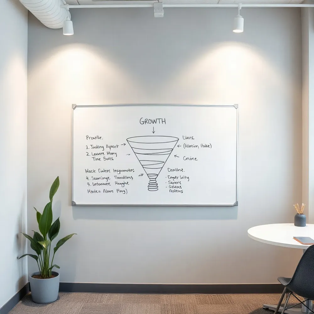
A clear, benefit-driven headline above the fold is non-negotiable. Most visitors decide whether to stay or leave within seconds, and a vague welcome message does nothing to earn their attention.
Compare “Marketing tools that help small businesses get more local customers” with a generic tagline like “We help businesses grow.” The first version answers who it serves and what outcome they get; the second forces the visitor to guess. Your hero section must deliver four things at once: a headline focused on value, a subheadline that names a specific pain point, a primary call-to-action, and a supporting visual. Optional trust badges or testimonials layered in can tip the balance for undecided readers.
Relevance beats volume when selecting keywords for that headline. A term closely aligned with audience intent drives more qualified traffic than a broader phrase simply because it matches what the searcher actually needs. Digital Consulting Pros applies this same principle when building homepages for clients, ensuring that the hero section’s messaging reflects both search intent and buyer psychology so that every visitor who lands on the page already sees themselves as a fit.
One Goal, One CTA, Clear Direction
A homepage that tries to do everything ends up doing nothing. The most effective homepages commit to one primary objective per page, then focus every element toward that single goal. This clarity guides the visitor toward a meaningful action rather than overwhelming them with choices.
Your primary call-to-action (CTA) should be placed prominently above the fold, where visitors first land. When users have enough context after scanning your value proposition, repeat the CTA again later in the page — for example, after a block of social proof or testimonials. This contextual repetition captures visitors who need more reassurance before committing.
Specific CTAs. “Book a Consultation” or “Start Your Free Trial” tell the visitor exactly what will happen next. These strong labels set clear expectations and reduce hesitation at the decision point.Vague CTAs. “Learn More” leaves too much uncertainty. Visitors may wonder what they will learn and whether it’s worth their time, leading to lower click-through rates and lost conversions.
The impact of a focused CTA strategy is substantial. One study found that CTAs on landing pages can increase conversion rates by 80%. For business owners managing paid ad spend, this lift translates directly into more qualified leads from existing traffic.
Social Proof: The Shortcut to Trust
Trust signals do more than reassure visitors — they actively drive conversions. Placing them near calls-to-action or signup forms, and especially above the fold, gives hesitant prospects the confidence they need to take the next step.
A concrete case in point: RubberStamps.net increased revenue per visitor by 33.20% simply by enlarging review star sizes on product pages. That is a reminder that even small visual changes to trust elements can produce meaningful revenue lift.
Digital Consulting Pros applies this principle directly. One client saw website enquiries jump 41% within four months of a multi-channel campaign that prominently featured testimonials and case study stats across Google, LinkedIn, and retargeting ads. Another client booked 17 qualified B2B appointments in just eight weeks after DCP built a social‑proof‑rich outreach sequence.
- Client logos and recognizable brand badges build instant authority.
- Written testimonials with full names and photos feel authentic.
- Case study stats (“41% more enquiries”, “17 appointments in 8 weeks”) give numbers credibility.
- Trust badges such as security icons reduce friction at checkout or signup.
Speed, Mobile, and the Non-Negotiable UX Basics
A fast-loading homepage isn’t a nice-to-have — it’s a conversion prerequisite. Research shows that even a one-second delay in mobile load time can decrease conversions by up to 20%. Since over 70% of web traffic is now mobile, and Google uses mobile-first indexing, speed and mobile usability are directly tied to both user trust and search visibility.
Mobile design requires specific choices: stack content vertically, use large tappable buttons, avoid hover-dependent interactions, and place sticky CTAs so the next action is always within reach. Common culprits that slow pages down include multiple chat tools, social-media embeds, and unoptimized images.
The fixes are straightforward: compress images using modern formats like WebP, serve assets through a CDN, minify CSS and JavaScript files, and enable browser caching. Digital Consulting Pros applies these optimizations as part of its website design process, making sure that speed supports every other conversion element rather than undermining it.
Visual Hierarchy That Guides the Eye
A homepage’s layout dictates where a visitor looks first, second, and not at all. Visual hierarchy uses size, color, contrast, and spacing to create a clear reading order: large headlines grab awareness, bold buttons signal action, and generous white space around those elements prevents distraction. Without this structure, visitors experience cognitive load — the mental effort required to process a cluttered page — which often leads to abandonment.
Use the AIDA Framework to Sequence Content
The AIDA framework (Awareness, Interest, Desire, Action) provides a proven sequence for arranging content from top to bottom. The hero section builds awareness with a benefit-driven headline. Supporting copy and visuals create interest. Social proof or outcome-focused details build desire. And a prominent call-to-action (CTA) captures the final action step. Applying this flow ensures that each visual element serves one role in moving visitors toward conversion.
Directional Cues and Contrast Pull Attention
Directional cues — such as a model’s gaze pointing toward a CTA or an arrow subtly indicating where to click — further guide the eye without relying on heavy text. High-contrast button colors (e.g., orange on a dark background) make CTAs visually distinct from surrounding elements. The effect can be dramatic: Underwater Audio improved its homepage visual hierarchy and saw online sales increase by 35.6%.
A homepage’s navigation should help visitors find what they need quickly, not overwhelm them with options. Effective website navigation keeps the menu tight — no more than 5-6 top-level items with clear, jargon-free labels. Each item should describe a category visitors actually use (“Services,” “About Us,” “Contact”), not internal terms like “Solutions Ecosystem.”
Place your primary call-to-action in the top-right corner of the menu so it’s always visible as visitors scroll. This sticky placement keeps the next step accessible without cluttering the page with extra navigation links.
For deeper content like service pages or case studies, breadcrumbs help both users and search engines understand site structure. They show the path back to the homepage and make it easy to explore related sections without getting lost.
Internal linking from the homepage to top service pages using descriptive anchor text also builds topical authority. For example, linking “B2B lead generation” instead of “click here” tells search engines and visitors exactly what they’ll find. Digital Consulting Pros uses this approach to connect its homepage to dedicated service pages for SEO, Google Ads, and AI-driven lead generation tools such as the DCP Lead Generator™.
| Element | Best Practice | Why It Matters |
|---|---|---|
| Menu size | ≤6 top-level items | ≤Reduces cognitive load; improves scanability |
| CTA placement | ↗️ Top-right corner | ↑Always visible; increases click-through rates |
| Labels | →Clear nouns (e.g., Services) | ⬆Visitors find what they expect; lowers bounce rate |
| Breadcrumbs | 🍽️ Yes on deep pages | ↑User orientation + crawl efficiency |
| Anchor text | 📝 Descriptive phrase (e.g., B2B lead gen) | ↑ Search ranking + click context |
Reduce Friction at Every Step
Conversion friction is anything that slows or stops your visitors from completing a desired action. Common friction points include overly long forms, unclear messaging, and too many competing links on your pages.
Minimize your form fields by asking only for essential information — typically name and email. A short form feels quick and safe, while a long form without clear justification can deter visitors.
Clarify next steps with micro-copy near your CTAs: ‘No credit card required’, ‘Cancel anytime’, or ‘We’ll never share your email’. These small reassurances address objections before they arise, reducing hesitation at the moment of decision.
SEO and the Conversion-First Homepage
SEO should influence the architecture of your homepage before visual design begins. This means structuring content with a clear heading hierarchy (H1, H2s, H3s) that is both crawlable for search engines and scannable for visitors. Pages that are easy to navigate and have logical content flow rank better and convert more effectively.
Title tags should be kept under 60 characters with the primary keyword placed near the beginning. Meta descriptions should be 150–160 characters long and include a call to action to encourage click-throughs from search results. These on-page elements are what convince a searcher to visit your site in the first place.
Structured data (schema markup) helps search engines and AI systems understand who you serve, what services you offer, and how you help. For example, marking up reviews, business details, and service areas can make your homepage eligible for rich results in search. Internal linking from the homepage also passes authority to your priority service pages, helping them rank faster.
Test, Measure, Improve Continuously
Conversion optimization is not a one-time task — it requires continuous testing and measurement. The most effective approach to A/B testing is to test one meaningful change at a time, such as CTA copy, button placement, or headline wording, using sufficient traffic and a clear hypothesis.
Prioritize high-traffic, high-intent pages first — typically service pages — then move to blog posts with strong organic reach. Before testing, define your conversion goals (e.g., form submissions or booked calls), set baseline conversion rates, and establish clear targets so you can measure the impact of each change.
Tools like Google Analytics 4 provide aggregate metrics, while heatmaps and session recordings from Hotjar or Microsoft Clarity reveal exactly where users hesitate or drop off. Form analytics can identify fields that cause abandonment. Combine these tools to diagnose friction points before running tests.
A real-world example shows the power of this cycle: a mid-size consulting firm revised its homepage with clearer client-first messaging, moved CTAs above the fold, added testimonials and logos, and compressed media to speed up load times. The result was a 37% drop in bounce rate and a 4.3x increase in leads within two months.
Common Mistakes That Kill Homepage Conversions
Visitors decide in seconds whether to stay or leave. A study from the Nielsen Norman Group found that users often leave a webpage within 10 to 20 seconds, so the content above the fold must immediately communicate your value proposition. If your headline and hero image don’t align with the searcher’s intent, you lose the sale before the scroll. Digital Consulting Pros specializes in building homepages that hook attention quickly. Our design process prioritizes clear, benefit-driven headlines and a single, prominent call-to-action above the fold. We help you avoid the common mistake of burying your core message under generic copy. Instead, we craft a focused funnel that guides each visitor toward one desired action, whether that’s requesting a quote, or downloading a lead magnet.
Your homepage has roughly five seconds to make an impression. According to a study highlighted by Ritger Digital, you need to win those seconds with a clear, concise headline and a visual that reinforces your unique selling proposition. We take this principle further. Digital Consulting Pros builds that foundation by staging your strongest asset first, whether it’s a compelling statistic, a customer testimonial, or a product demo. Competitors often stuff the top of the page with generic hero sliders and vague taglines. We flip that, placing your most persuasive element front and center.
Beyond the Fold: Guiding the Scroll
The fold is a myth in the sense that users will scroll, but only if you give them a reason. The best homepages use the ‘F-shaped’ pattern, guiding the eye from the headline to the value prop, then to social proof, and finally to the CTA. A well-structured homepage mirror this journey. It answers three questions in order: What do you offer? How will it benefit me? What do I do next? The 11 Ways to Instantly Increase Conversions guide supports this logic, emphasizing the need for a clear value proposition and a single call-to-action. We ensure your entire scroll path is conversion-focused. Each section builds trust and momentum, leading the visitor to click and convert.
However, many homepages fail because they ask the user to make a decision before providing enough reassurance. They place the signup form right at the top, demanding personal information before earning trust. Instead, we recommend a progressive approach. Use your homepage to answer objections, showcase case studies, and highlight customer logos. Then, present your offer. This is a core principle in our website design process, where we map out the conversion funnel before a single pixel is placed. By the time a visitor reaches your CTA, they’ve already been sold on the value.
The Role of Clarity and Design in Conversion
Clarity comes before conversion. A messy, cluttered homepage is the ultimate turn-off. A study from AmericanEagle.com highlights that best practices for conversion include simple design, clear navigation, and prominent CTAs. We agree. We replace complex layouts with simple, high-converting web design. Our focus is on minimal visual noise and maximum persuasion. We use white space strategically to draw the eye to your key message and CTA. Competitors sometimes load their homepages with every possible feature, creating a confusing experience. We strip away the clutter, focusing on a single goal.
This commitment to clarity extends to your website copy. We help you write copy that speaks directly to your target buyer’s pain points and aspirations. Instead of buzzwords like ‘synergy’ or ‘best-in-class,’ we use concrete, outcome-driven language. We need to answer the question in the visitor’s mind: ‘What’s in it for me?’ This is where high-converting website design comes into play. It’s not just about looking good; it’s about designing a tool that guides the user toward a specific action. We build pages that are both visually appealing and engineered to convert, ensuring your homepage is not a digital brochure but a lead-generation machine.
| Aspect | Impact on Conversion | Best Practice |
|---|---|---|
| Headline | High | Communicate value proposition clearly |
| Above the Fold | High | Place key elements in first 10 seconds |
| Visual Design | Medium | Use clean, uncluttered layouts |
| Clear CTA | High | Single, contrasting action button |
| Social Proof | Medium | Showcase testimonials and case studies |
Real Results: Data-Backed Wins From Smart Design
Numbers speak louder than claims. Several businesses have seen measurable gains by applying the principles outlined in this article, proving that conversion-focused design delivers real ROI.
Choose Your Gift (CYG), an employee gift-pricing program, saw a 47% increase in online transactions and a 97% revenue increase year-over-year after a website redesign that enhanced navigation and branding. General American (LGA), a life insurance company, improved its sales conversion rate by 27% year-over-year after launching a customer-focused content and analytics platform. These results show that even established companies can unlock significant growth with deliberate design changes.
Smaller changes deliver outsized returns too. Ideal of Sweden increased clicks on its add-to-cart button by 5.6% simply by adding a countdown banner — a low-effort urgency trigger. A mid-size consulting firm with a slow, unclear homepage cut its bounce rate by 37%, improved mobile load time from 5.8 to 2.1 seconds, and generated 4.3 times more leads within two months after rewriting its headline, moving CTAs above the fold, and adding social proof.
Digital Consulting Pros applies this same data-driven methodology for its clients. One client reported a 41% increase in website enquiries within four months through multi-channel visibility across LinkedIn, Google, Facebook, and retargeting ads combined with warmer sales conversations. Another client achieved a 58% positive response rate one month into a LinkedIn outreach campaign managed by the agency’s team.
From Homepage to Revenue Engine
When a visitor lands on your homepage, you have only a handful of seconds to capture their attention and guide them toward action. That’s why every element, from the headline to the call-to-action button, must be deliberately designed to move the visitor closer to conversion. A conversion-focused homepage is not about creative flair alone; it’s a strategic asset that directly impacts your bottom line.
In practical terms, this means your homepage should instantly communicate what you offer, who it’s for, and what you want the visitor to do next. This might sound simple, but too many business homepages lead with vague taglines, generic hero images, and navigation that’s optimized for the company internally rather than for the customer. Converting visitors into customers requires a clear hierarchy, compelling copy, and a prominent, unmissable call to action.
Core Conversion Principles
Clear Value Proposition. Within seconds, a visitor should know exactly what you do and why they should stay. Your headline and subheadline should speak directly to their pain points and desired outcomes. For example, instead of a generic tagline, use specific language like ‘We Design Homepages That Triple Your Consultation Bookings.’Strategic Call to Action. Every page should have one primary goal, and your call-to-action button should reflect that. Whether it’s ‘Get a Free Quote’ or ‘Book a Consultation,’ the action should be specific, urgent, and impossible to miss. Above-the-fold placement is almost always best, but make sure it’s repeated strategically throughout the page for visitors who need more time.Social Proof and Trust. Visitors are inherently skeptical. They’re looking for evidence that you can deliver on your promises. That’s where social proof comes in. Customer testimonials, client logos, case studies, and trust badges (like security certifications or industry accreditations) serve as that evidence. They signal that others have taken the risk and been rewarded, reducing the perceived risk for new visitors.Minimal Friction. Every extra field in a form, every extra click to find information, and every slow-loading page is a chance for a visitor to leave. A conversion-focused homepage streamlines the journey. That means short, clear forms; fast loading times; and a layout that doesn’t demand users scroll endlessly to find what they need.
Design and Copy Elements That Convert
Design and copy are not separate disciplines; they work together to guide your visitor from curiosity to conversion. Take a look at the practices from Website Homepage Best Practices, which emphasize the importance of readability, visual hierarchy, and a mobile-first approach. A homepage that is difficult to read, slow to load, or impossible to navigate on a smartphone will kill conversions faster than almost any other offense.
Similarly, your copywriting should focus on the benefits, not just the features. Instead of saying ‘We have 20 years of experience,’ say ‘We’ve spent 20 years helping businesses like yours save thousands in ad spend.’ The best copy uses concrete numbers, addresses objections, and, most importantly, compels visitors to take that desired action. For a deeper dive into structuring your message, consider the funnel-focused approaches outlined in the conversion-focused web design guide.
Turning Your Homepage into a Lead-Generation Engine
Ultimately, your homepage should do more than just look pretty; it should actively generate leads and supplement your wider marketing efforts. This means integrating clear calls-to-action not just in the hero section but also in your footer, in the sidebar, and even as sticky elements on mobile. And if your homepage’s primary role is to capture leads, make sure that’s the singular focus of every key element on the page.
For instance, you might use pop-ups or slide-ins to offer a lead magnet, like a free checklist or a case study, in exchange for an email address. Or you might use a chatbot to qualify visitors in real time. A results-focused approach often aligns closely with methods like homepage SEO, ensuring that the visitors who arrive are already looking for a solution you provide. These tactics work together to turn your homepage from a digital brochure into a core business channel that consistently drives qualified opportunities and revenue.